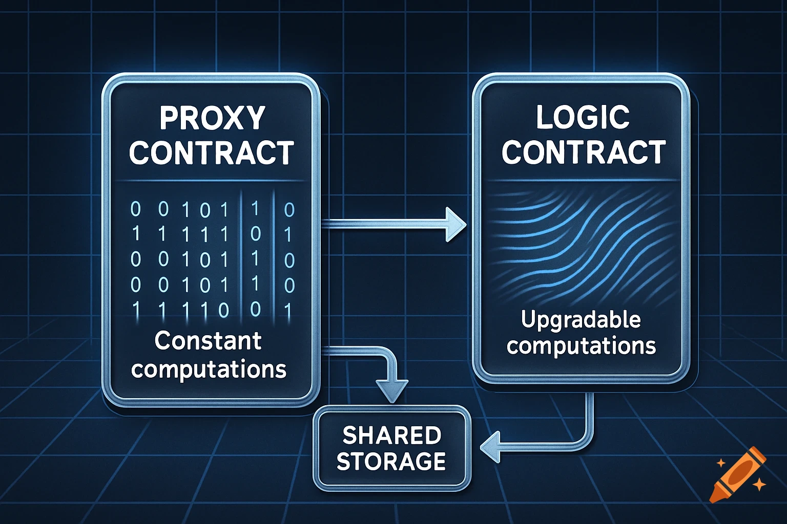
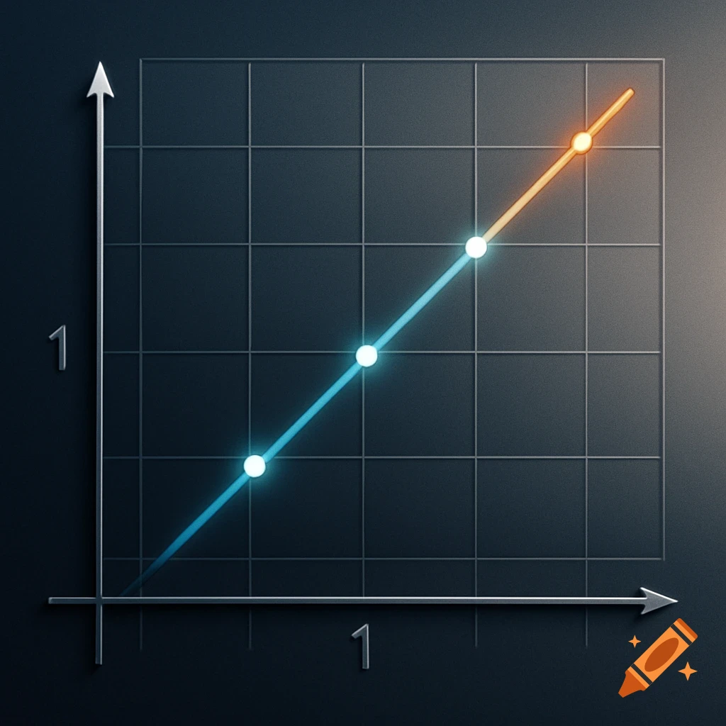
A line graph showing Tool Effectiveness vs. Operational Complexity. The orange line for Spreadsheets drops sharply. The blue line for ERP Modules drops slowly and plateaus. The green line for FSM (PTI) remains flat.

X-axis labeled: Operational Complexity (Small → Enterprise) Y-axis labeled: Tool Effectiveness (0–100) Three lines: Orange line: Spreadsheets, starts high and drops sharply Blue line: ERP Modules, starts high, drops slowly and plateaus Green line: FSM (PTI), starts high and stays almost flat Include small labels next to each line with the tool name Add light grid lines, clear axes, and a professional presentation style Background: white or light, clean, corporate style, suitable for a PowerPoint slide” Mehr sehen
More images like this