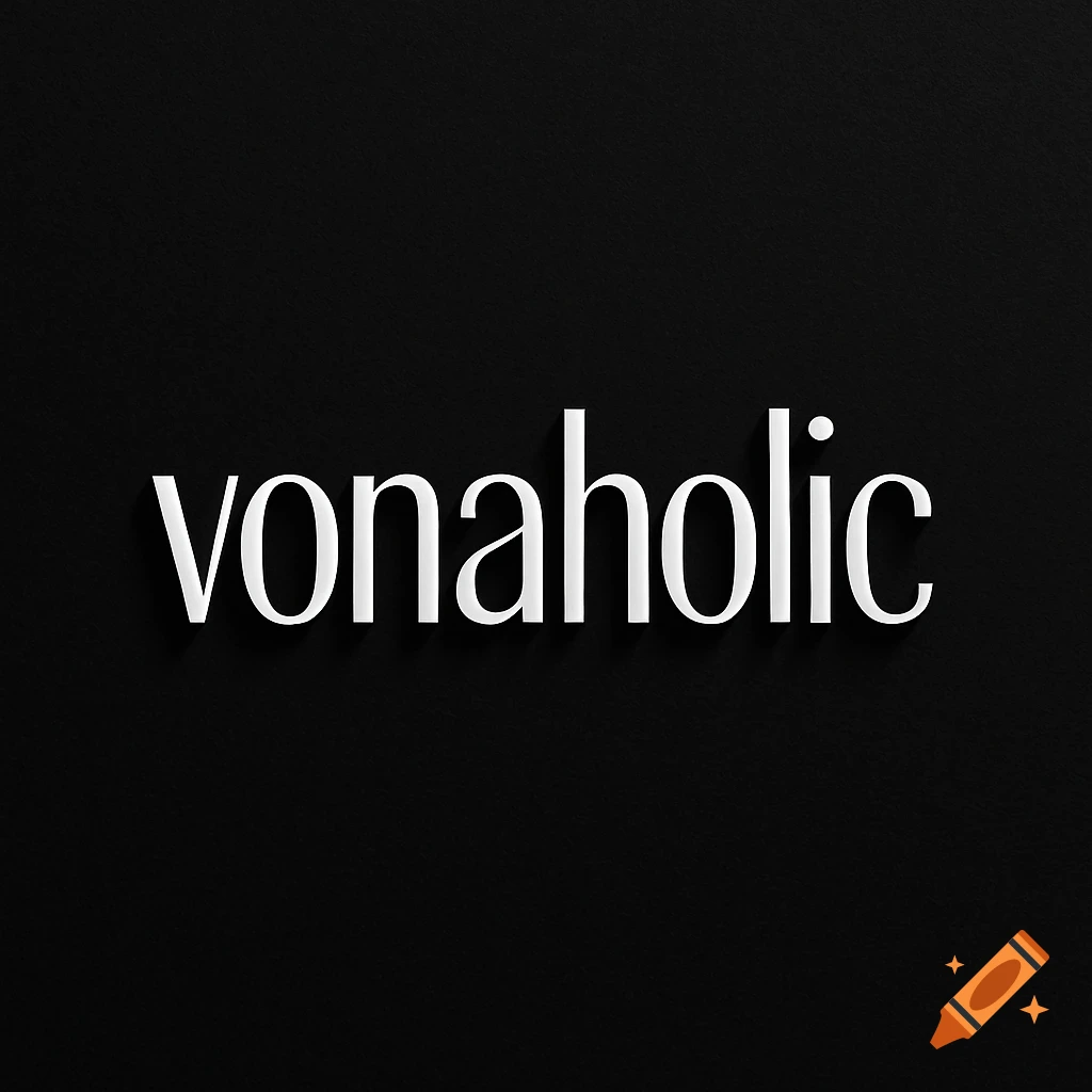
A minimalist logo for "VELOUR" with a bold black sans-serif font, a wavy orange line, and a subtle grain texture on a cream background, enclosed in a black border.

Base idea: Minimal, bold “VELOUR” with one playful twist → looks clean at small size but still has personality. Layout (square icon) [ cream / off-white background ] VELOUR ~~~ Details that matter 1. Typography Font style: clean sans-serif (think: Helvetica Now, Inter, or a slightly softer grotesk) All caps: VELOUR Tracking: slightly expanded (so it breathes at small size) 2. The “funky accent” (this is the key) Replace a boring underline with a wavy line Not perfectly symmetrical—give it a subtle groove Thickness: about 60–70% of the letter stroke weight Alternative twist if you want more personality: Make the “O” slightly stretched horizontally Or tilt just the “R” by a few degrees 3. Color palette (strong + simple) Background: warm cream (#F5F1E8) Text: near-black (#111111) Accent line: burnt orange or muted coral (#D66A4E) 4. Texture (important for vibe) Add very light grain/noise over everything Opacity: ~5–10% This makes it feel like a zine instead of a tech brand Ver mais
More images like this