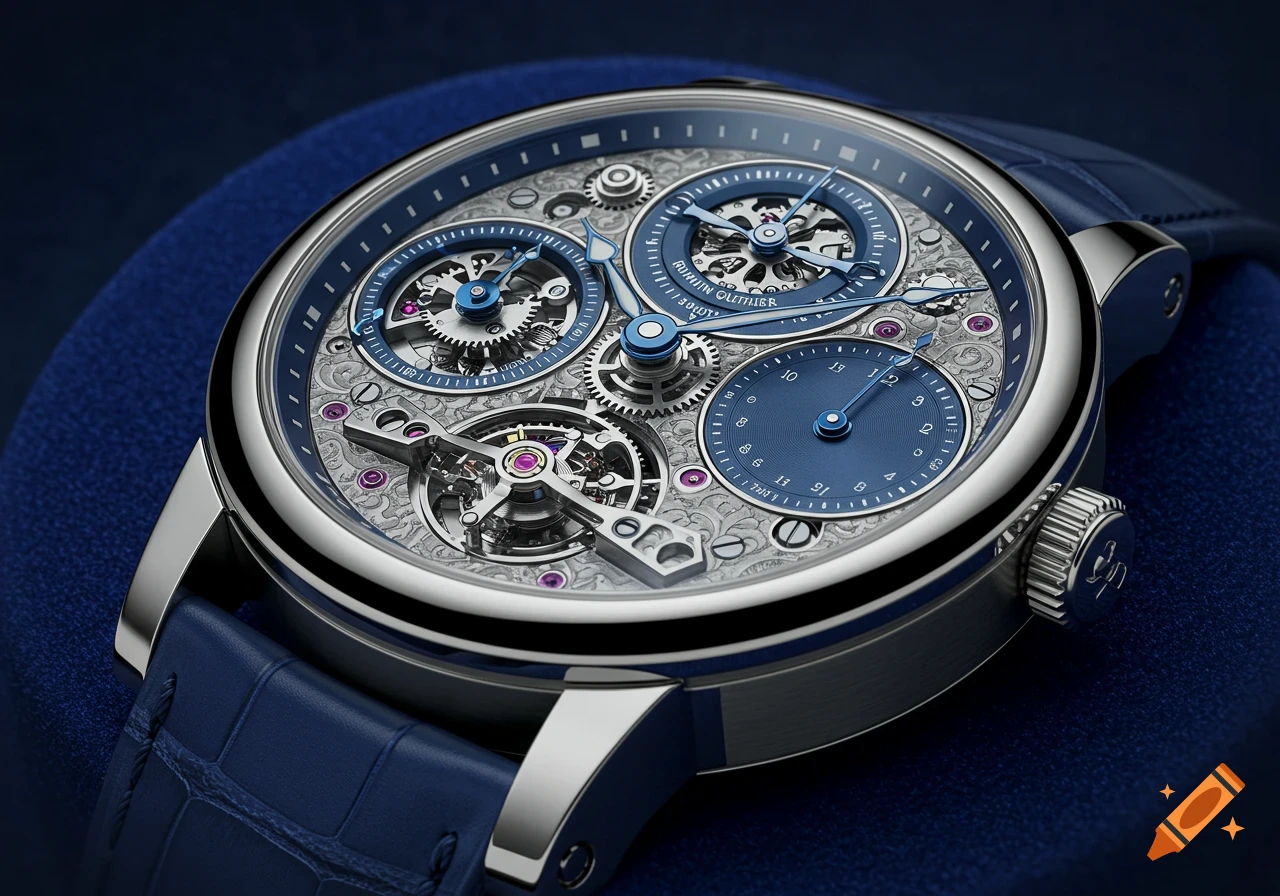
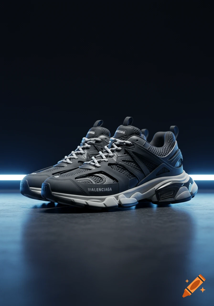
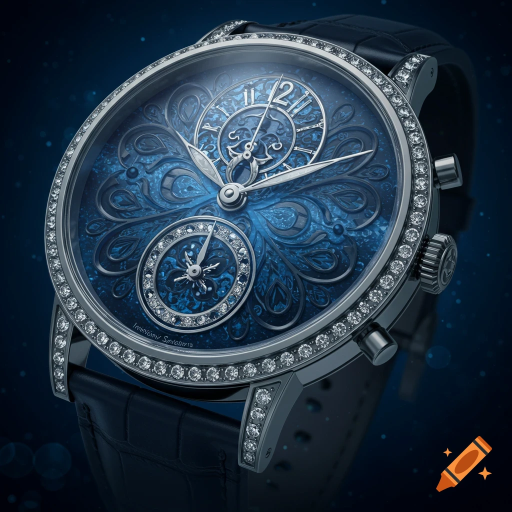
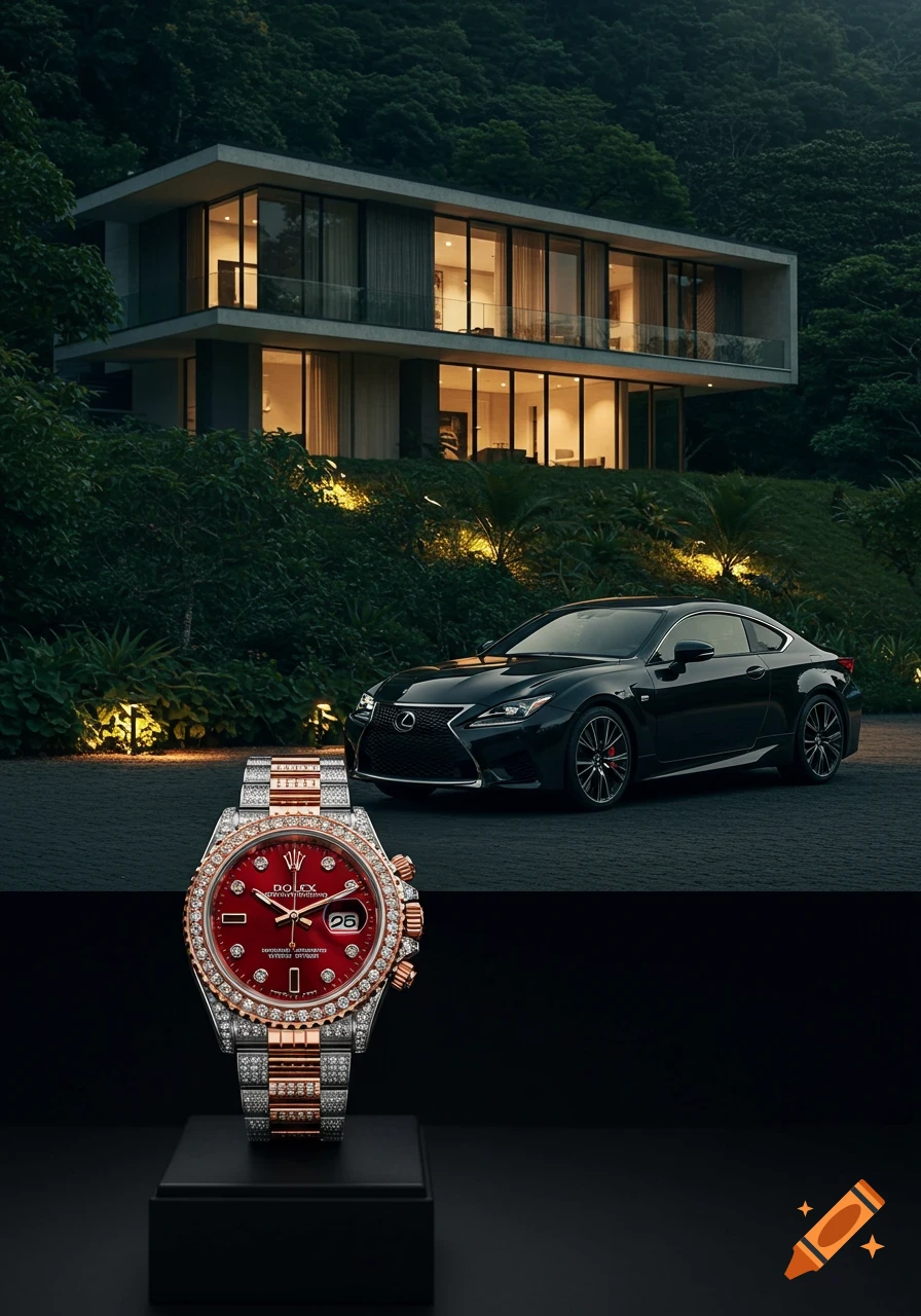
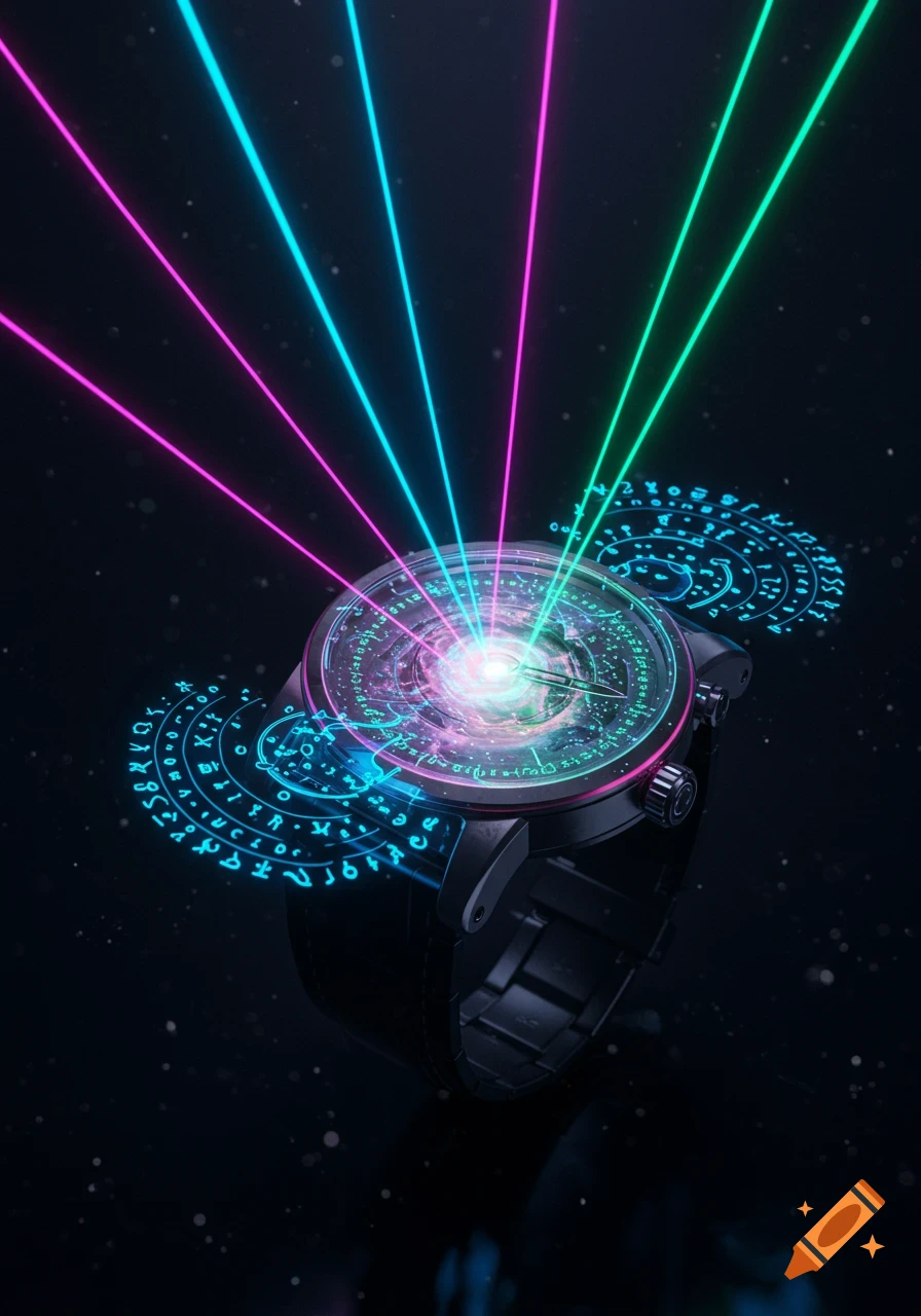
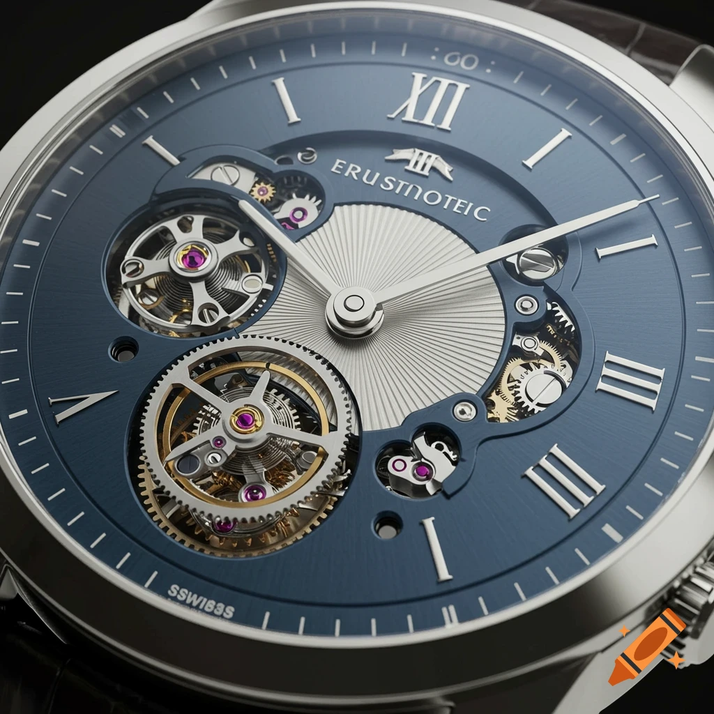
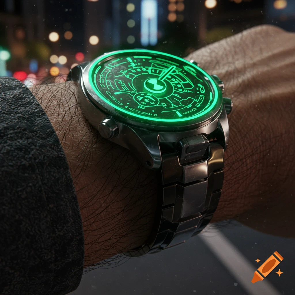
A blue luxury wristwatch with a leather strap centered on a black background with repeating gray geometric shapes and the word 'ANOMALY'.

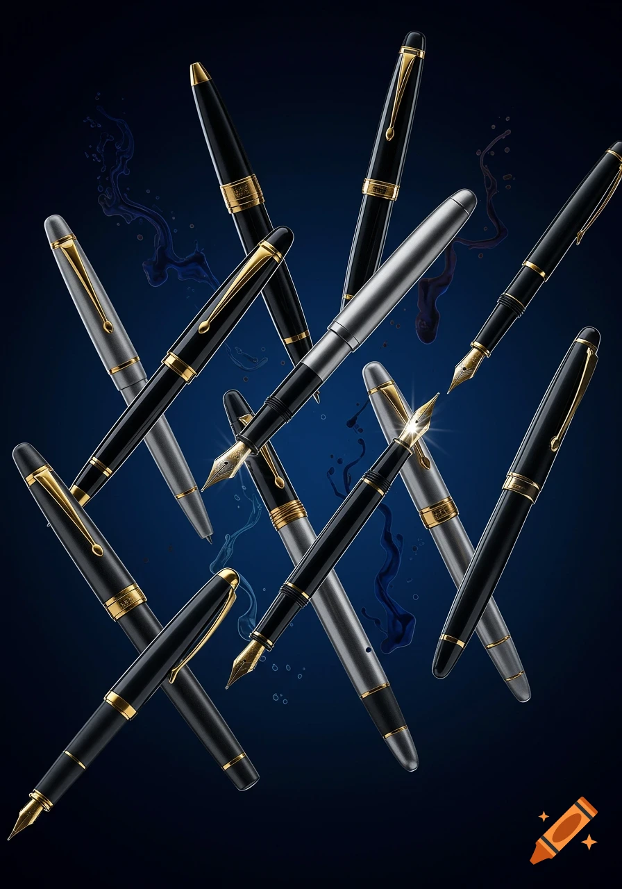
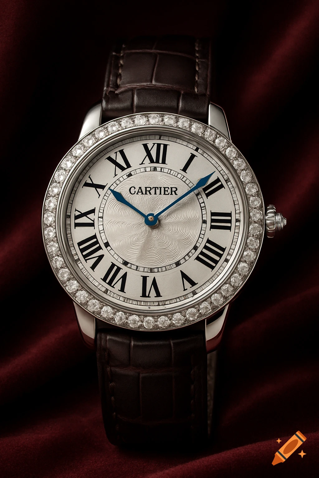
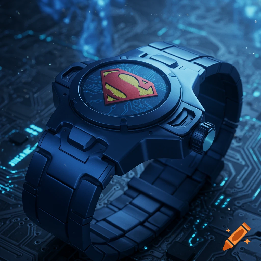
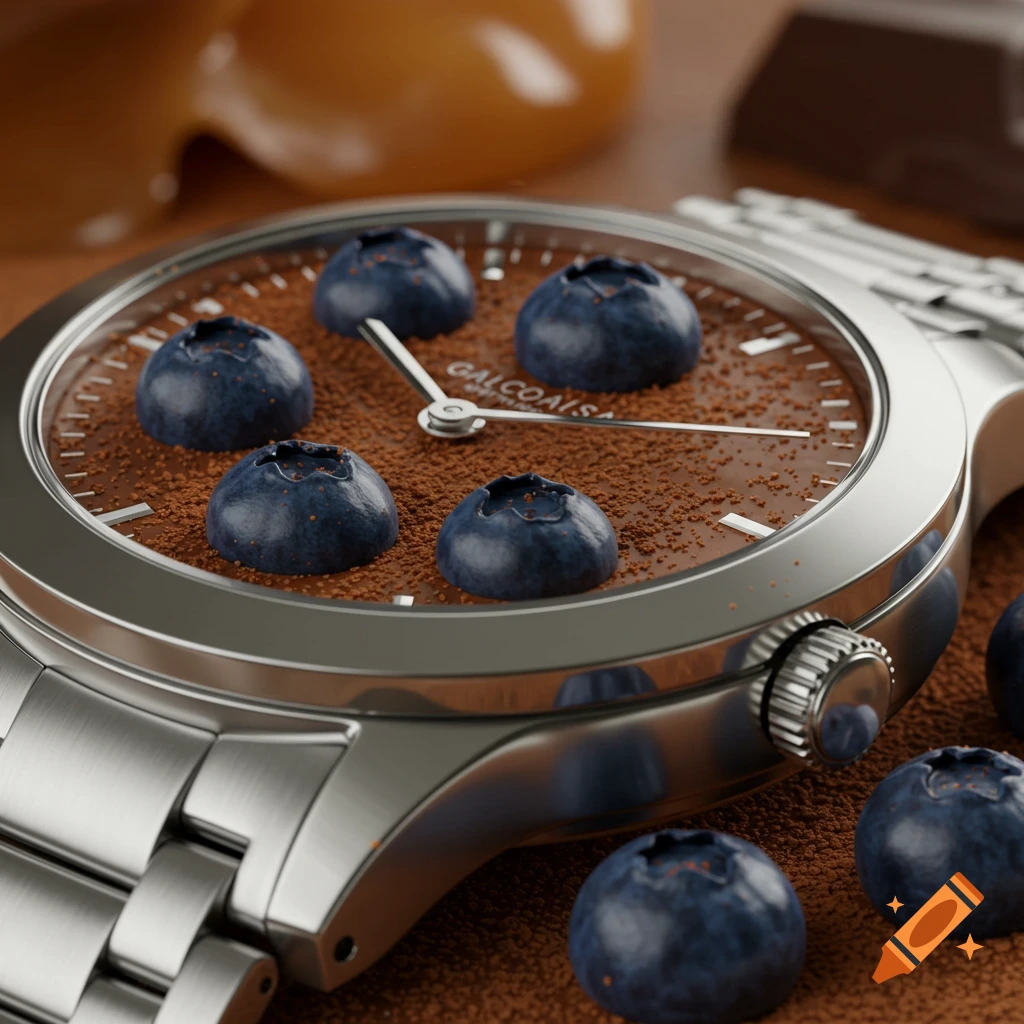
Create a high-end commercial product poster based on the "Anomaly" (Variation) principle in graphic design and layout. Definition of Anomaly for layout design: Most visual elements follow a consistent, repeated pattern — same shape, size, spacing, rotation, or color. Then, one single element deliberately breaks that pattern. The broken element becomes the visual focus. The rest of the pattern remains intact to make the break obvious but elegant. In this poster: · The background or supporting structure is a clean, repetitive grid or rhythm (e.g. dots, lines, geometric icons, typography blocks, or product silhouettes arranged regularly). · The anomaly is the product itself — different in scale, form, color, position, or orientation from the repeated elements. · The anomaly must look intentional, not random. It should naturally belong to the composition while standing out. Aesthetic requirements (commercial-grade): · Minimalist and bold — no clutter, no unnecessary decoration. · Elegant visual contrast — the anomaly creates subtle but powerful tension. · High-end commercial look — polished, premium, suitable for official advertising (social media, print, or web banners). · Not student work — no generic "class exercise" composition. Must be publishable. Marketing function: · Product must be clearly visible and recognizable as the hero. · The anomaly effect must highlight the product’s uniqueness or benefit without being gimmicky. Tone: Modern, clean, refined, striking in its Ver mais
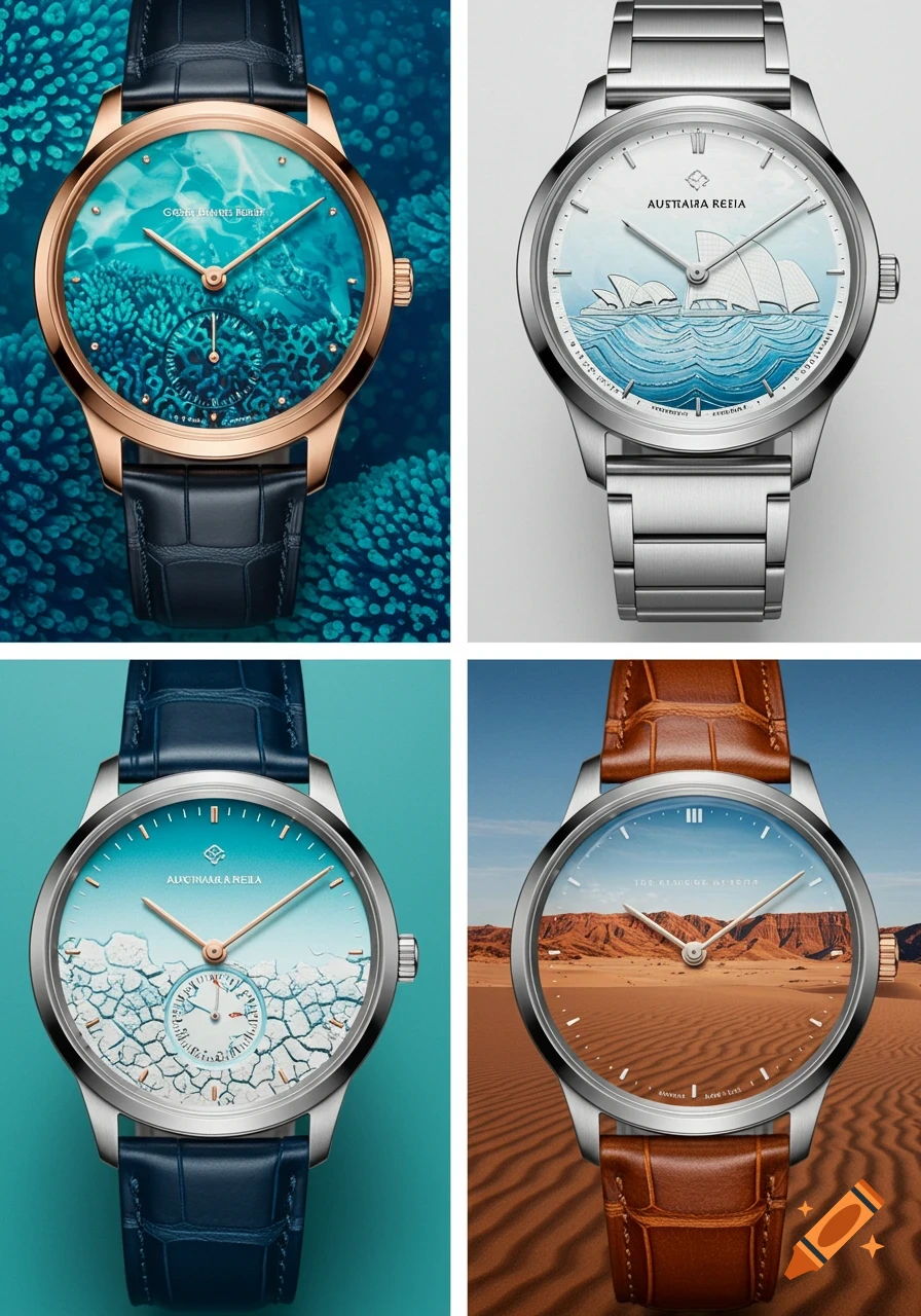
More images like this