


'%3e%3cpath%20d='M12%2020.3333C16.6024%2020.3333%2020.3333%2016.6024%2020.3333%2012C20.3333%207.39762%2016.6024%203.66666%2012%203.66666C7.39763%203.66666%203.66667%207.39762%203.66667%2012C3.66667%2016.6024%207.39763%2020.3333%2012%2020.3333Z'%20stroke='%23F2F2F2'%20stroke-width='2.08333'%20stroke-linecap='round'%20stroke-linejoin='round'/%3e%3cpath%20d='M8.66667%2013.6667C8.66667%2013.6667%209.91667%2015.3333%2012%2015.3333C14.0833%2015.3333%2015.3333%2013.6667%2015.3333%2013.6667'%20stroke='%23F2F2F2'%20stroke-width='2.08333'%20stroke-linecap='round'%20stroke-linejoin='round'/%3e%3cpath%20d='M9.5%209.5H9.50833'%20stroke='%23F2F2F2'%20stroke-width='2.08333'%20stroke-linecap='round'%20stroke-linejoin='round'/%3e%3cpath%20d='M14.5%209.5H14.5083'%20stroke='%23F2F2F2'%20stroke-width='2.08333'%20stroke-linecap='round'%20stroke-linejoin='round'/%3e%3c/g%3e%3cdefs%3e%3cclipPath%20id='clip0_10282_1064'%3e%3crect%20width='20'%20height='20'%20fill='white'%20transform='translate(2%202)'/%3e%3c/clipPath%3e%3c/defs%3e%3c/svg%3e)


A graphic on lined paper with a red pen, titled "Its vs. It's" and text about avoiding writing mistakes.
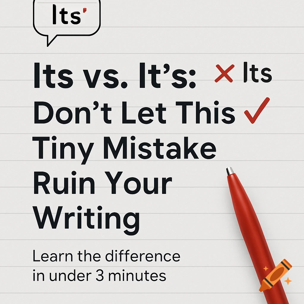
Main Text (Large Font): Its vs. It’s Don’t Let This Tiny Mistake Ruin Your Writing Subtext (Smaller Font): Learn the difference in under 3 minutes Background: Light gray or white Optional: notebook paper texture or simple desk flat lay Visual Element (Optional): A red pen or pencil Text bubble or editor-style markup A correction mark (✔️ and ❌) Font Suggestions: Headline: Montserrat or League Spartan (bold and clear) Subtext: Open Sans or Lora Avoid serif-heavy display fonts unless it's clean Colors: Black or navy for main text Red for emphasis (like "DON’T" or the correction marks) Keep it readable, high contrast Ver mais
Mais imagens como esta
