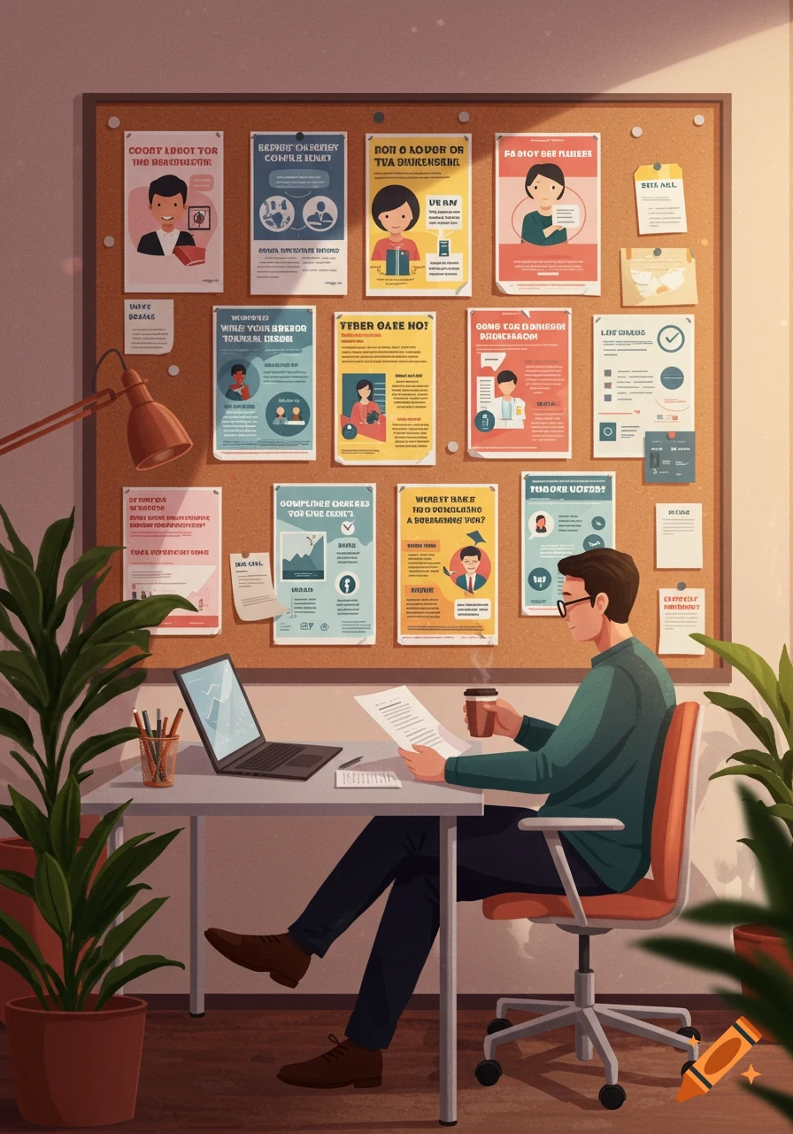
An infographic titled 'Your Logo Isn't Broken (Your System Might Be)' with three diagnostic questions about design systems, featuring icons and text on a cream background with green and golden accents.
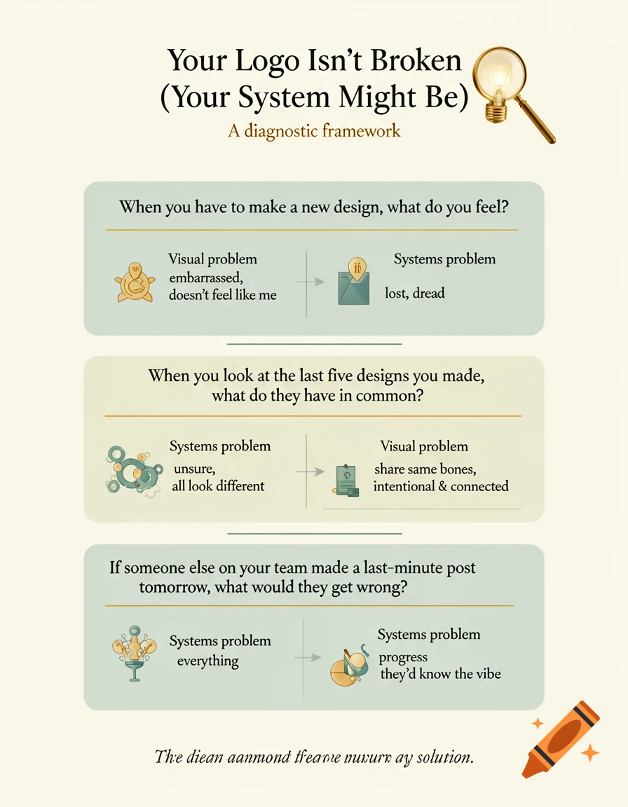
Create a clean, educational infographic in a vertical LinkedIn format (1080x1350px) with the following specifications: BACKGROUND: Soft cream color PRIMARY COLORS: Green-leaning blues (sage green, teal, muted blue-green) ACCENT COLOR: Warm golden/mustard tone TYPOGRAPHY: Serif fonts throughout LAYOUT: Three diagnostic questions presented as a vertical flow with visual separators between each. SECTION 1 (Top): Title: "Your Logo Isn't Broken (Your System Might Be)" Subtitle: "A diagnostic framework" [Use small, elegant visual element - perhaps a magnifying glass or lightbulb in golden accent] SECTION 2 (Middle - Main Content): Three stacked boxes/cards, each representing one diagnostic question: QUESTION 1: "When you have to make a new design, what do you feel?" [Small icons or visual indicators on left] Two outcomes shown: - Visual problem path (embarrassed, doesn't feel like me) - Systems problem path (lost, dread) QUESTION 2: "When you look at the last five designs you made, what do they have in common?" Two outcomes shown: - Systems problem (unsure, all look different) - Visual problem (share same bones, intentional & connected) QUESTION 3: "If someone else on your team made a last-minute post tomorrow, what would they get wrong?" Two outcomes shown: - Systems problem (everything) - Closer to solution (they'd know the vibe) Each question should be visually distinct but cohesive, with connecting lines or arrows showing the diagnostic flow. SECTION 3 (Bottom): Small tagline: Ver mais
More images like this