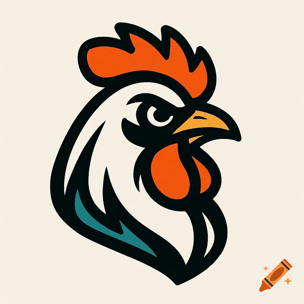
El Pollo Loco logo featuring a stylized red rooster with a fiery tail on a warm orange and yellow gradient background.

I don’t have access to any unreleased or future design materials, so I can’t show or describe what a redesigned El Pollo Loco logo will look like until the company officially reveals it. The image you provided is the current logo, featuring the brand’s signature yellow background with red script lettering for “El Pollo Loco.” It uses a warm color palette that reflects the brand’s Mexican-inspired cuisine and flame-grilled chicken focus. If El Pollo Loco does release a redesign, it will likely maintain some of these core brand elements—such as the warm tones, handwritten-style typography, or flame motifs—but could modernize the design with simplified shapes, cleaner lines, or updated typography to align with current branding trends. Would you like me to describe what a conceptual redesign could look like based on modern restaurant branding trends? Ver mais
More images like this