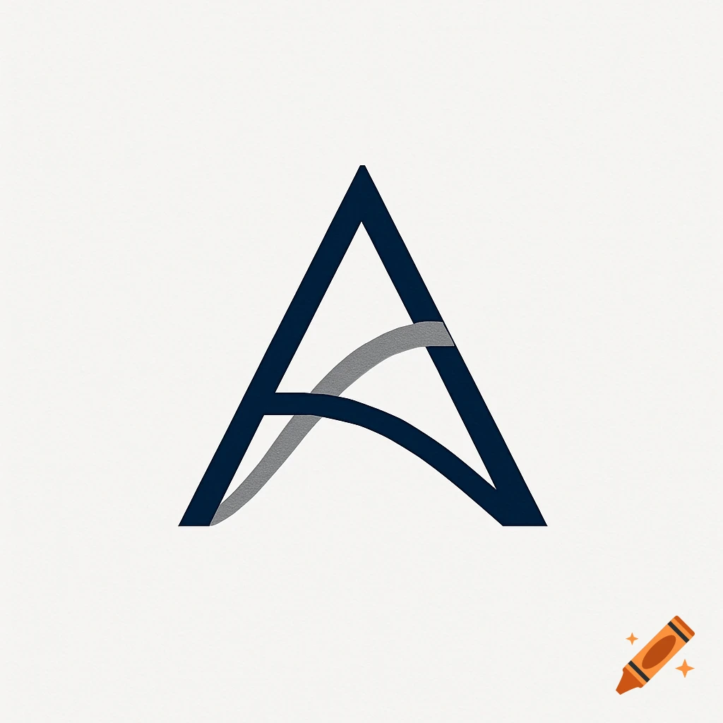
Corporate wordmark logo for ATREON GROUP in dark blue and gray serif and sans-serif fonts.

Design a definitive corporate wordmark logo for "ATREON GROUP", a global infrastructure and construction materials holding company. This is a typographic-only logo — absolutely no icons, symbols, or decorative elements of any kind. Typography and hierarchy: The word ATREON dominates the composition — set in a refined, slightly serif typeface with strong structural character, similar to a high-contrast Garamond or a contemporary transitional serif used by elite financial institutions (Blackstone, Goldman Sachs, KKR). The letterforms should feel authoritative, timeless, and precise — not decorative. Wide letter-spacing, optically balanced. Below ATREON, the word GROUP appears at roughly one-tenth the visual weight: extremely small, in a clean geometric sans-serif (Inter or Helvetica Neue Light), all caps, very wide tracking, centered. The contrast between the dominant ATREON and the near-invisible GROUP is intentional — it communicates corporate hierarchy, not equality between words. Color: Deep navy blue (#0F1C2E) for ATREON. Medium gray (#6B7280) for GROUP. No gold. No gradients. No color effects whatsoever. Separator: A single hairline rule between ATREON and GROUP — extremely thin (0.3–0.5pt), navy blue, opacity 25–30%. Subtle enough to feel like breathing room, not a graphic element. Aesthetic references: The restraint of Blackstone. The typographic authority of Goldman Sachs. The institutional weight of a sovereign infrastructure fund. It must feel like it belongs on the Voir plus
More images like this