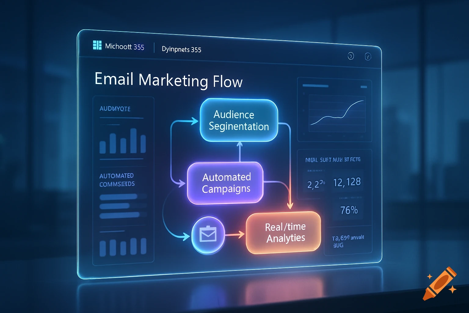
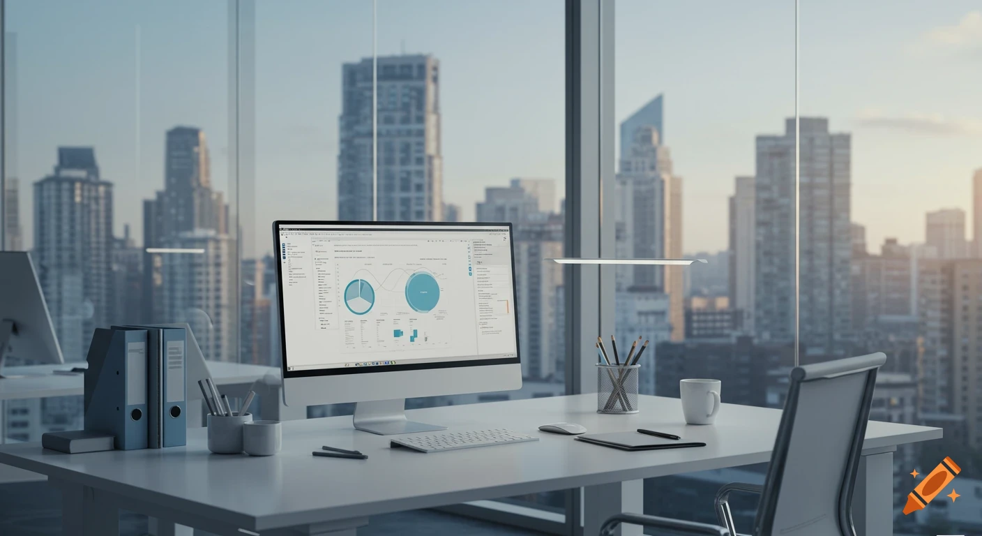
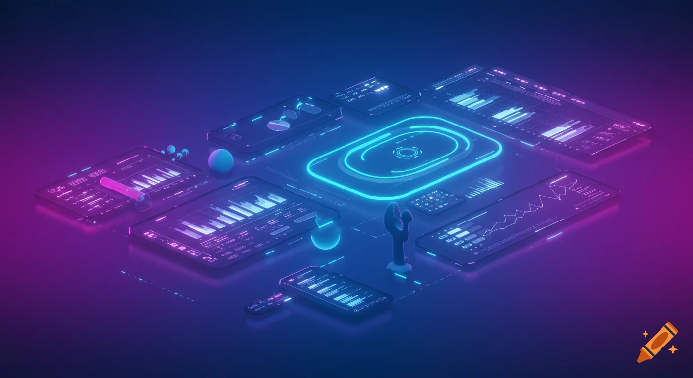
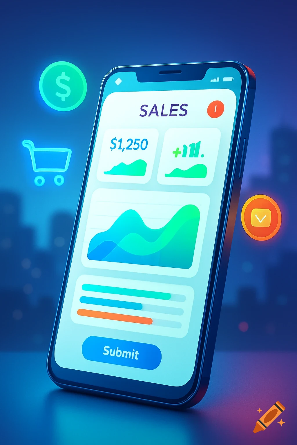
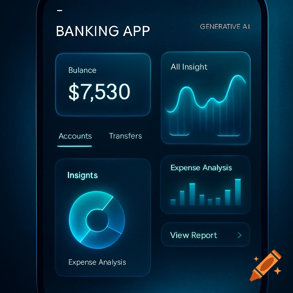
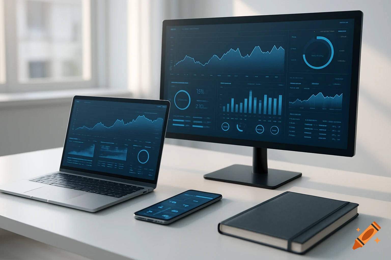
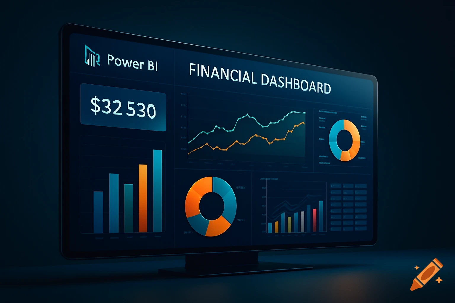
Multiple floating, translucent panels with business data, charts, and text in a professional, modern style with blue and purple gradients.
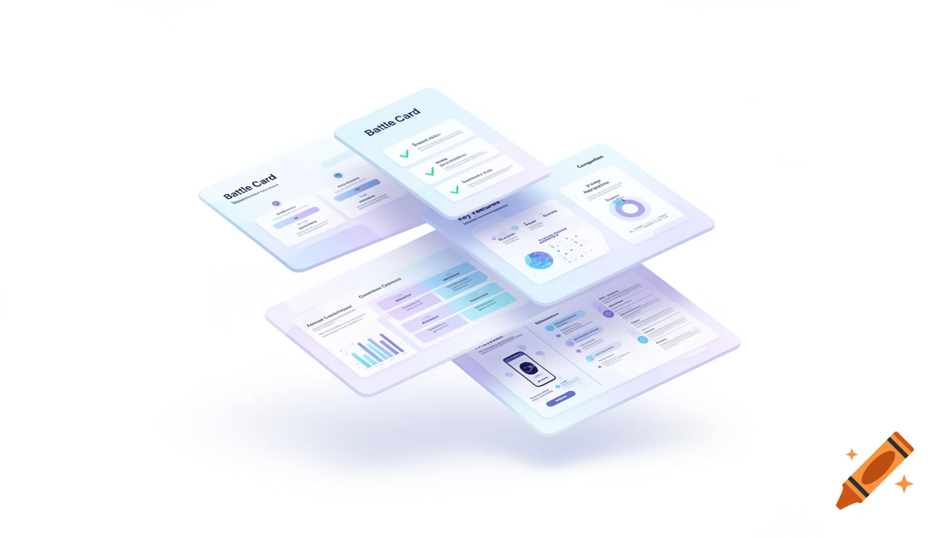
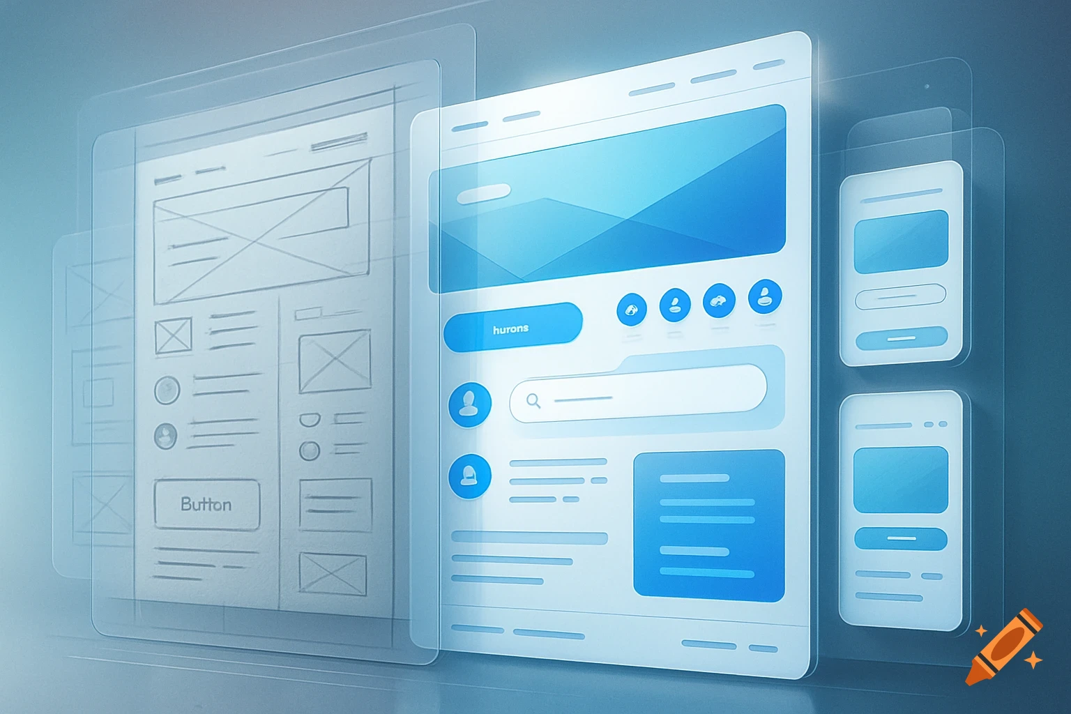
A clean and modern illustration clearly representing business battle cards for a tech company. Show multiple sleek cards or panels slightly overlapping or floating, each card containing simple elements like comparison layouts, checkmarks, charts, and product highlights, making it obvious these are strategic comparison cards. Include a small amount of readable text on the cards such as "Battle Card", "Key Features", or "Comparison", but keep the text minimal and not too small so it remains visible even at a smaller size. Use a professional, minimal design style with soft gradients in pastel blue and purple tones, matching a high-tech corporate brand similar to IQSIGHT. The design should feel polished, modern, and slightly futuristic. Keep the composition simple and well-balanced with plenty of white space. Avoid clutter and excessive detail. The image should be clear and recognizable when scaled down for an email header. Soft lighting, clean background, subtle depth. Wide landscape format, suitable for an email banner. Voir plus
More images like this