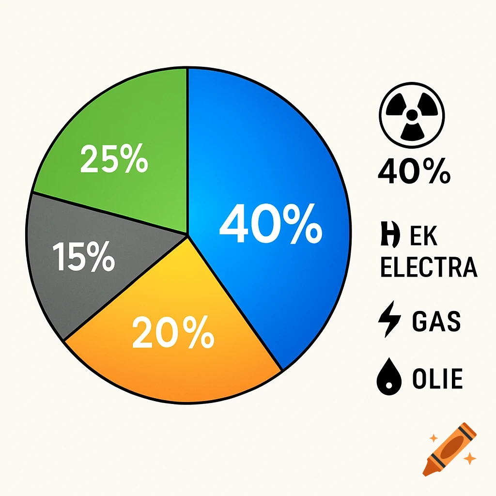
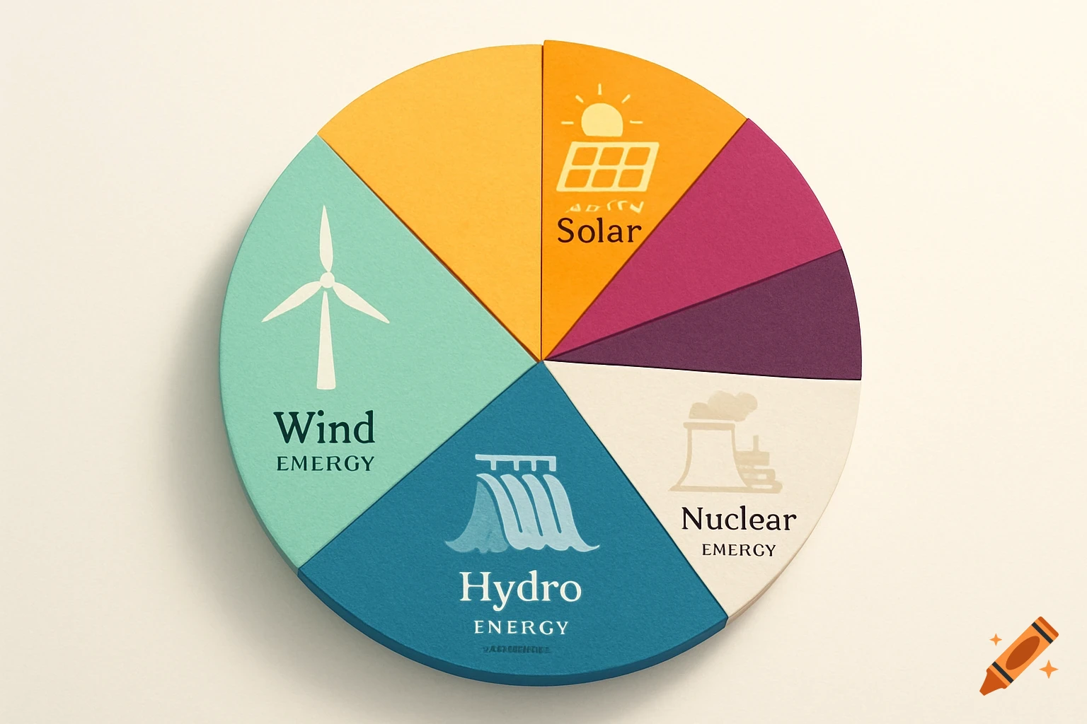
A pie chart infographic shows energy distribution: blue 40% for nuclear, green 25% for electric, yellow 20% for oil, and grey 15% for gas, with corresponding icons and text labels.
Infographic, piechart, kernenergie 40 %, olie 20 %, gas 15 % en electra 25 %. Voir plus