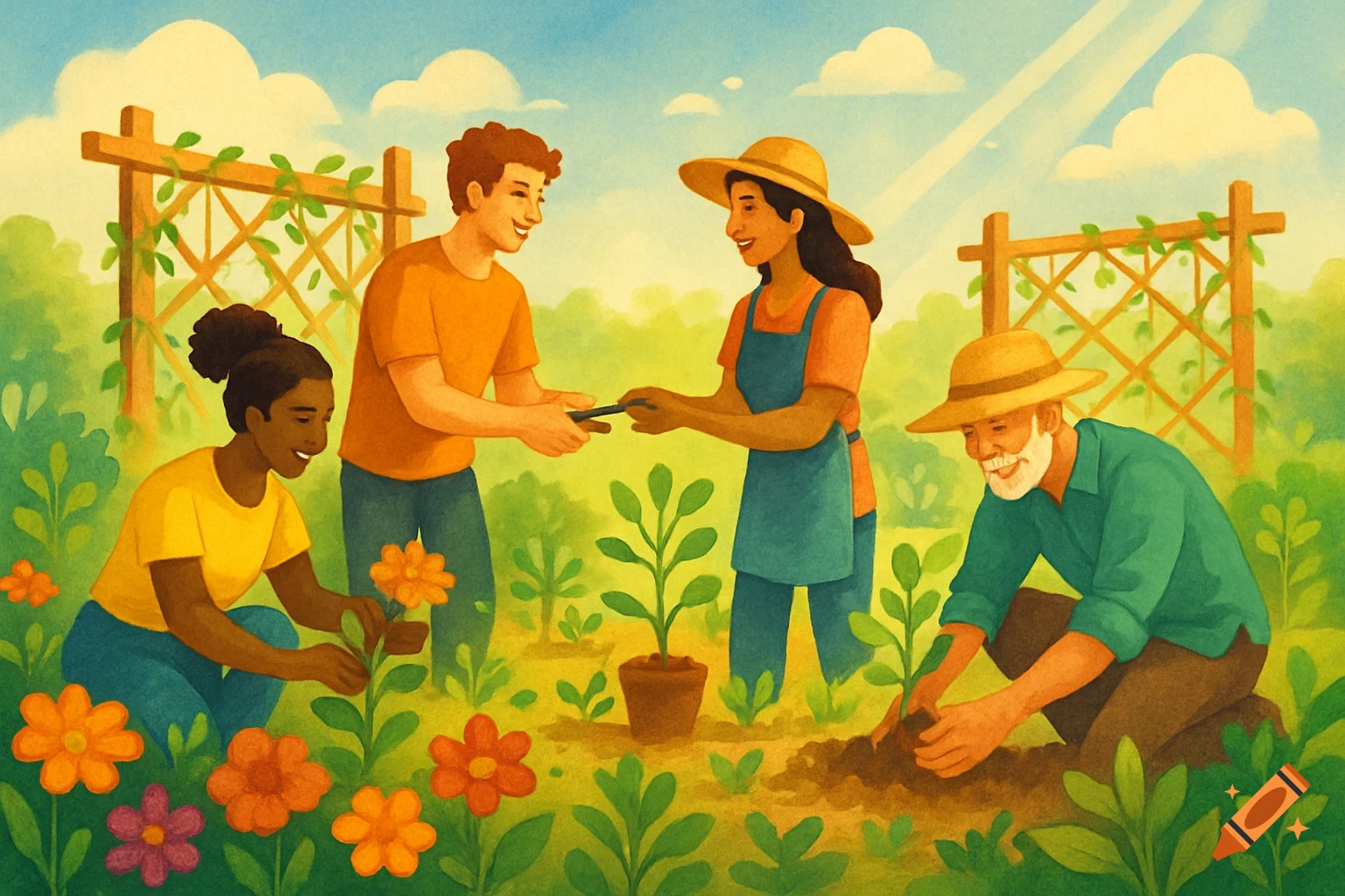
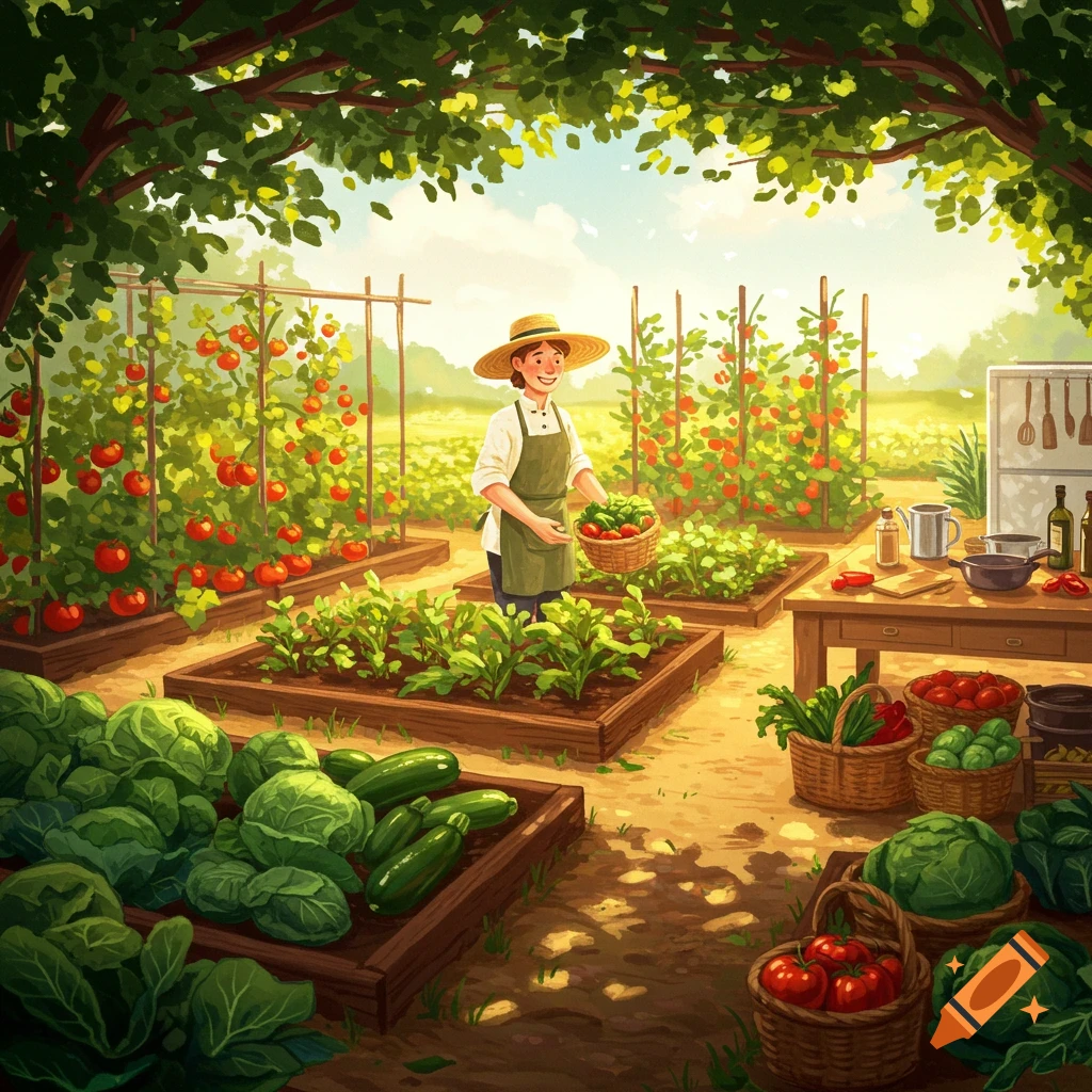
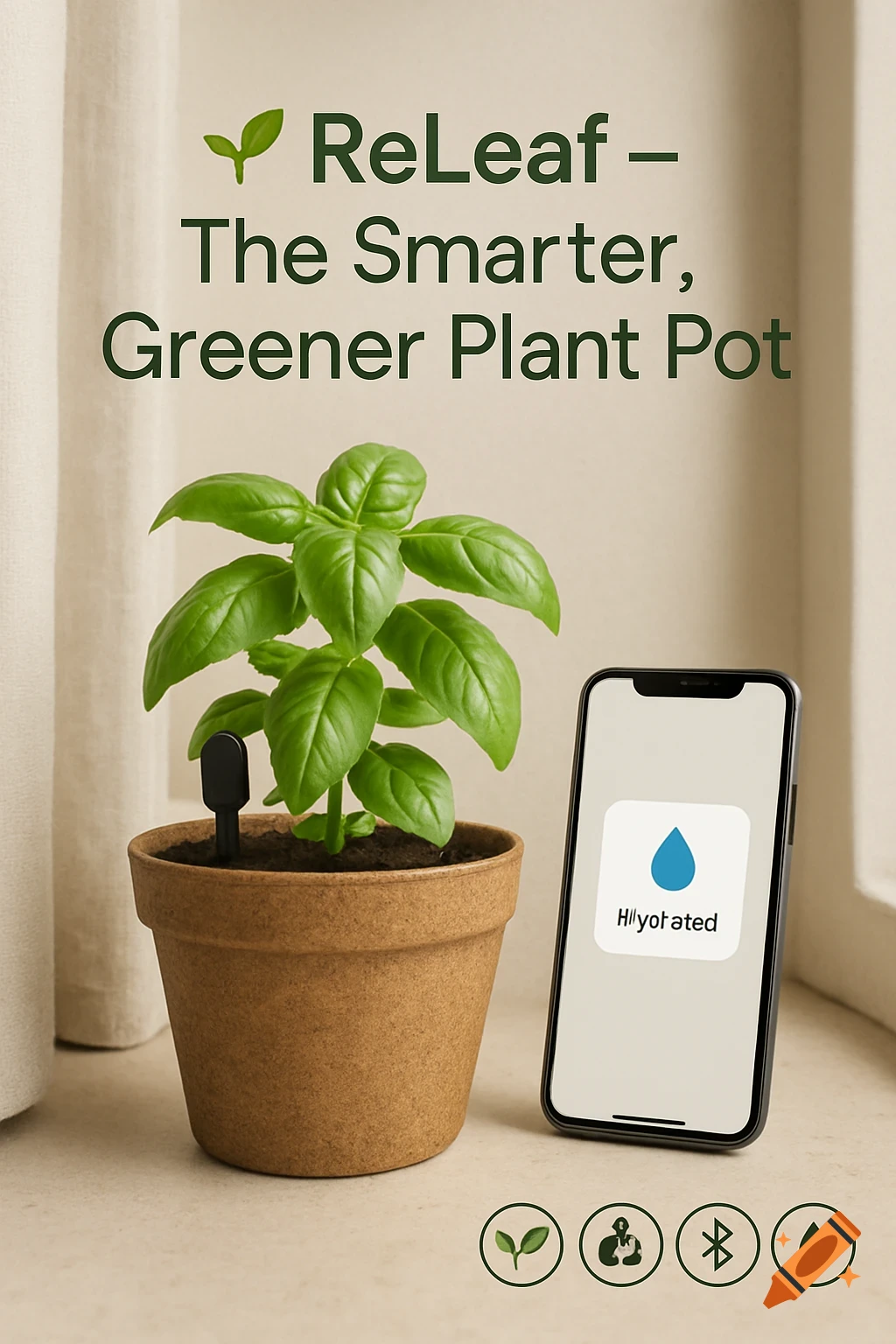
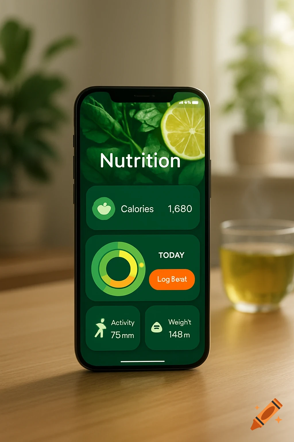
A clean, functional user dashboard mock-up for the GreenThumbHub web service, showing tasks, stats, diary entries, and a featured plant.

Design a clean, functional mock‑up of the “User Dashboard” for the GreenThumbHub web service. The dashboard is the first screen a logged‑in gardener sees after signing in. Follow these constraints: 1. **Overall layout** - Top bar: logo on the left, global search field in the center, user avatar + dropdown on the right. - Left vertical navigation panel (fixed width) with icons + short labels: • Calendar – “Care Calendar” • Catalog – “Plant Catalog” • Diary – “Garden Diary” • Forum – “Community” • Exchange – “Plant Exchange” • Settings – “Profile / Settings” - Main content area shows a personalized overview. 2. **Main content sections (grid of cards)** - **Today’s Tasks** – 3‑4 cards (Watering, Fertilizing, Pruning, Harvest). Each card displays: * Plant thumbnail * Action name + time * “Mark as done” button (check‑mark toggle) - **Quick Stats** – small widgets with icons and numbers: * Total plants tracked * Upcoming events * New forum posts - **Recent Diary Entries** – horizontal scroll list; each entry shows date, plant name, short note, edit icon. - **Featured Plant of the Week** – larger highlighted card with image, brief description, and “Add to My Garden” button. 3. **Visual style** - Base palette: monochrome (light gray #F5F5F5, medium gray #CCCCCC, dark gray #333333) for background, borders, text. - Accent colors that convey meaning: * Green #4CAF50 – watering actions * Brown #8D6E63 – fertilizing/soil actions * Orange #FFB74D – pruning/harvest actions - Typography: Voir plus
More images like this