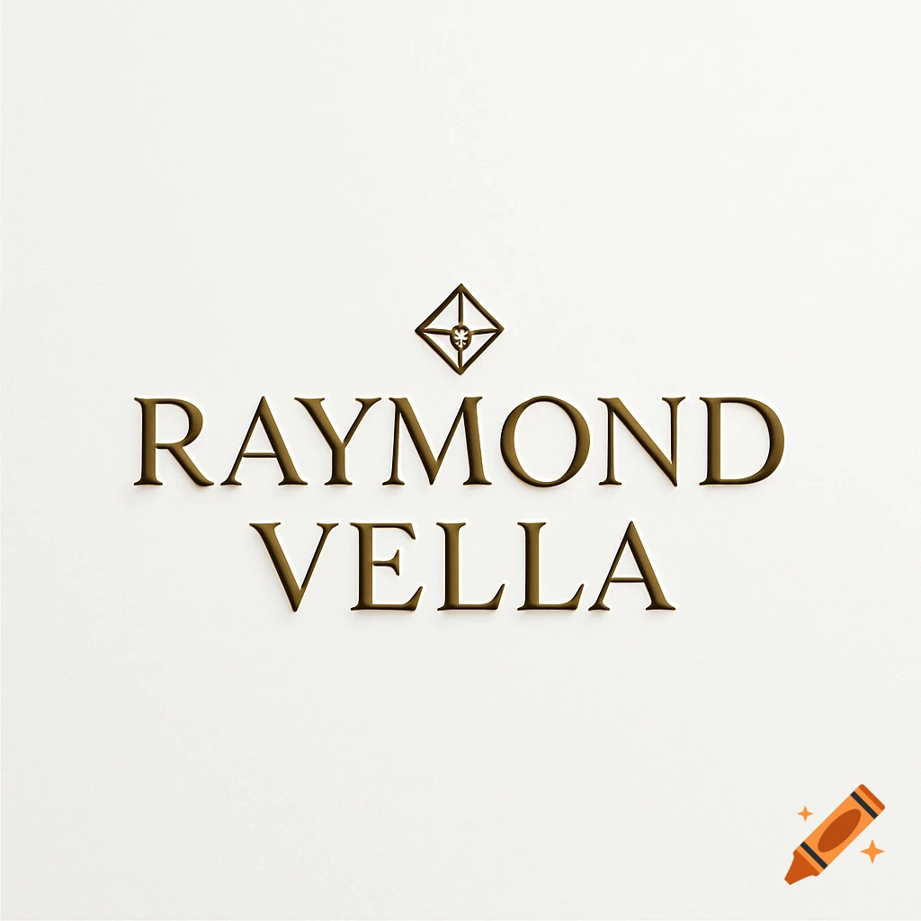
Minimalist logo design for 'Fold' featuring a geometric diamond icon and serif typography in multiple color variations.

**Logo design for a brand called "Fold" — two deliverables in one composition:** **1. Wordmark:** The word "Fold" set in Cormorant Garamond Light, classic high-contrast serif, elegant and refined. Letterspacing slightly open. Warm dark brown-black color (`#1E1B16`). **2. Icon:** A minimal abstract symbol representing a fabric fold — a single clean diagonal crease line, like a pressed shirt fold seen from above. Geometric but warm. The icon sits to the left of or above the wordmark. Not a literal shirt — purely abstract line geometry suggesting a fold. **Color versions in one sheet:** — Primary: dark heading color on warm cream background (`#F5F2ED`) — Accent: same layout with the fold-line icon rendered in amber gold (`#C17F3E`) — Reversed: cream wordmark and icon on deep dark background (`#1E1B16`) **Style:** premium retail branding, artisanal yet contemporary, fashion-adjacent. Clean white/cream space. No gradients, no drop shadows, no 3D effects. Flat vector aesthetic. Think independent fashion label meets point-of-sale software identity. Similar energy to: Aesop, Margaret Howell, A.P.C. **Do not include:** taglines, badges, decorative borders, or any text other than the word "Fold". Ver más
More images like this