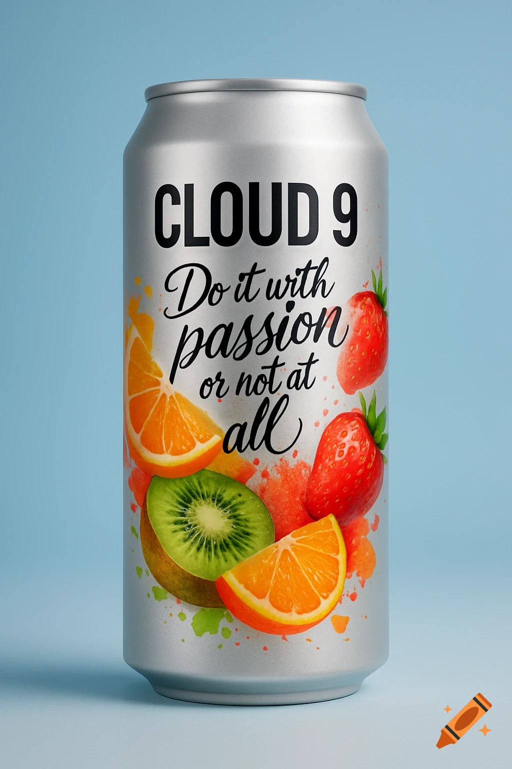
Black and vibrant multi-colored packaging design for "Rapid Protein Pink Lemonade" with a winged dumbbell crest and "Zero Effort" tagline, in a retro hand-illustrated style.

Create a front-of-pack packaging design mockup for a protein powder pouch brand called RAPID PROTEIN with the tagline ZERO EFFORT. Overall style: hand-illustrated folk label / tattoo flash look—bold clean linework, flat fills, crisp edges, cohesive illustration style, modern-retro, premium, disruptive (Liquid Death energy but NOT copying any specific Liquid Death assets). COLOR SYSTEM (strict): Use black + 2 to 3 bold accent colors only (example accents: teal + hot pink + yellow, or red + teal, etc.). Do NOT create a rainbow collage. Flavor should be communicated through imagery/icons, not by changing the overall color palette. MANDATORY LAYOUT STRUCTURE (must follow exactly): Top banner ribbon: large readable text ZERO EFFORT (badge/ribbon style). It must not compete with the main brand name. Center medallion/crest: circular emblem featuring a signature wings motif (winged crest). Add a small hidden detail like EST. 2026 integrated subtly. Hero wordmark (largest text on pack): RAPID PROTEIN centered, high contrast, readable from 6 feet away. Three benefit badges in one consistent system (same size/shape/type style), placed in a clean row or balanced arrangement:NO SUGAR NO CLUMPING NO STIRRING Bottom small placeholders: PINK LEMONADE and XXg PROTEIN (small, tidy). FLAVOR IMAGERY (for Pink Lemonade): Include small illustrated elements that suggest the flavor (e.g., lemon slice, lemon peel twist, strawberry or berry accent if desired, droplets, citrus leaves), integrated into Ver más
More images like this