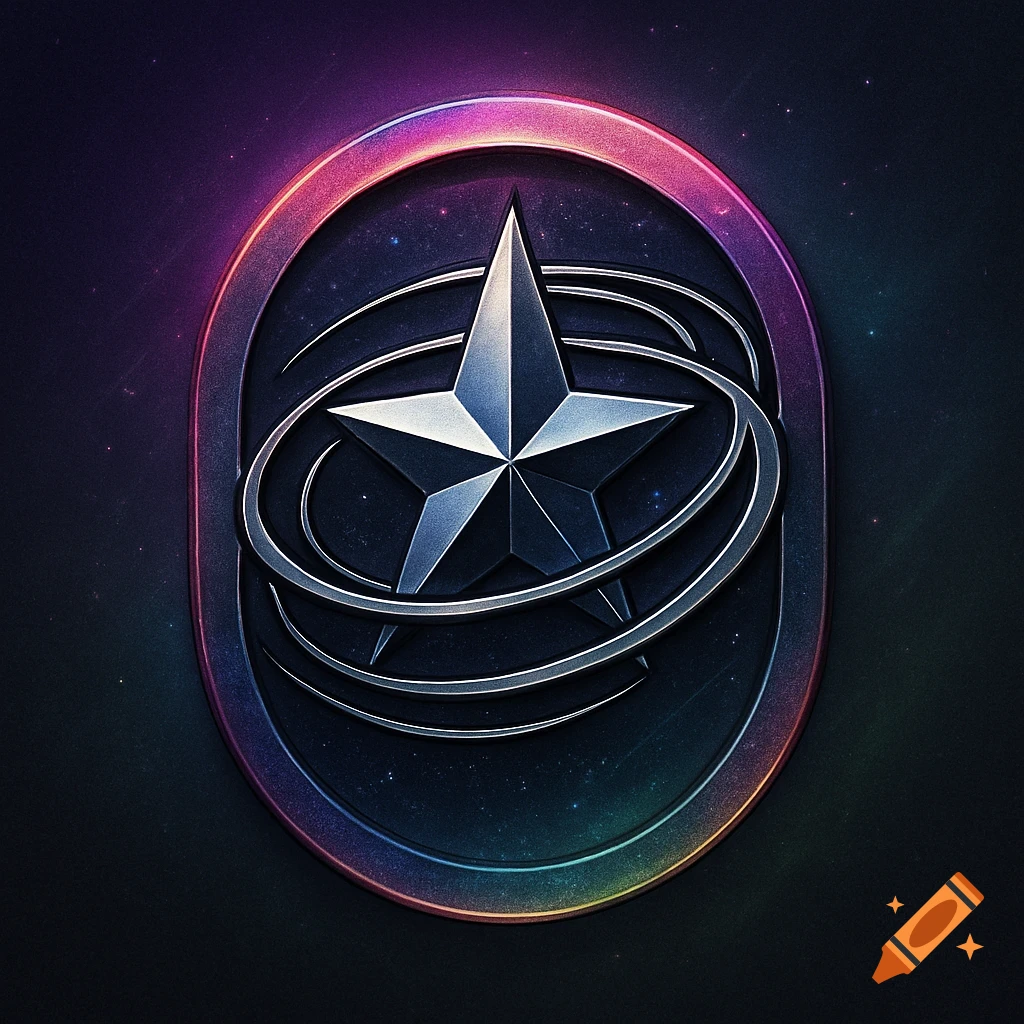
A bold gold logo with a spiked star in an oval ring, above the words 'HELLO HELLO' and 'KATSEYE' on a black background.

High-fashion pop logo design for a song titled “HELLO HELLO.” The centerpiece is a bold circular emblem with an abstract, spiked star-like symbol inside (similar to a chaotic, sharp-edged star enclosed in an oval ring). The symbol feels slightly aggressive but polished—clean vector edges, balanced symmetry, and strong identity. Integrate the official KATSEYE logo subtly into the design: either embedded within the circular ring (engraved or cut-out style), or placed small and clean beneath the emblem like a luxury brand stamp, or hidden בתוך the star shape as a negative-space detail. Typography: “HELLO HELLO” in a sleek, modern sans-serif font, slightly condensed, spaced out for a premium feel. Placement can be under the symbol or partially overlapping the bottom edge of the circle. Color direction: Primary: bold neon yellow or electric gold on deep black (like the reference) Optional alternates: chrome silver, icy white glow, or hot pink accents Subtle glow or glass shine effect, but keep it controlled and not messy Style: Y2K pop meets luxury branding meets K-pop album design. Clean, iconic, instantly recognizable. Finish: ultra crisp vector, high contrast, centered composition, transparent or black background, album-cover ready. Ver más
More images like this