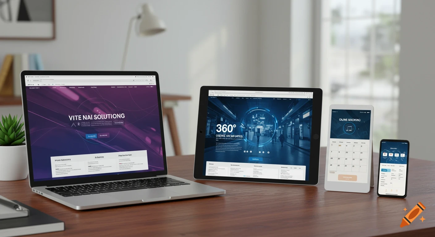
Kiosk tablet display showing NEAS logo, buttons for MACS, Transport, Maintenance, and footer copyright.
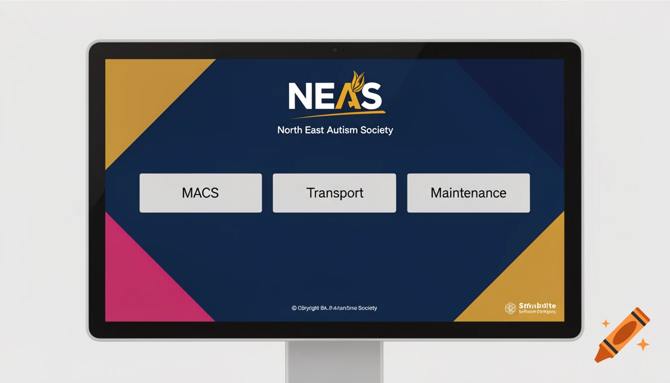
es. Right now the AI is hearing "geometric shapes" and inventing hexagons, polygons, abstract tech patterns, and other shapes that aren't part of the NEAS visual language. Based on the guideline examples, I would explicitly restrict it to only diagonal panels, triangles, angled cuts, and sloping edge shapes. The NEAS brand graphics are essentially large angular colour fields, not general geometric patterns. Try this version: Design a minimal kiosk tablet home screen for North East Autism Society. Display only the NEAS logo at the top, three large touch-friendly buttons labelled MACS, Transport and Maintenance in the centre, and a small footer containing copyright text and a software company logo. Use dark blue (#004D71) and mustard gold (#B28E16) as the dominant colours, with navy (#152845) and raspberry pink (#A3195B) used only as small accents. Light grey (#EDEDED) may be used for button surfaces and supporting elements. The background should be heavily inspired by the official NEAS branding. Use only large diagonal panels, triangular shapes, angled colour blocks, sloping edge cuts, and corner-to-corner directional shapes. Shapes should extend from the edges and corners of the screen to frame the content. Do not use circles, hexagons, polygons, diamonds, abstract geometric patterns, floating shapes, scattered triangles, low-poly effects, technical meshes, wireframes, particles, decorative icons, illustrations, blobs, waves, or organic curves. The angular shapes should feel See more
More images like this