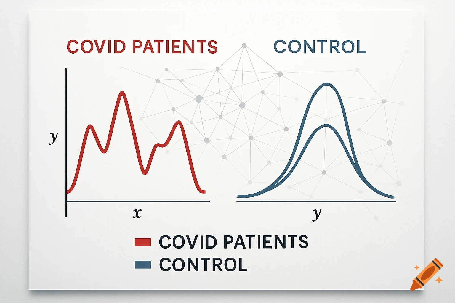
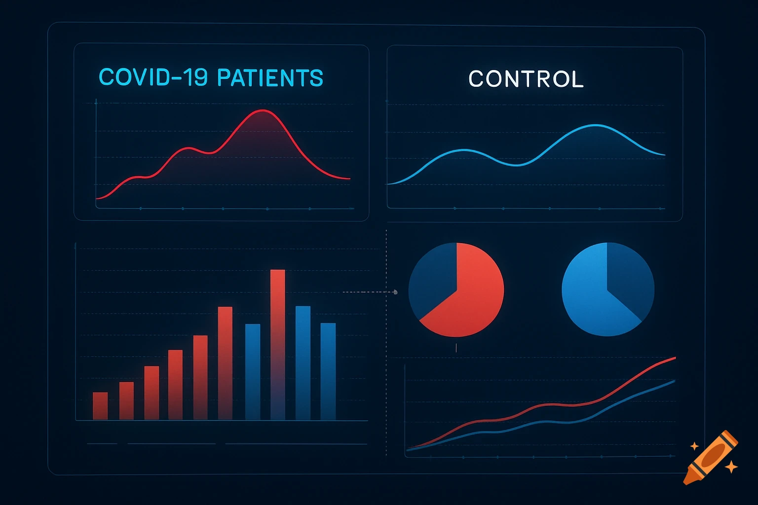
A schematic diagram showing two graphs, one for COVID patients with an irregular red curve, and one for a control group with a smoother blue curve, both labeled with axes and a legend.
A schematic diagram showing COVID patients vs control groups with graphs" Mehr sehen