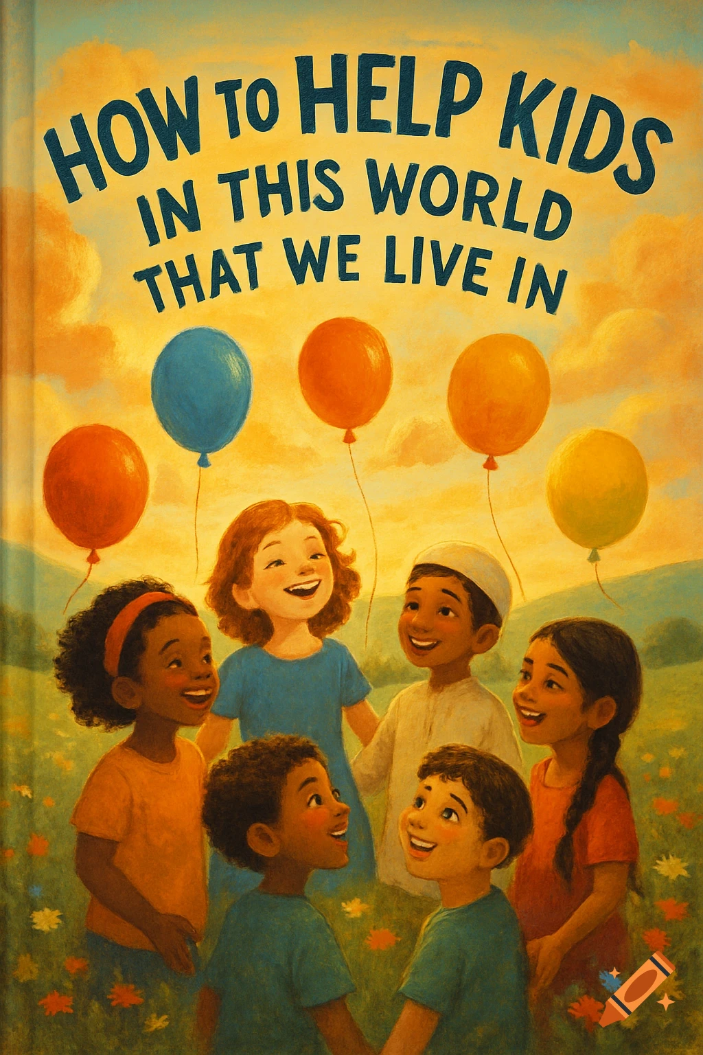
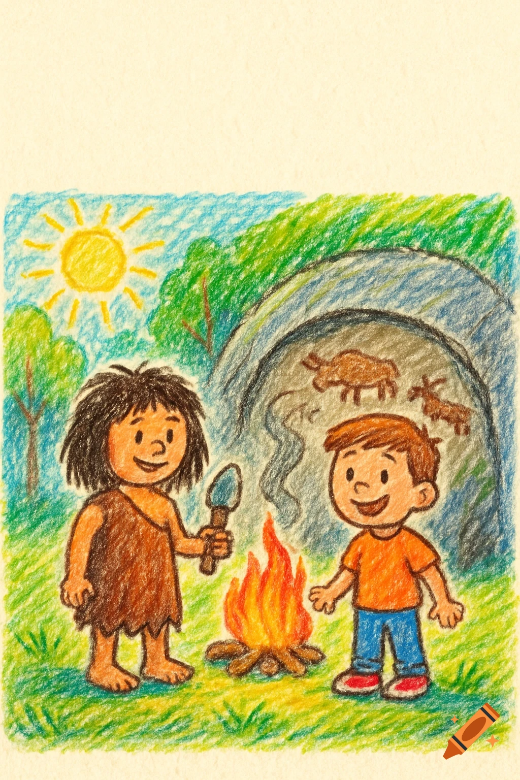
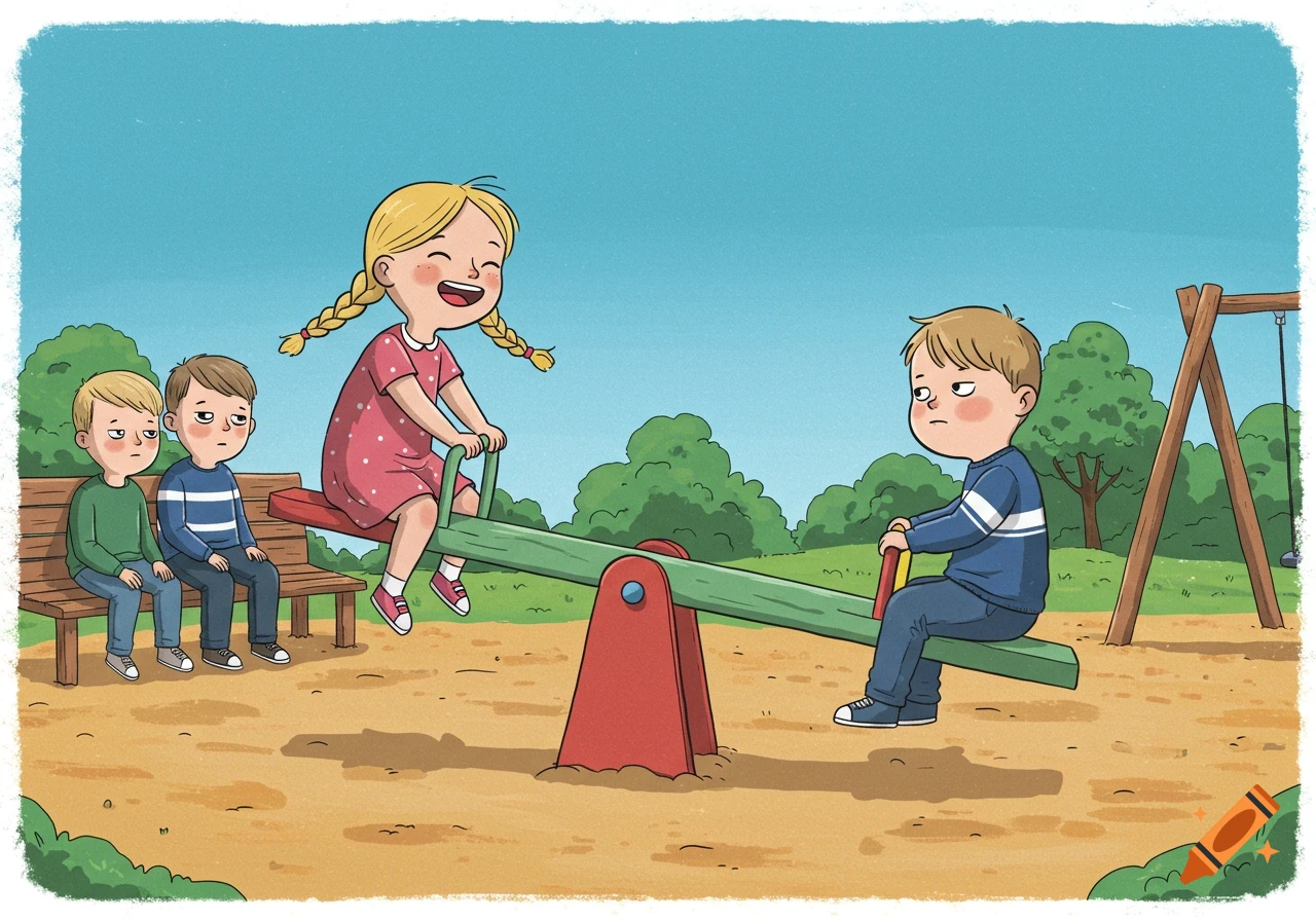
Crayon drawing album cover with a family and house surrounded by dark scribbles and war symbols, with text "What Has Happened to Our World? By Little Dreamer".

Album Cover Art Concept Based on Your Lyrics Title (suggested on cover): What Has Happened to Our World? Visual Elements Central Image: A Child’s Drawing Under Siege Imagine a colorful, naïve crayon drawing of a simple home and family—bright, hopeful colors like yellow, red, and blue. Surrounding this innocence are dark, aggressive scribbles—black and deep gray—that creep inward, almost like smoke or shadows, symbolizing fear and aggression invading the safe space of childhood. Some scribbles subtly form threatening shapes—eyes, clenched fists, or war-like symbols—but still abstract enough to maintain a raw, emotional tension. Background: Textured, Worn Paper Use an off-white or beige textured background, resembling aged or crumpled drawing paper, to evoke a sense of history and fragility. Slight stains or faded edges can symbolize damage and wear from ongoing conflict and emotional strife. Symbolic Overlay: Faint World Map or Globe A subtle, semi-transparent outline of a world map or globe behind the child’s drawing, cracked or fractured, to symbolize the global scale of the issues described. Typography: Handwritten and Childlike Album title and artist name in a handwritten or crayon-like font, placed gently so as not to overpower the art. The text could appear as if it’s part of the child’s drawing, reinforcing the theme of innocence confronting harsh realities. Color Palette Bright Primary Colors (yellow, red, blue) for the child’s drawing — innocence, hope, normalcy. Mehr sehen
More images like this