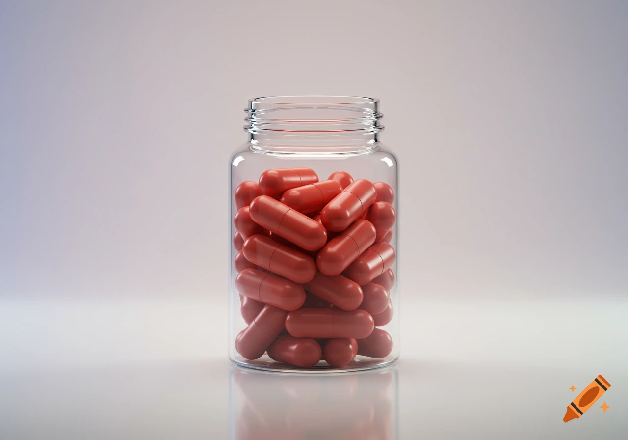
A white product box for "VIRA MAG Smart Magnesium" dietary supplement. The front features a blue wavy graphic, and side panels list benefits with minimalist icons.

Ultra-premium minimal pharmaceutical packaging design for a dietary supplement named "VIRA MAG". Core concept: “Stability Field” — representing whole-body balance, not a specific organ. Front box design: - Pure off-white / soft medical white background - Central minimal circular form (soft, thin outline or very subtle gradient fill) - Inside the circle: a single smooth wave transitioning from slightly irregular to perfectly stable (very subtle, not dramatic) - At the exact center: a tiny, soft-focus نقطه (core point), symbolizing targeted intelligent effect Visual style: - No ECG, no heart reference, no human figure, no leaves, no nature, no chemical molecules - No complex geometry, only soft organic minimal forms - Extremely clean, lots of negative space - High-end clinical aesthetic (Apple-level minimalism meets pharmaceutical precision) Color system: - Base: off-white / cool white - Primary accent: deep calm blue or teal (very controlled, not saturated) - Secondary subtle gradients: cool gray → soft blue - No strong or loud colors Typography: - Modern sans-serif (clean, geometric but friendly) - "VIRA MAG" prominent - "Smart Magnesium" lighter weight - Persian text included: "ویرا مگ" - Perfect alignment, strict grid system (Design Language System) Side panel: - Ultra-minimal thin line icons (abstract, not illustrative) - Represent: muscle relief, nervous system calm, energy, bone strength, cardiovascular support - Very subtle, evenly spaced Back panel: - Clean Mehr sehen
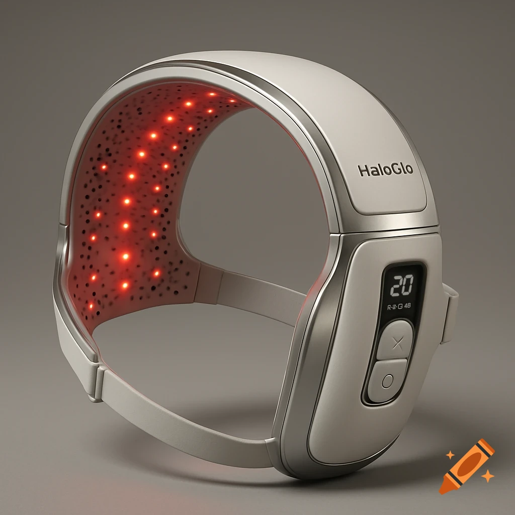
More images like this