

'%3e%3cpath%20d='M12%2020.3333C16.6024%2020.3333%2020.3333%2016.6024%2020.3333%2012C20.3333%207.39762%2016.6024%203.66666%2012%203.66666C7.39763%203.66666%203.66667%207.39762%203.66667%2012C3.66667%2016.6024%207.39763%2020.3333%2012%2020.3333Z'%20stroke='%23F2F2F2'%20stroke-width='2.08333'%20stroke-linecap='round'%20stroke-linejoin='round'/%3e%3cpath%20d='M8.66667%2013.6667C8.66667%2013.6667%209.91667%2015.3333%2012%2015.3333C14.0833%2015.3333%2015.3333%2013.6667%2015.3333%2013.6667'%20stroke='%23F2F2F2'%20stroke-width='2.08333'%20stroke-linecap='round'%20stroke-linejoin='round'/%3e%3cpath%20d='M9.5%209.5H9.50833'%20stroke='%23F2F2F2'%20stroke-width='2.08333'%20stroke-linecap='round'%20stroke-linejoin='round'/%3e%3cpath%20d='M14.5%209.5H14.5083'%20stroke='%23F2F2F2'%20stroke-width='2.08333'%20stroke-linecap='round'%20stroke-linejoin='round'/%3e%3c/g%3e%3cdefs%3e%3cclipPath%20id='clip0_10282_1064'%3e%3crect%20width='20'%20height='20'%20fill='white'%20transform='translate(2%202)'/%3e%3c/clipPath%3e%3c/defs%3e%3c/svg%3e)


A grey t-shirt with a cartoon of an exhausted hiker slumped by a tent and tree stump, surrounded by mosquitoes, one wearing a crown. Text says "SURVIVING CAMPING ONE BUG BITE AT A TIME."
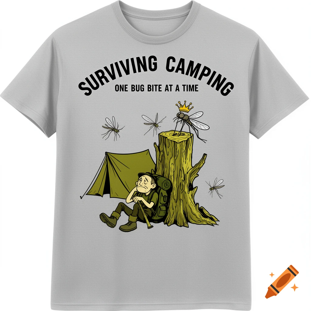
A bold, high-contrast t-shirt design centered on a 1080x1080 #D3D3D3 background, strictly optimized for maximum legibility and the "Glance Test." Illustration (The "Glance Test"): To ensure the design remains sharp from a "favicon to a billboard," the illustration is simplified to one main idea: an exhausted cartoon hiker slumped against a tree stump. Background clutter is removed, leaving only a crooked tent and a few oversized mosquitoes. One mosquito wears a tiny crown to symbolize dominance ("The King of the Campsite"). Typography (The Golden Rule of Readability): * Headline: "SURVIVING CAMPING" arcs above in a Bold, Heavy Sans-Serif font—the best category for clean, instant readability. Supporting Detail: "ONE BUG BITE AT A TIME" sits below in a complementary weight to establish a clear visual hierarchy. Rules Followed: Max 2 fonts used, high contrast, and zero "cramping" to ensure the text doesn't become "barely visible." Composition & Negative Space: The design uses a "Balanced Layout" with healthy margins, allowing the graphic to "breathe" on the fabric. It is perfectly center-aligned to provide a stable, professional look. Color Palette (The "Versatility" Rule): A limited palette of Olive Green, Muted Yellow, and Black. These high-contrast colors are chosen specifically to pass the "Squint Test," ensuring the design "pops" even on small mobile screens. Technical Checklist: * Linework: Thick vector outlines only; no gradients or fine details that won't print well. Mehr sehen
More images like this
