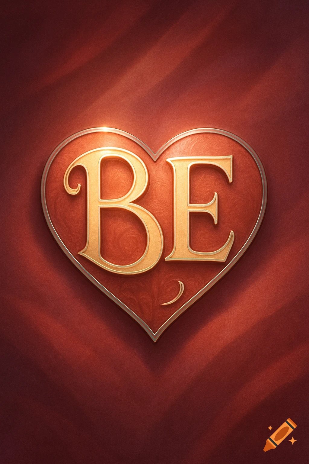
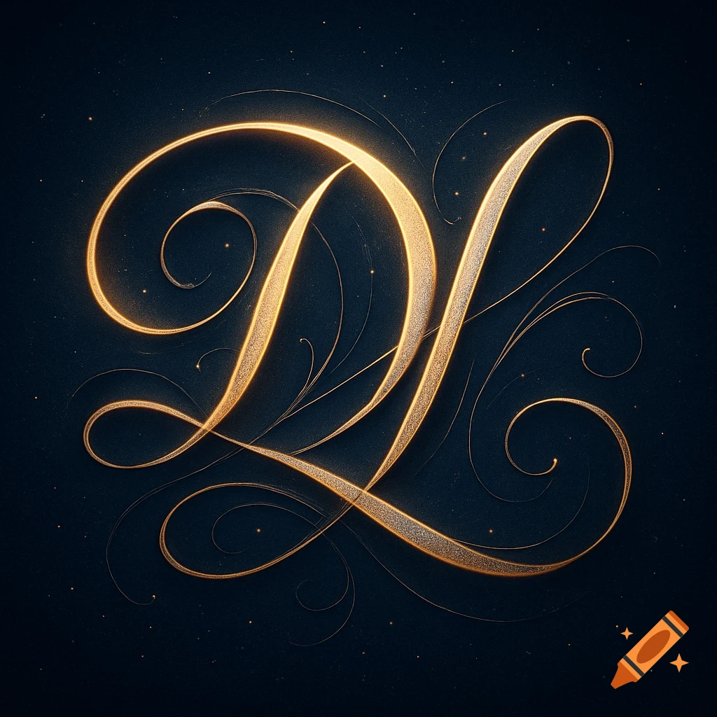
A sophisticated logo for "IntimaDating" in golden script on a dark red background with an outline of a heart. The 'M' and 'A' combine to form a stylized person, and the 'Y' forms an outstretched figure. Below is the tagline "REAL CONNECTION. TRUE YOU.".

Create a premium, visually striking logo for a modern dating events brand centered around intimacy, emotional connection, and authentic human interaction. Brand name: **IntimaDating** **Core concept:** The logo should subtly separate the word into “Intima” and “Dating”, while still reading fluidly as a single brand name. A key creative feature is the hidden symbolism within the typography: - The letter **“C”** is transformed into a **crouching human figure**, representing introspection, vulnerability, and inner awareness. The curve of the “C” should double as the silhouette of a person curled inward. - The letter **“Y”** is transformed into a **human figure opening outward**, arms or body expanding upward or outward, symbolizing connection, openness, and emotional expression. - These human forms must be **cleverly integrated into the letterforms**, so at first glance they read as normal typography, but on closer inspection reveal the hidden figures. - The illusion should feel intelligent, subtle, and rewarding to notice—not obvious or cartoonish. **Typography style:** - Use **curved, flowing, organic letterforms** that evoke sensuality, warmth, and emotional softness - Avoid rigid, geometric, or overly corporate fonts - The font should feel: - Romantic but not cliché - Joyful and uplifting - Elegant and slightly playful - Smooth and body-like, almost mimicking natural human curves - Consider custom lettering rather than standard fonts **Visual tone and emotional Mehr sehen
More images like this