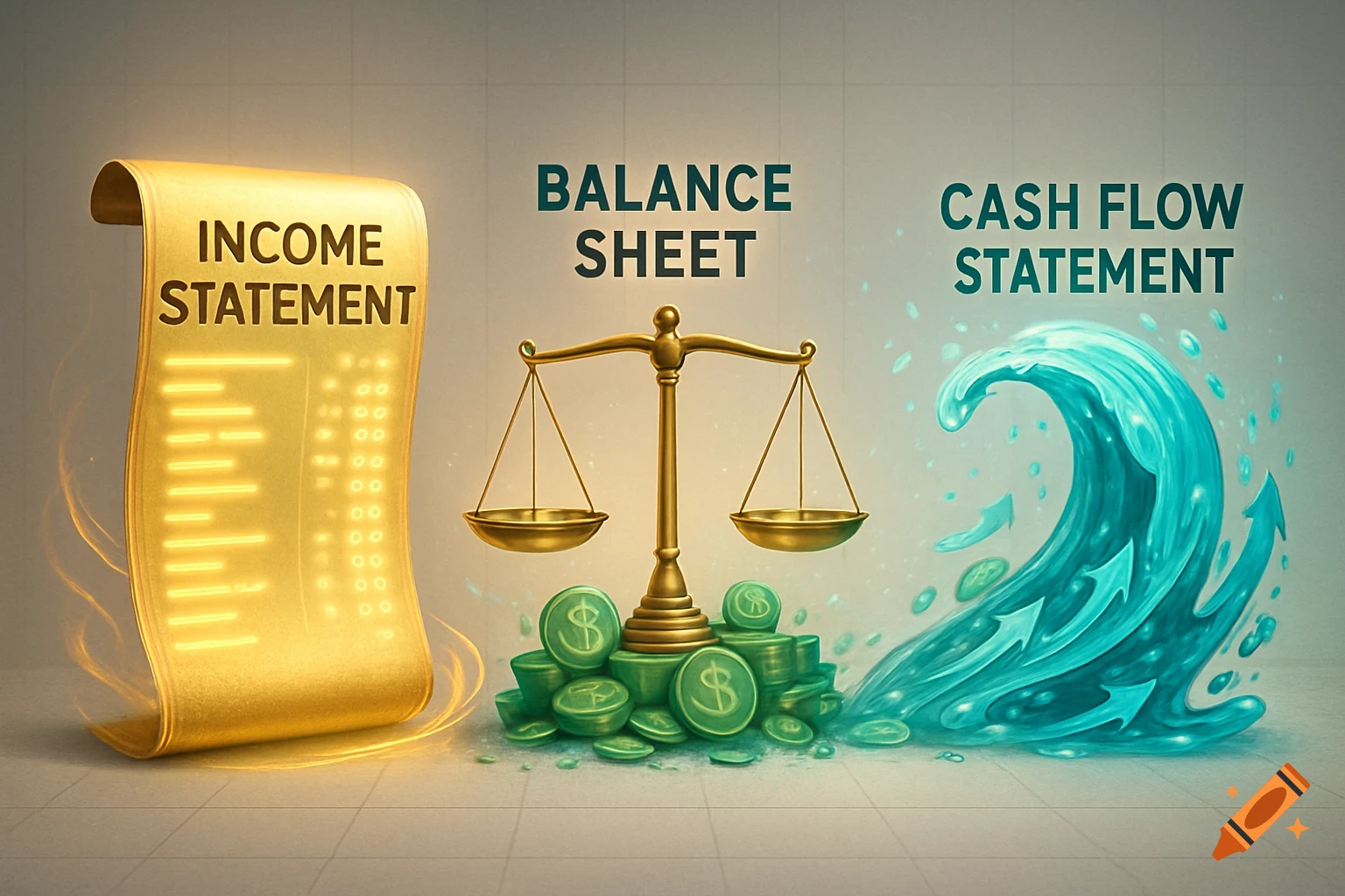
A graph illustrating car loan depreciation with 72-month ($0 down) and 48-month (20% down) loans versus car market value.

Create a graph based on the following: Visual Description of the Car Loan/Depreciation Graph Imagine a standard X-Y graph. The horizontal axis is "Time" (0 to 72 months), and the vertical axis is "Dollar Value" ($0 to $30,000). The Blue Line (The Car’s Market Value) This line represents the "Ice Cube." It starts high at $30,000 at month 0 (new purchase). It immediately drops steeply. Within months, it's at $26,000. By month 12, the line is significantly lower (around $22,000). It continues to curve downward, slowing slightly in its "melt rate," ending around $10,000 by month 72. The "Red Line" Scenario (72-Month Loan, $0 Down) The Debt: This line also starts at $30,000. The Problem: Because the 72-month term makes the payments lower, this line drops very slowly. The Gap: For nearly the first 5 years (months 0 to 60), the Red Line (Debt) is above the Blue Line (Car Value). The area between them is the "Underwater" zone. You owe more than the car is worth until about month 60, when the lines finally cross. The "Green Line" Scenario (48-Month Loan, 20% Down) The Debt: This line starts much lower at $24,000 (because you paid $6,000 down). The Solution: Because the 48-month term has higher payments, this line drops quickly. The Gap: The Green Line is never above the Blue Line. At month 0, you have $6,000 in positive equity. By month 12, the Green line is already well below the Blue line. You remain "Above Water" (in the "Green Zone") for the entire life of the loan. Mehr sehen
More images like this