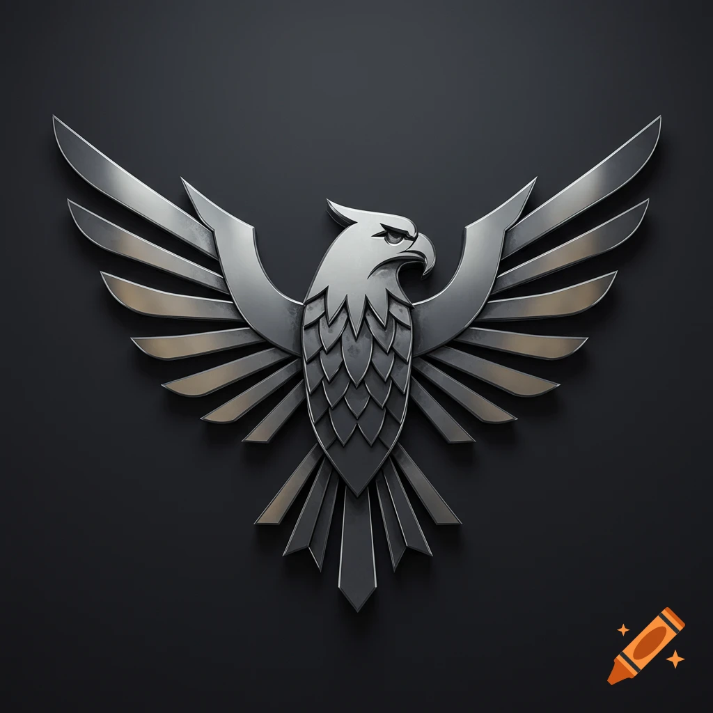
A stylized mechanical phoenix logo in blue and gray with orange accents, text 'Phoenix Inc. Advanced Manufacturing & Industrial Automation'.

Here’s a ready‑to‑use logo concept for “Phoenix Inc. – Advanced Manufacturing & Industrial Automation.” I’ll describe it so a designer (or a logo generator) can implement it precisely. Core concept Modern, geometric phoenix rising, built from clean, angular shapes (suggesting machinery, robotics, and precision). Visual feel: high‑tech, industrial, trustworthy; suitable for a global B2B company, not a consumer brand. Symbol (phoenix mark) Style: Minimal, semi‑abstract phoenix forming a circular or slightly oval emblem, wings sweeping upward to imply growth and resilience. Shapes: Use overlapping metallic “feathers” that resemble gear teeth or robotic arms to tie in advanced manufacturing and automation. Motion: Wings angled upward at about 45° to convey progress and rising performance. Color palette Primary: Deep industrial blue (tech, reliability) – for the main phoenix body and text. Dark graphite/anthracite gray – for secondary details and tagline. Accent: Controlled gradient from ember orange to bright copper for the wing tips or inner core, hinting at fire without looking flashy. Example (for your designer): industrial blue + graphite as base, with a subtle orange glow inside the circle behind the phoenix head. Typography Company name: “Phoenix Inc.” in a bold, modern sans‑serif (e.g., similar to Eurostile, Nexa, or Montserrat but with slightly squared terminals to echo machinery). Tagline: “Advanced Manufacturing & Industrial Automation” in a lighter weight of the same Mehr sehen
More images like this