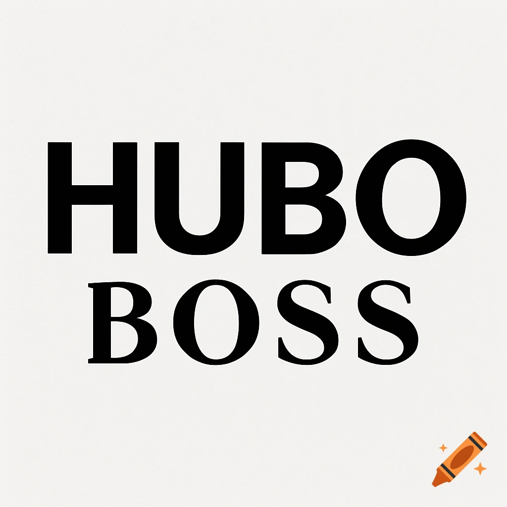
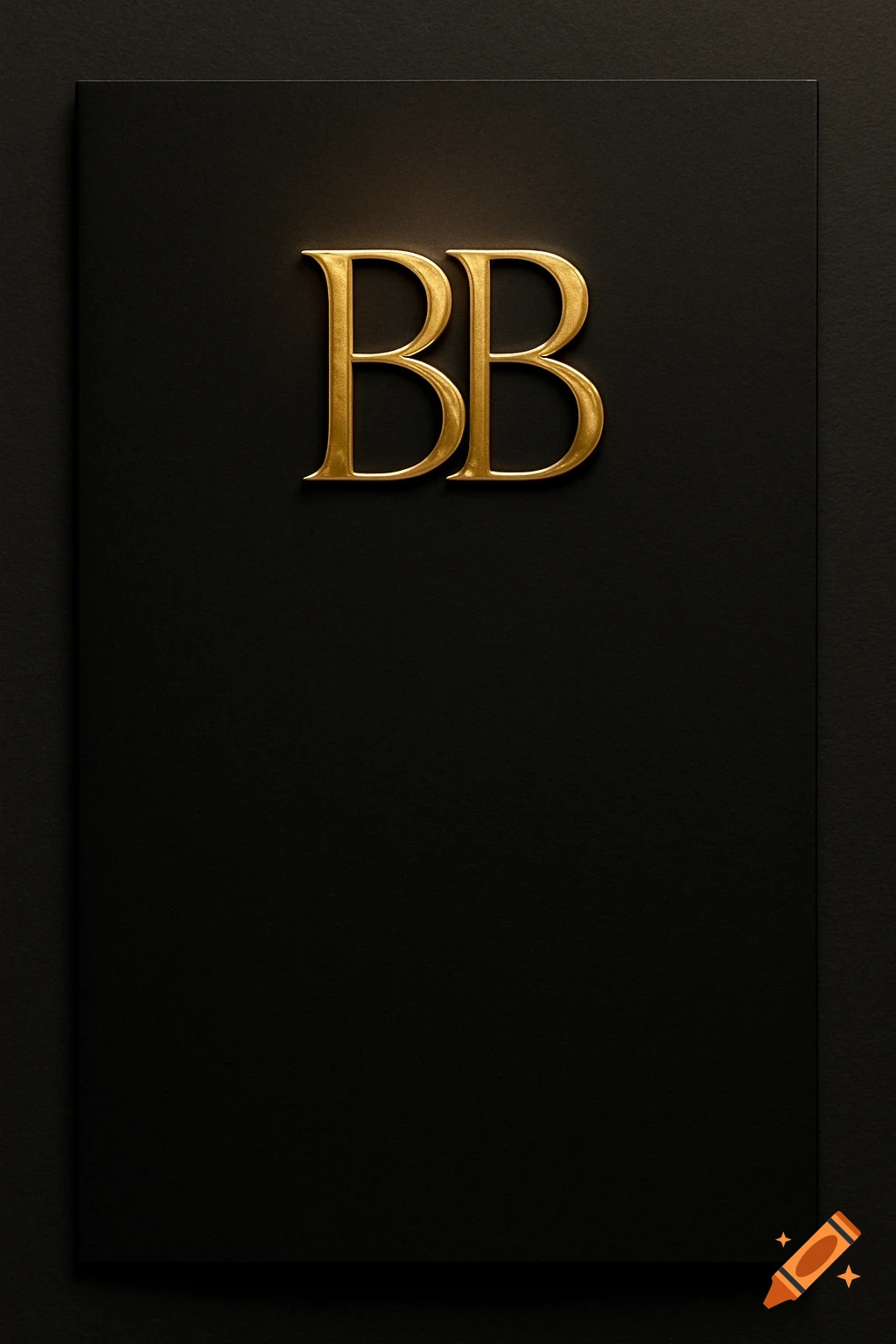
A minimalist corporate ad featuring the typography mark 'BON SUT' in deep navy bold geometric letters on a light background.

is a big ad with a modern Italian corporate logo featuring the typography mark 'BON SUT'. The letters should be minimalistic, bold, geometric, and contemporary sans-serif letterforms that work together as a unified mark. Each letter has equal visual weight and strong character. There is a classic designed Subclaim: "Zaštitite svoju gostoljubivost" and a small text that says: "Brzo ostvarite naknadu štete uzrokovane turizmom." The letters are slightly overlapped or nested to create cohesion and a sense of movement. Use only clean angles and sharp lines—no curves or soft edges. Incorporate subtle Italian cultural elements that are not obvious: a thin horizontal precision line running through or beneath the letters (inspired by Italian design grids), a minimal accent detail referencing Italian heritage (perhaps a tiny serif corner or elegant dash), and proportions subtly based on golden ratio principles. Add one small decorative detail that suggests Italian craftsmanship—perhaps a corner flourish or subtle geometric accent that feels refined and purposeful, not decorative. Color palette: Deep navy or charcoal primary color with a refined accent (gold, burnt orange, or deep red) appearing in just one small detail. Keep the design monochromatic and professional. Style: Luxury corporate, minimalist, Italian modernism, clean and sophisticated. The logo should work at any size and convey precision, elegance, and international appeal. High contrast, sharp details, professional Mehr sehen
More images like this