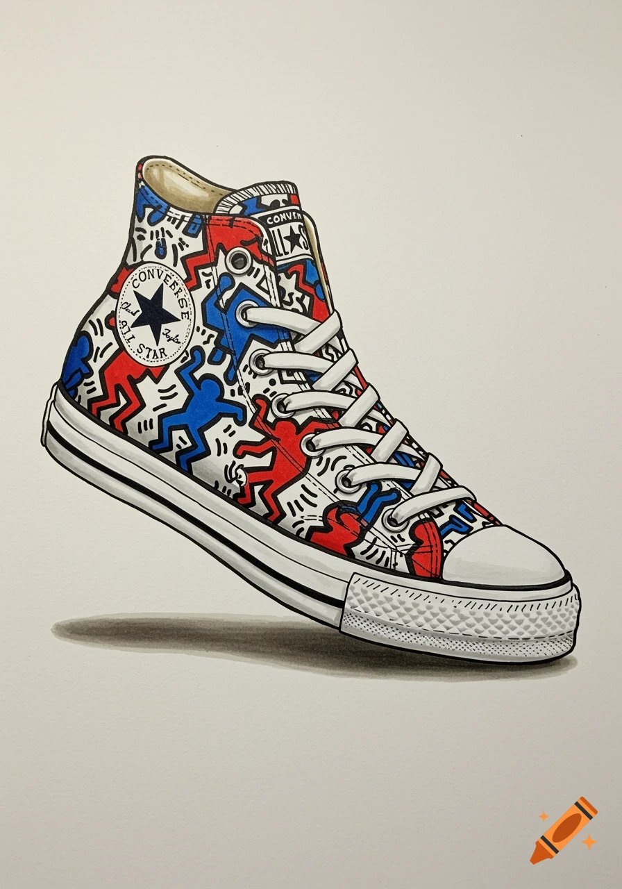
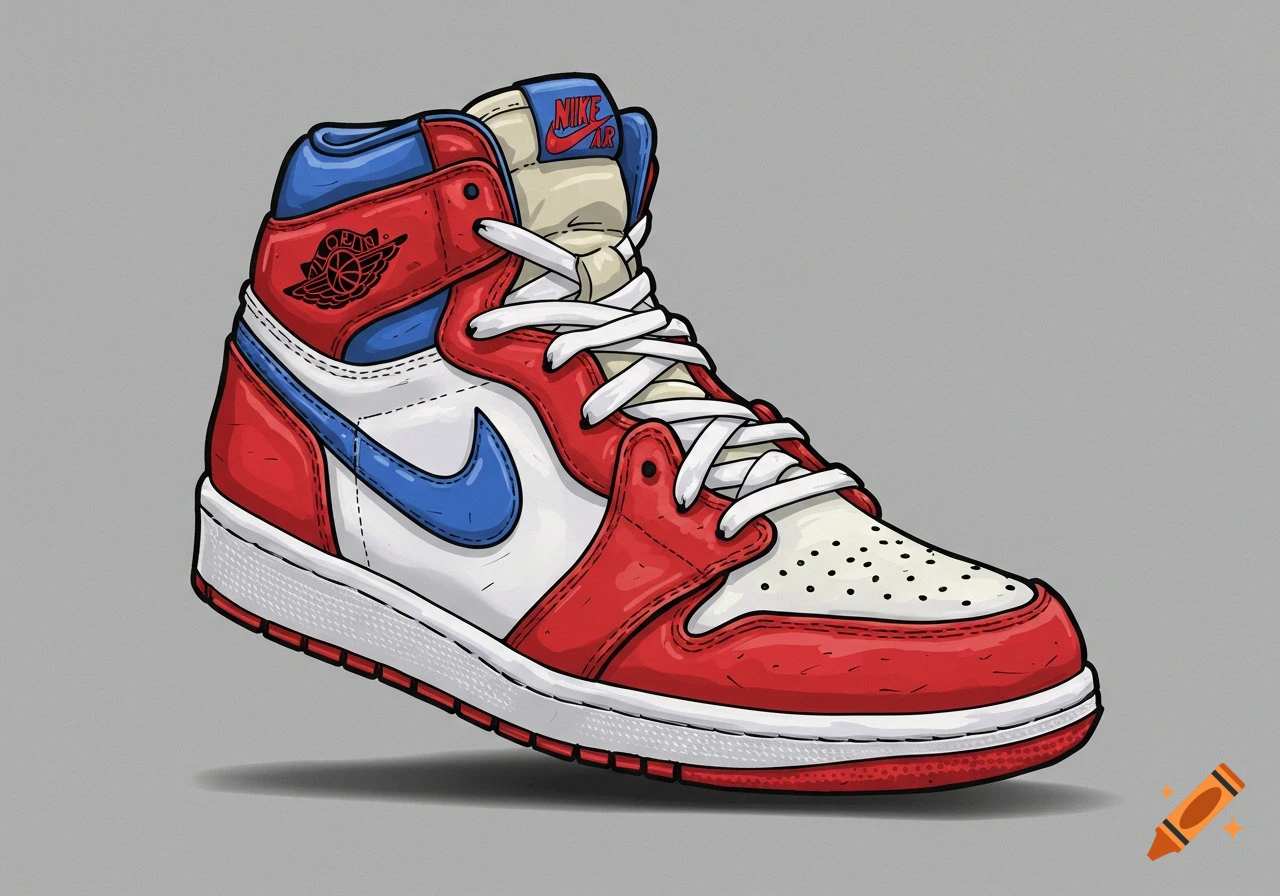
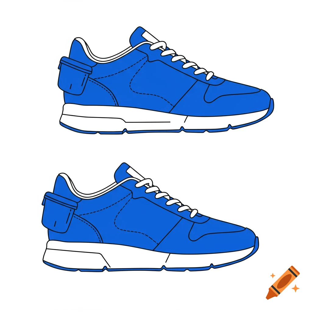
Illustration comparing solid and bright colored sneakers with title 'Color Preference: Solid vs Bright'.

1. Background: • White background, clean and simple. 2. Title: • At the top, in neat black typed letters: “Color Preference: Solid vs Bright” • The title is centered and in a clear, professional font (like Arial or Helvetica). 3. Shoe Illustrations: • Cartoony shoes drawn in the center of the card. You’ll want to keep these simple but recognizable, like sneakers. For Solid Color Shoes: • Draw shoes that are solid-colored, using a variety of colors like blue, red, black, etc. • Make sure the shoes have simple outlines, no complex details, just enough to distinguish them (e.g., a cartoonish shape of a Converse or Jordan sneaker). For Bright Color Shoes: • Use vibrant, multi-colored shoes (think of bright patterns like stripes, polka dots, or a mix of colors). • Again, keep the shapes simple and fun, like Converse sneakers with playful colors or a Jordan silhouette. • You can group the shoes by color preference. Half of them will be solid (e.g., just one color), and half will be bright (e.g., multi-colored patterns). Make sure they look like they’re representing survey answers, so maybe a slight overlap or arrangement to show a comparison. 4. Symbols: • For clarity, you might want to use small shapes or patterns next to the shoes: • Solid-colored shoes could have solid circles next to them. • Bright-colored shoes could have sparkly stars or rainbow lines around them. 5. Legend: • At the bottom of the postcard, in small neat black typed letters, include a legend to explain the Mehr sehen
More images like this