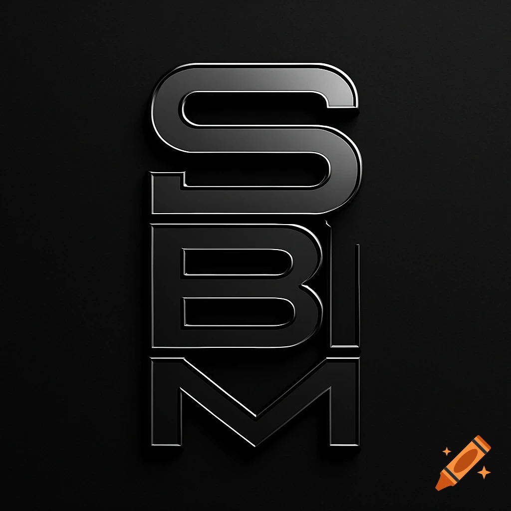
A minimalist logo with two stacked lines of bold black text on a white background. The top line reads "SHEM4ESH" and the bottom line reads "SHEMESH", with the 'M' in the top line stylized as an orange '4' that interlocks with the 'M' on the bottom line.

A professional, minimalist vector logo design for an online local community marketplace, centered on a clean, solid, professional white background. Text Content and Structural Layout: The logo consists of two lines of stacked text reading "SHEMESH" on the top line and "SHEMESH" on the bottom line. Both lines must use an identical, ultra-bold, thick geometric sans-serif all-caps typeface. The top and bottom words must be perfectly matched in letter height, thickness, and tracking, stacking directly over each other to form a unified, flush block. The Integrated Typographic Architecture: - Left Side: The logo begins with the letters "S-H-E" on the top line, perfectly stacked right above an identical "S-H-E" on the bottom line. - Center Interlock: Instead of separate words, a single giant letter "M" spans vertically across both lines to anchor the logo. The right-hand inner anatomy of this massive "M" is structurally modified to form a crisp number "4", colored in a vibrant accent orange. There are no double outlines or overlapping ghost shapes; the "M" and the "4" are seamlessly fused. - The Bridge: The bottom horizontal crossbar of the orange "4" extends dynamically to the right, morphing directly into the bottom horizontal leg/shelf of the letter "E" on the top line. - Right Side: The top line finishes with "E-S-H" (with the E connected to the 4). The bottom line has no extra characters and finishes with a standard "E-S-H" aligned perfectly directly underneath. Color Scheme: Mehr sehen
More images like this