A line graph titled "Demand Curves for Pizza Shops." It shows two demand curves: "Pizza Stop" (blue) and "Pizza Palace" (red). The x-axis represents quantity of pizzas, and the y-axis represents price per pizza.
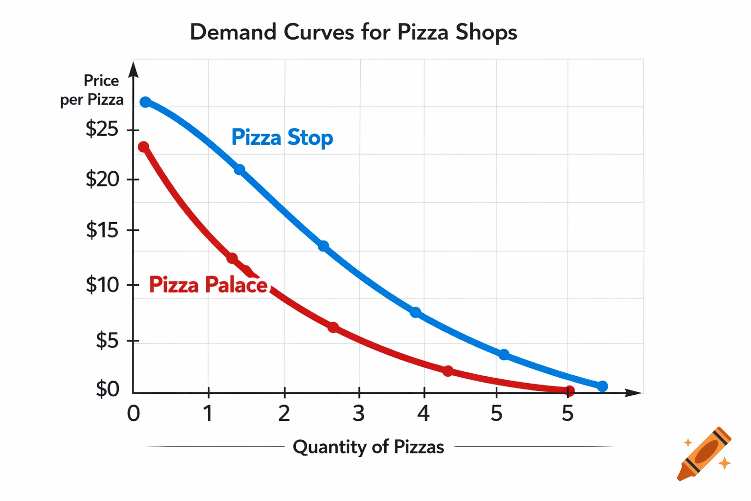
Create a clear, simple, and colorful graph showing the demand curves for two pizza shops, "Pizza Stop" and "Pizza Palace." The x-axis represents the quantity of pizzas (e.g., 0, 1, 2, 3, 4, 5). The y-axis represents the price per pizza (e.g., $0, $5, $10, $15, $20, $25). Include two demand curves: "Pizza Stop" with a demand at $5 per pizza, showing higher demand (e.g., at a price of $5, demand is 5 pizzas; at higher prices, demand decreases). "Pizza Palace" with a demand at $25 per pizza, showing lower demand (e.g., at $25, demand is 1 pizza; at lower prices, demand increases). Label the demand curves clearly with the shop names. Use different colors for each demand curve. Include title: "Demand Curves for Pizza Shops" Add gridlines for clarity and labels for axes. Mehr sehen
More images like this