

'%3e%3cpath%20d='M12%2020.3333C16.6024%2020.3333%2020.3333%2016.6024%2020.3333%2012C20.3333%207.39762%2016.6024%203.66666%2012%203.66666C7.39763%203.66666%203.66667%207.39762%203.66667%2012C3.66667%2016.6024%207.39763%2020.3333%2012%2020.3333Z'%20stroke='%23F2F2F2'%20stroke-width='2.08333'%20stroke-linecap='round'%20stroke-linejoin='round'/%3e%3cpath%20d='M8.66667%2013.6667C8.66667%2013.6667%209.91667%2015.3333%2012%2015.3333C14.0833%2015.3333%2015.3333%2013.6667%2015.3333%2013.6667'%20stroke='%23F2F2F2'%20stroke-width='2.08333'%20stroke-linecap='round'%20stroke-linejoin='round'/%3e%3cpath%20d='M9.5%209.5H9.50833'%20stroke='%23F2F2F2'%20stroke-width='2.08333'%20stroke-linecap='round'%20stroke-linejoin='round'/%3e%3cpath%20d='M14.5%209.5H14.5083'%20stroke='%23F2F2F2'%20stroke-width='2.08333'%20stroke-linecap='round'%20stroke-linejoin='round'/%3e%3c/g%3e%3cdefs%3e%3cclipPath%20id='clip0_10282_1064'%3e%3crect%20width='20'%20height='20'%20fill='white'%20transform='translate(2%202)'/%3e%3c/clipPath%3e%3c/defs%3e%3c/svg%3e)


A split infographic compares 'High Risk Approach' and 'Population Approach'. Left shows a doctor with a patient and icons for personalized care. Right shows diverse people and icons for community and policy.
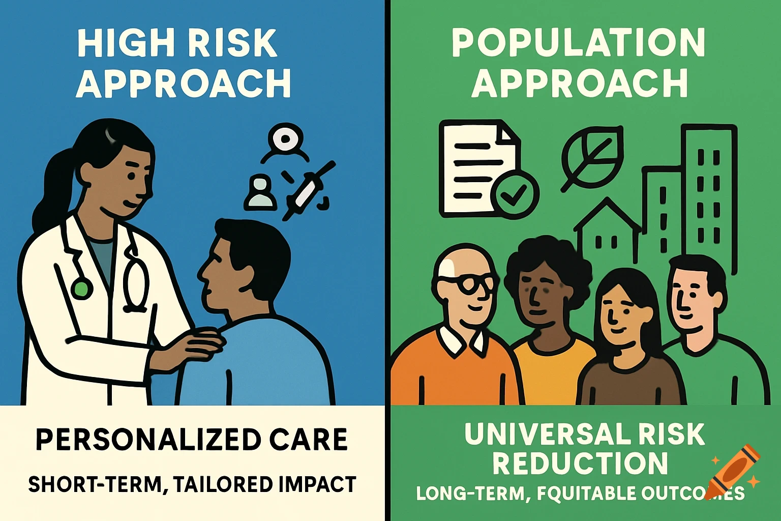
rompt: Create a split infographic comparing the High Risk Approach and the Population Approach. On the left, show a healthcare professional providing personalized care to an individual, with icons representing family history and targeted interventions; include text about short-term, tailored impact. On the right, depict a community with policy symbols and diverse people benefiting from environmental changes; include text about universal risk reduction and long-term, equitable outcomes. Use contrasting colors (blue for high risk, green for population), modern style, clear icons, and simple labels. Mehr sehen
More images like this
