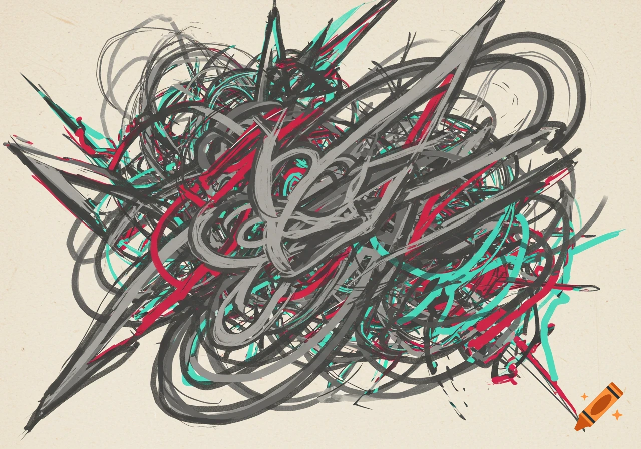
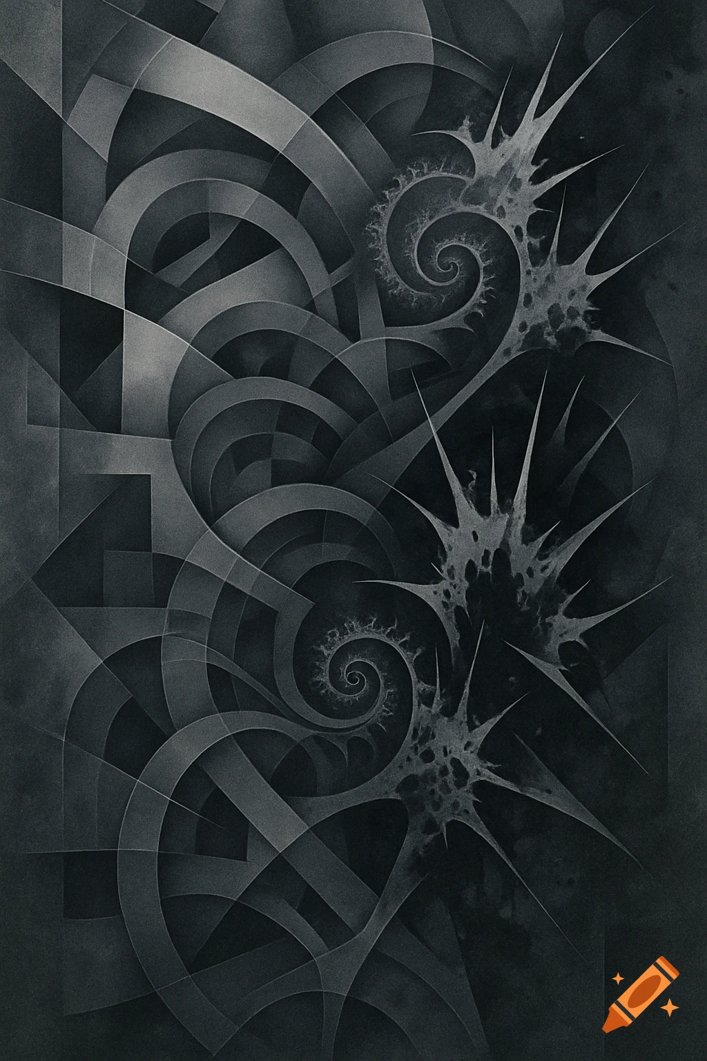
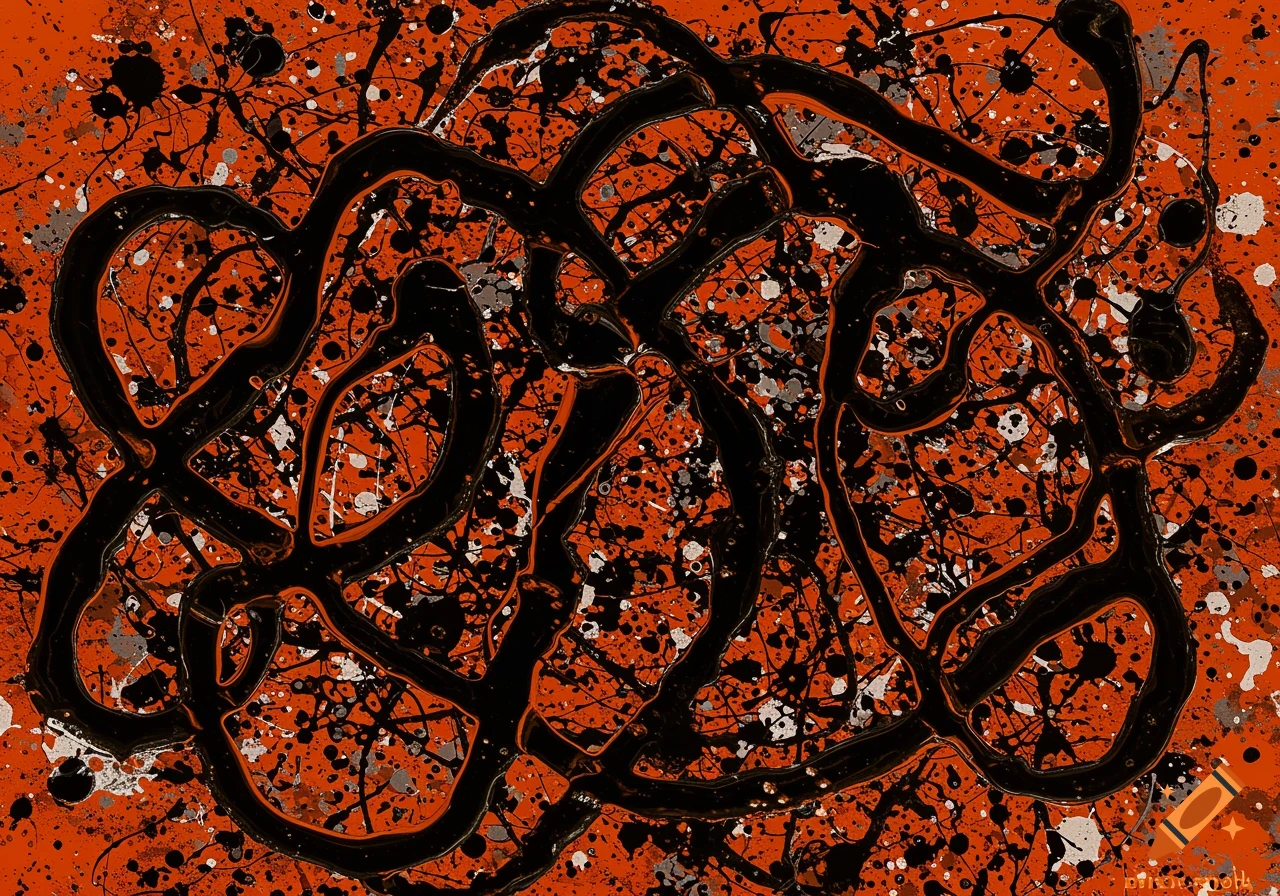
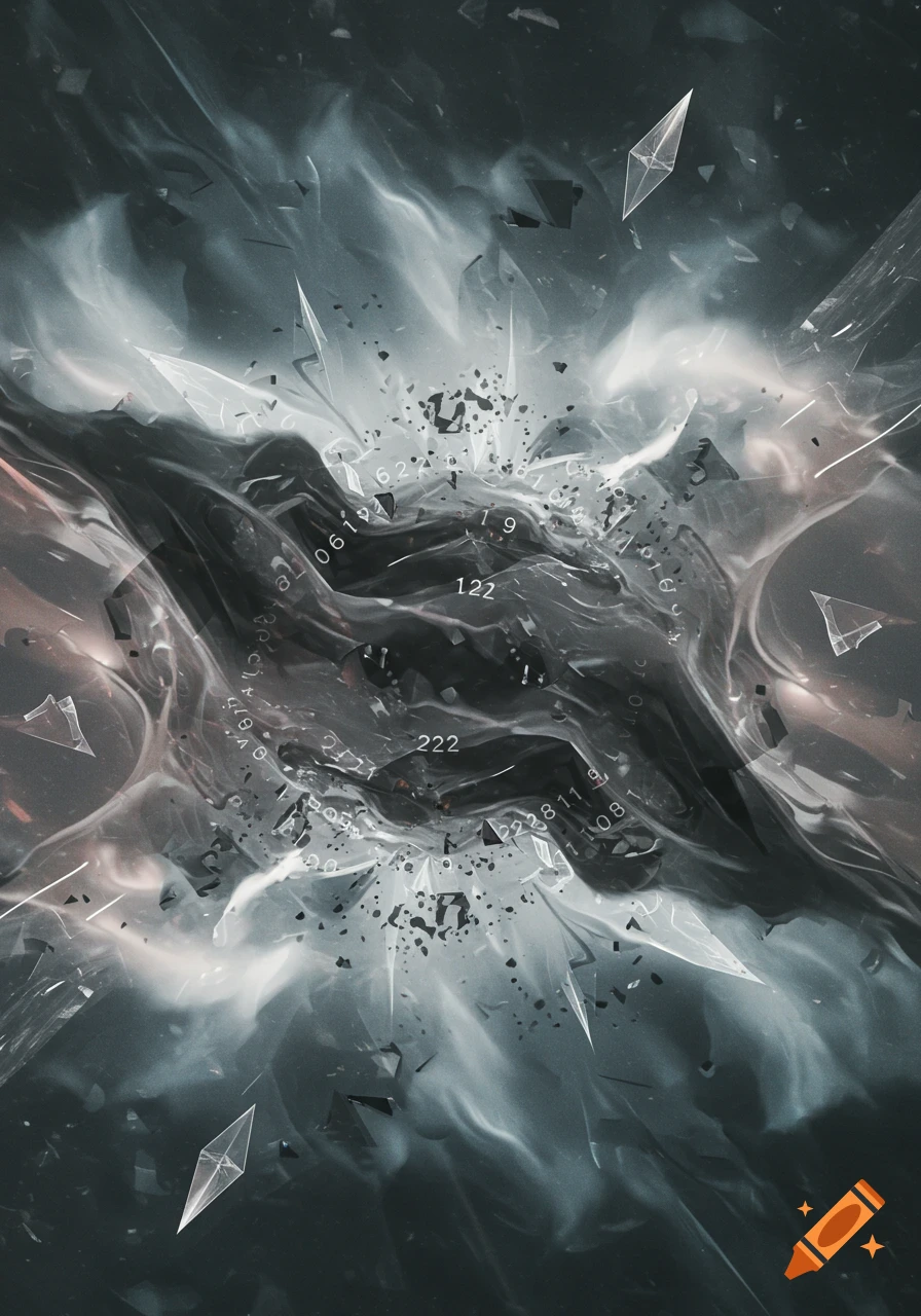
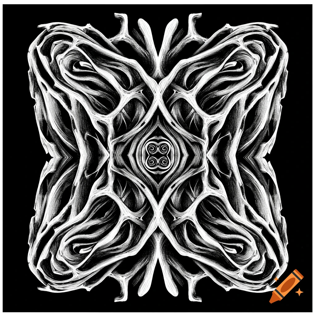
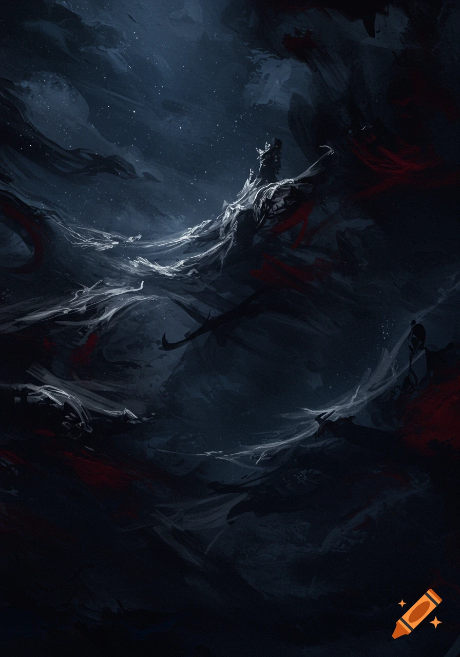
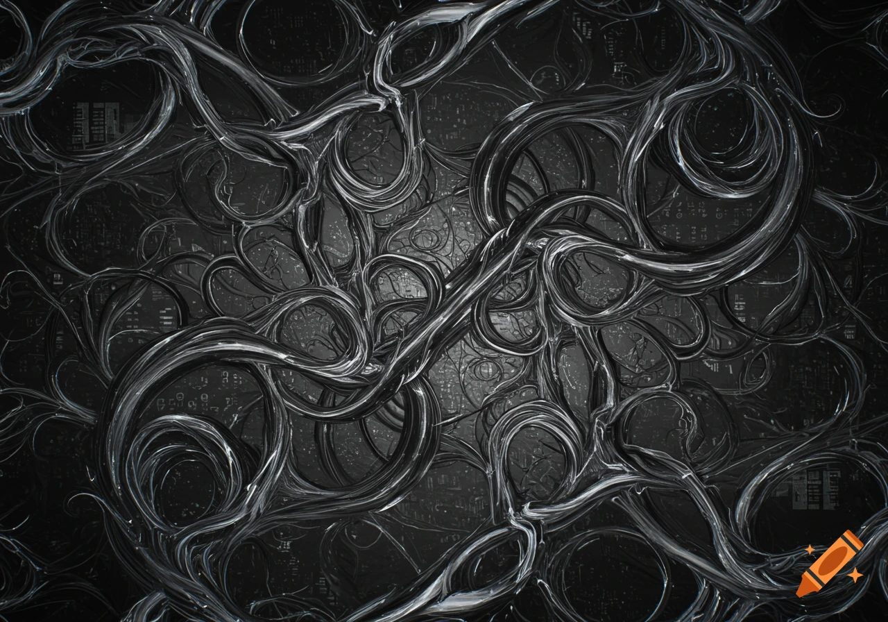
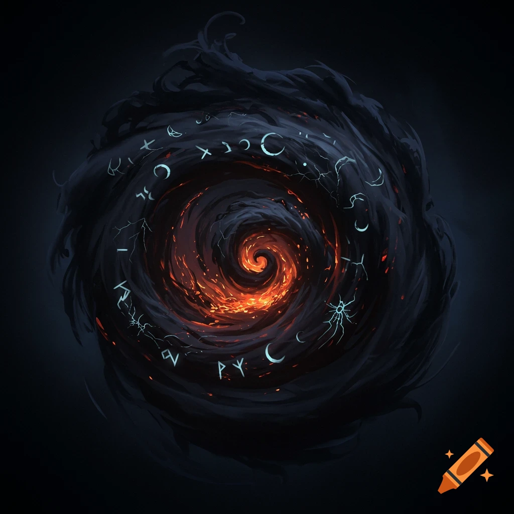
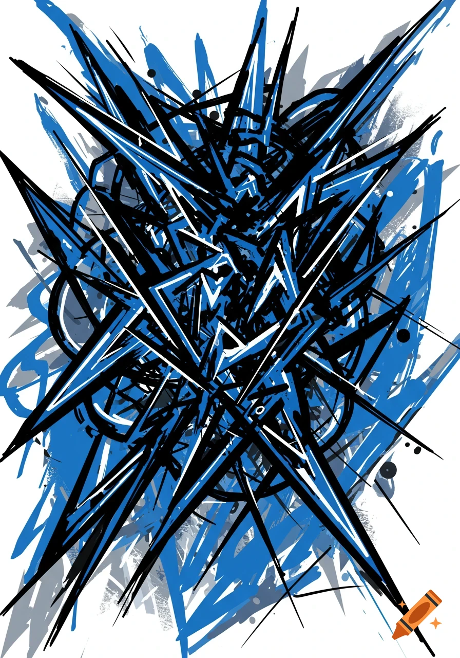
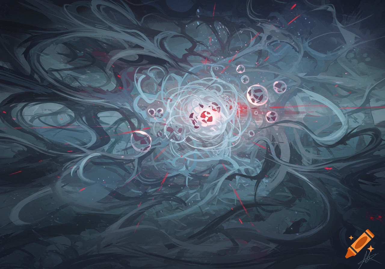
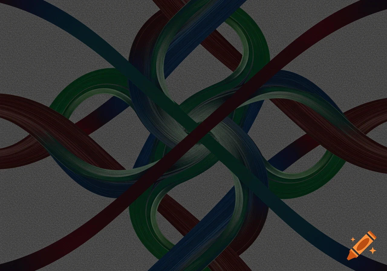
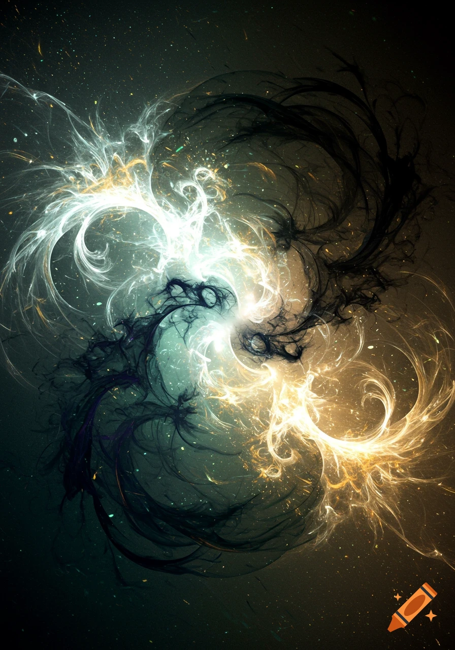
An abstract painting with tangled dark blue and gray lines and sharp red streaks.

Title of My Work: “Beneath the Surface” Emotion: Anxiety In my painting, I chose to express the emotion of anxiety. To do this, I used mostly jagged, overlapping lines that twist and intersect in unpredictable ways, creating a sense of restlessness. I chose cool-toned blues and grays as the dominant colors, but I included sudden, sharp streaks of red to represent moments of panic or sudden stress. The composition is purposely unbalanced, with heavier linework and color concentration in the lower right corner to create visual tension and an uneasy feeling, like something is pulling downward. There’s very little negative space, which helps to add to the sense of overwhelm and clutter that often comes with anxiety. The overlapping elements are meant to reflect racing thoughts and internal chaos. Working on this piece was a little more emotional than I expected. I found it surprisingly hard to let go of trying to draw something recognizable and just focus on feelings and design choices. I also noticed how powerful color can be—just switching one shade could shift the mood of the whole piece. One of the challenges I faced was trying to make the piece feel chaotic without making it completely unreadable or messy. I learned that composition, even in abstract work, still needs balance and purpose, even if it’s not symmetrical. Overall, this assignment helped me understand how artists can communicate through visual language alone, using line and color to express emotions in a deep Mehr sehen
More images like this