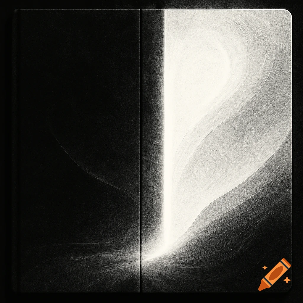
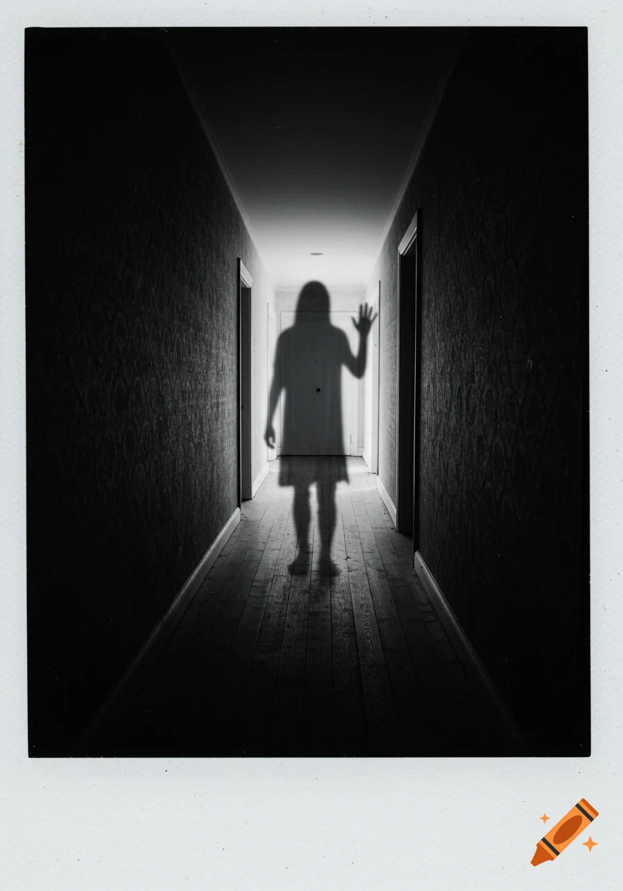
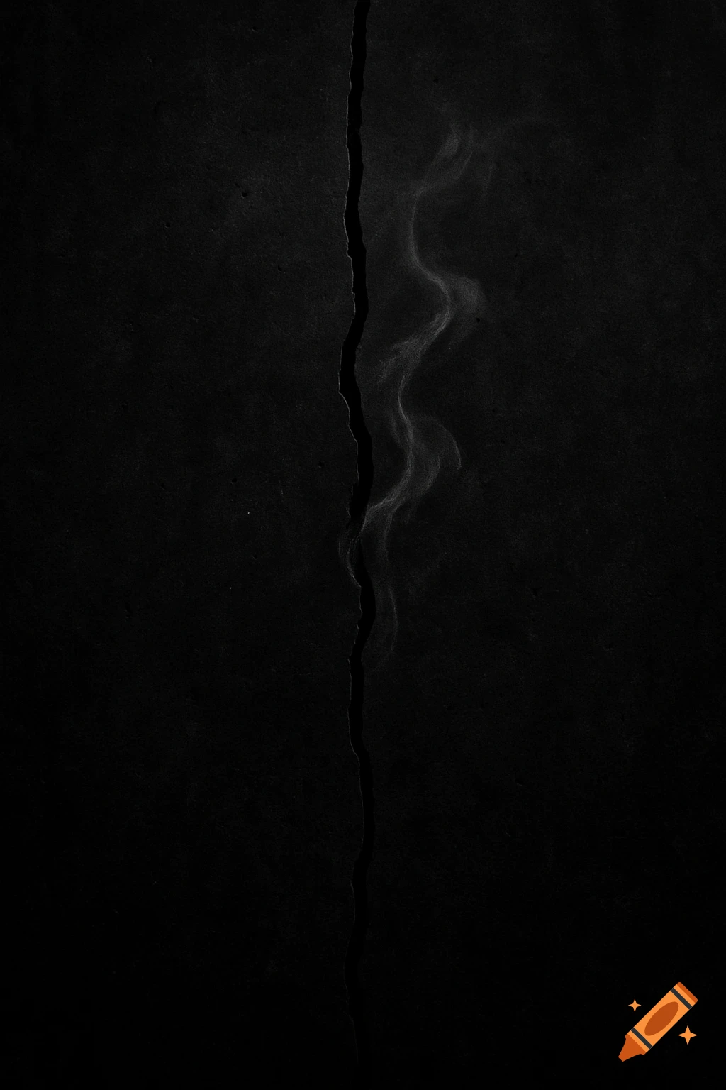
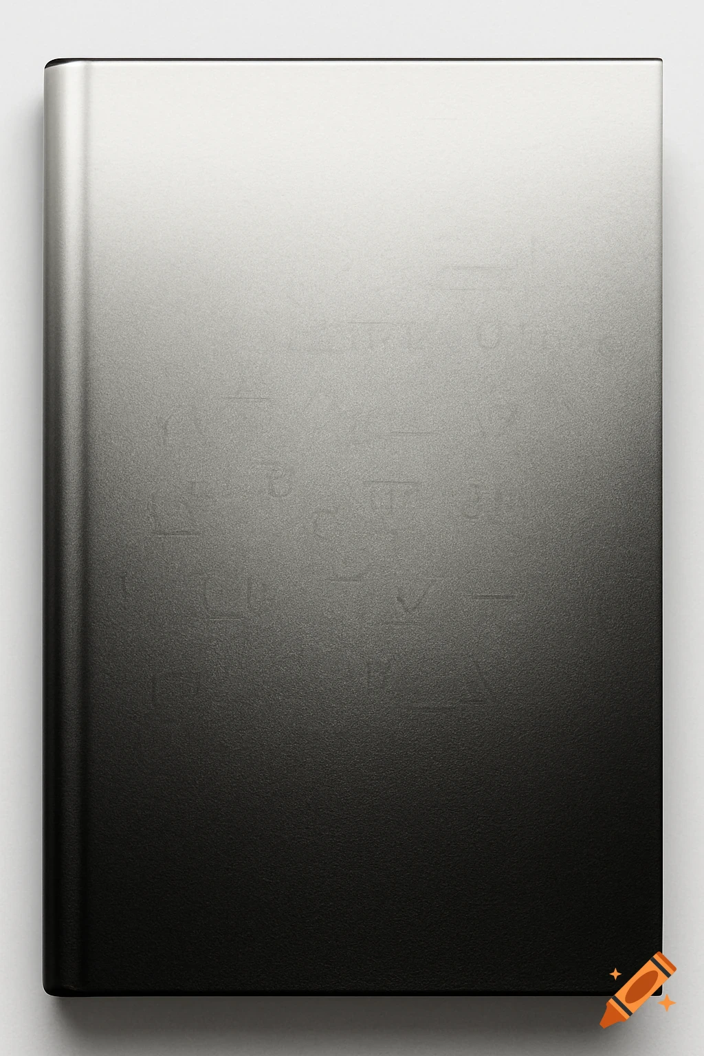
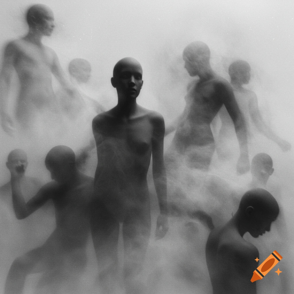
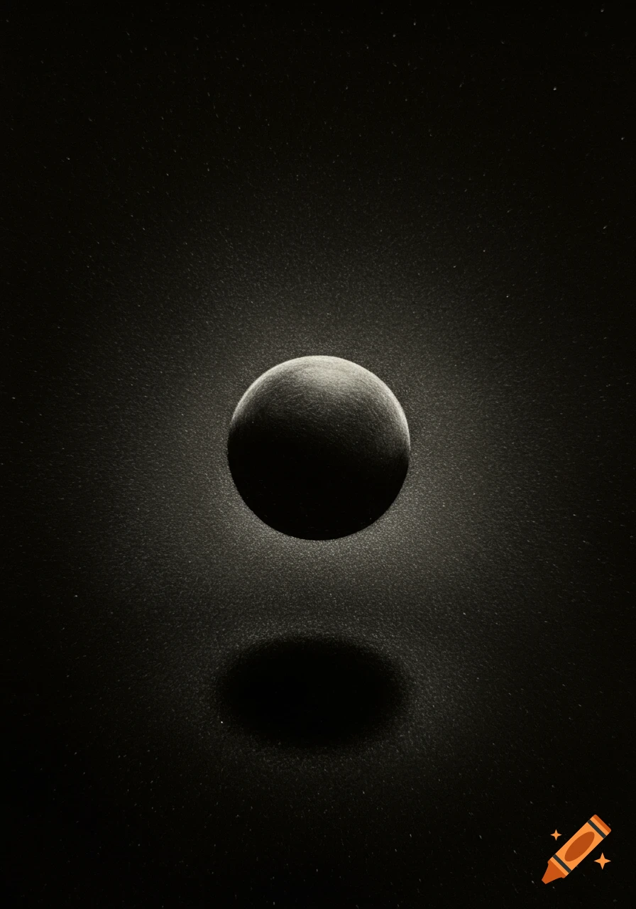
A minimalist black book cover with a thin white crack down the center, revealing a faint, blurred human silhouette.

BOOK COVER DESIGN — *THE WAY I USED TO BE* Create a minimalist, emotionally charged literary fiction / young adult contemporary book cover for the title **THE WAY I USED TO BE**. **Canvas & Composition** * Standard trade paperback ratio, 6 × 9 inches. * Pure matte black background (#000000). * No texture, grain, noise, pattern, vignette, glow, or gradient. * The black should feel deep, empty, absorptive, and silent. * Maintain a strict vertical composition with a subtle feeling of downward emotional gravity. * Overall aesthetic: sophisticated, restrained, symbolic, gallery-quality book design. **Primary Visual Element — Fracture** * A single thin fracture line running nearly the entire height of the cover. * Begins approximately 0.75 inches from the top edge and ends 0.75 inches from the bottom edge. * Positioned slightly right of center (about 10% off-center). * Width approximately 1–2 pixels. * Include 2–3 delicate branch fractures at 0.5–1 pixel thickness. * Fracture should appear controlled and quiet, not explosive. * No shattered glass effect, no debris, no dramatic impact burst. * Optional slight diagonal tilt (5–10 degrees) to create emotional tension. * The fracture must visually pass in front of all other elements. **Hidden Human Presence** * A barely visible human silhouette emerging from darkness. * Soft outline only: rounded head, gentle shoulders, no facial features. * No clothing details. * Opacity approximately 8–12% white. * Very subtle blur to soften edges. Mehr sehen
More images like this