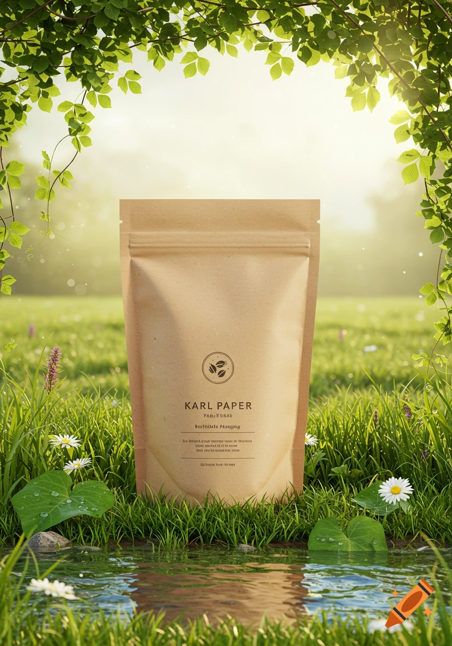
Product photograph of two beige specialty coffee bags with Persian and English labels.

Design and refine the existing premium specialty coffee label system for the brand “SAAR”, using the provided original SAAR logo references and the provided existing label design as the STRICT primary visual references. IMPORTANT: Do NOT redesign the brand identity from scratch. Do NOT create a new visual concept. Do NOT replace, redraw, distort, or reinterpret the original SAAR logos. Preserve the existing label's overall concept, visual language, composition style, proportions, materials, and color palette. The goal is to professionally refine the existing design by improving typography, spacing, hierarchy, readability, information organization, and practical usability. The label system consists of TWO coordinated sides: LABEL ONE = PERSIAN SIDE LABEL TWO = ENGLISH SIDE ━━━━━━━━━━━━━━━━━━━━ LABEL ONE — PERSIAN SIDE ━━━━━━━━━━━━━━━━━━━━ Use the original Persian SAAR logo exactly as provided. Keep the original Persian logo intact. Add the word: «قهوه» Place «قهوه» naturally in the upper-right area of the existing Persian logo so the overall reading becomes: «قهوه سار» The added word must feel like an intentional part of the logo composition, not a separate sticker or unrelated text. Preserve the original logo proportions, visual character, and identity. Under the Persian logo, remove the previous tagline completely. Replace it with exactly these three lines: دقت در انتخاب سختگیر در کیفیت وفادار به اصالت Use elegant, premium, formal Persian typography with excellent Mehr sehen
More images like this