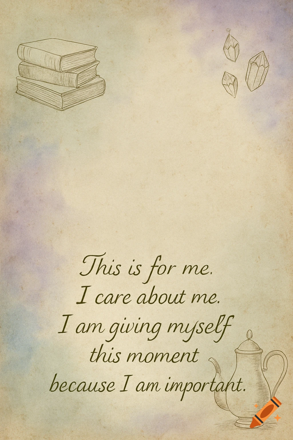
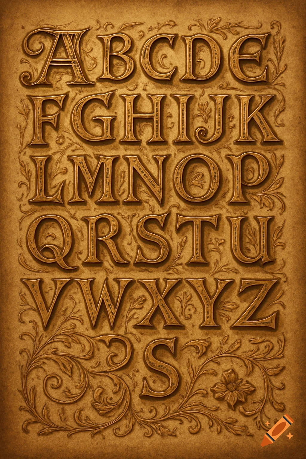
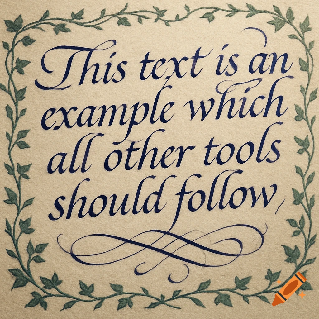
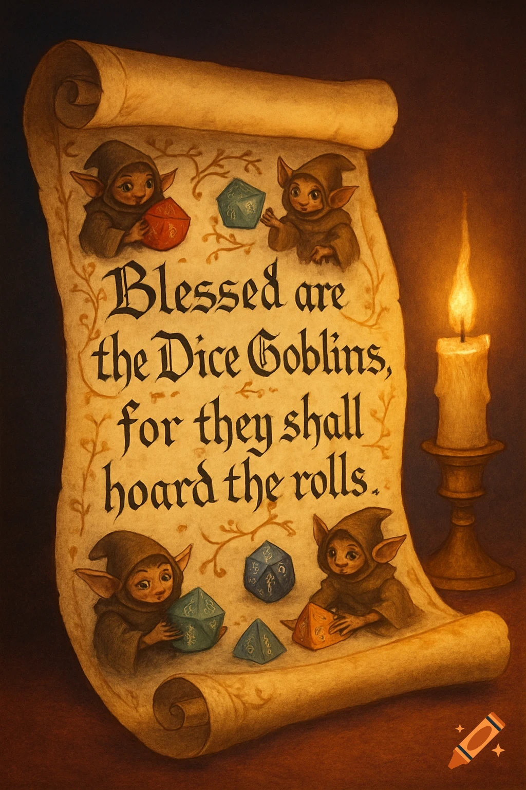
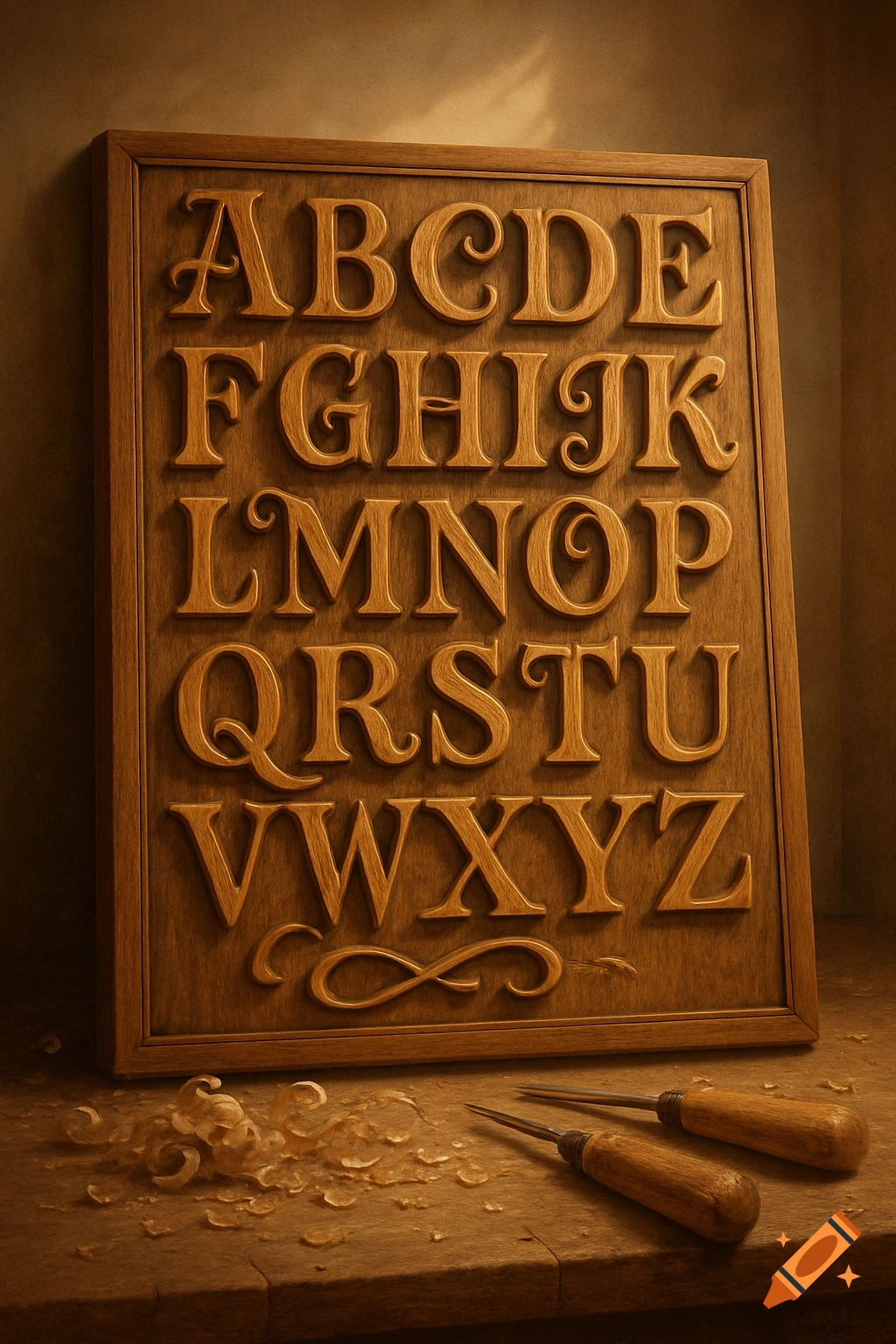
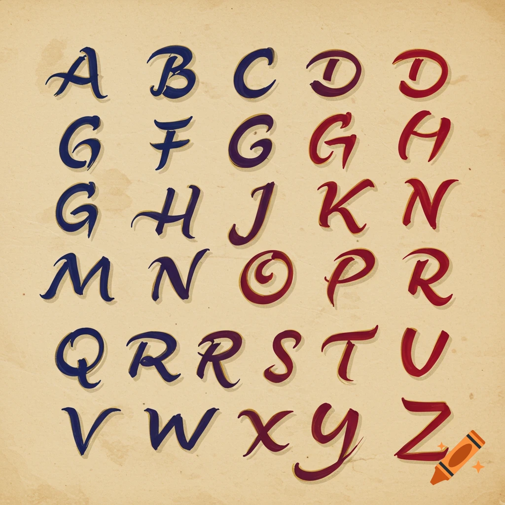
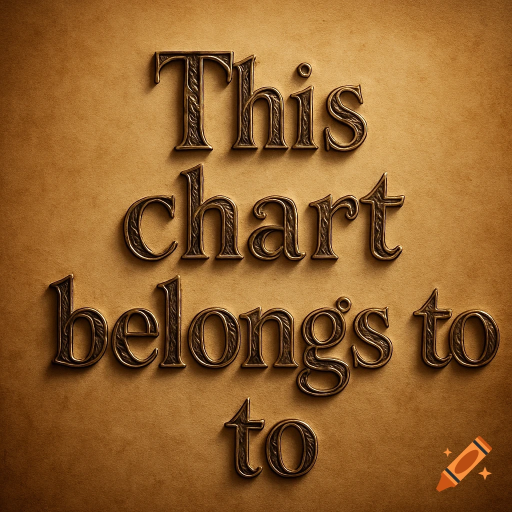
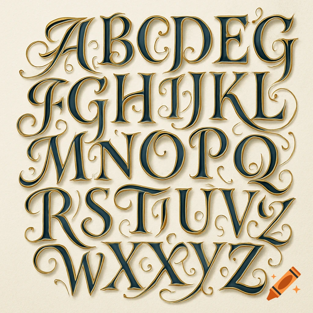
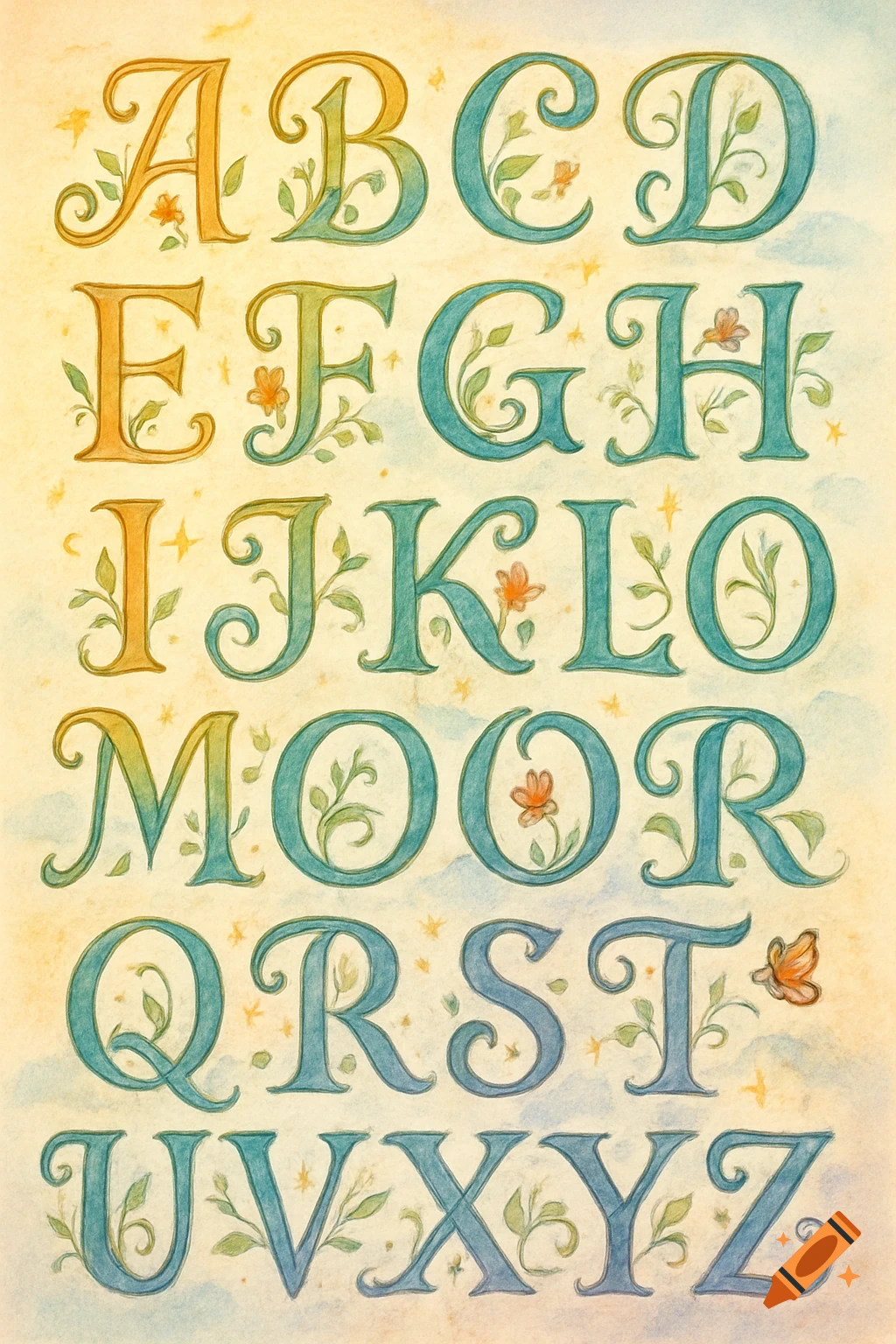
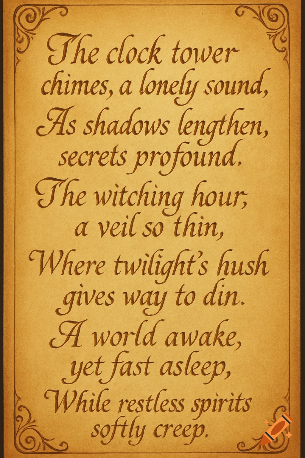
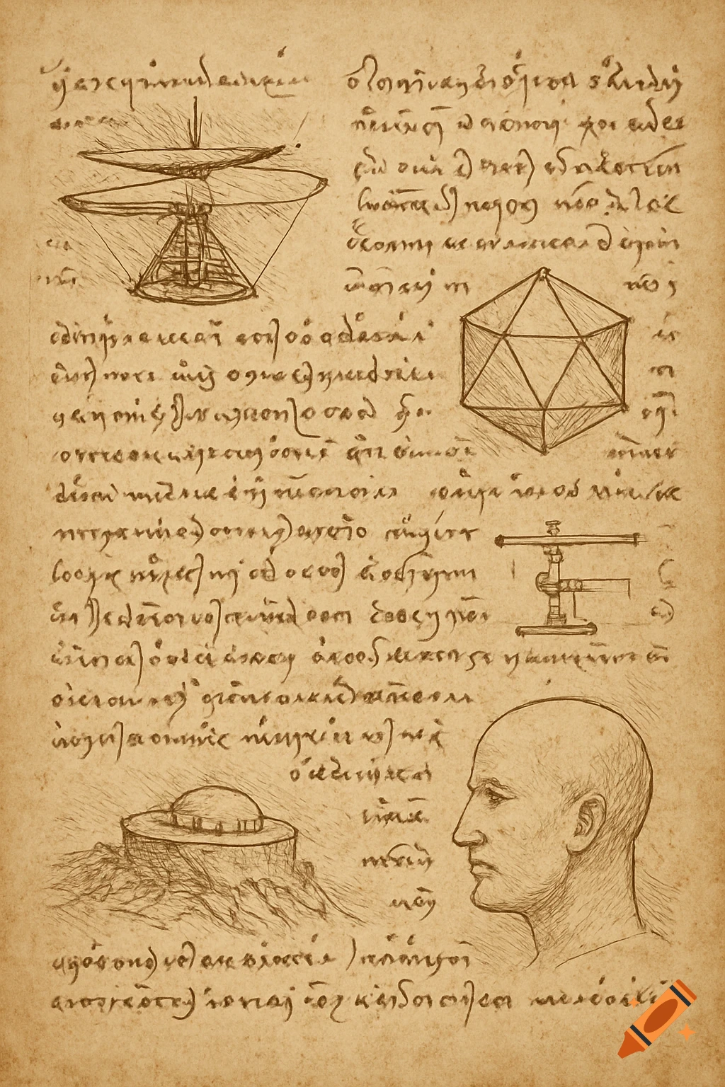
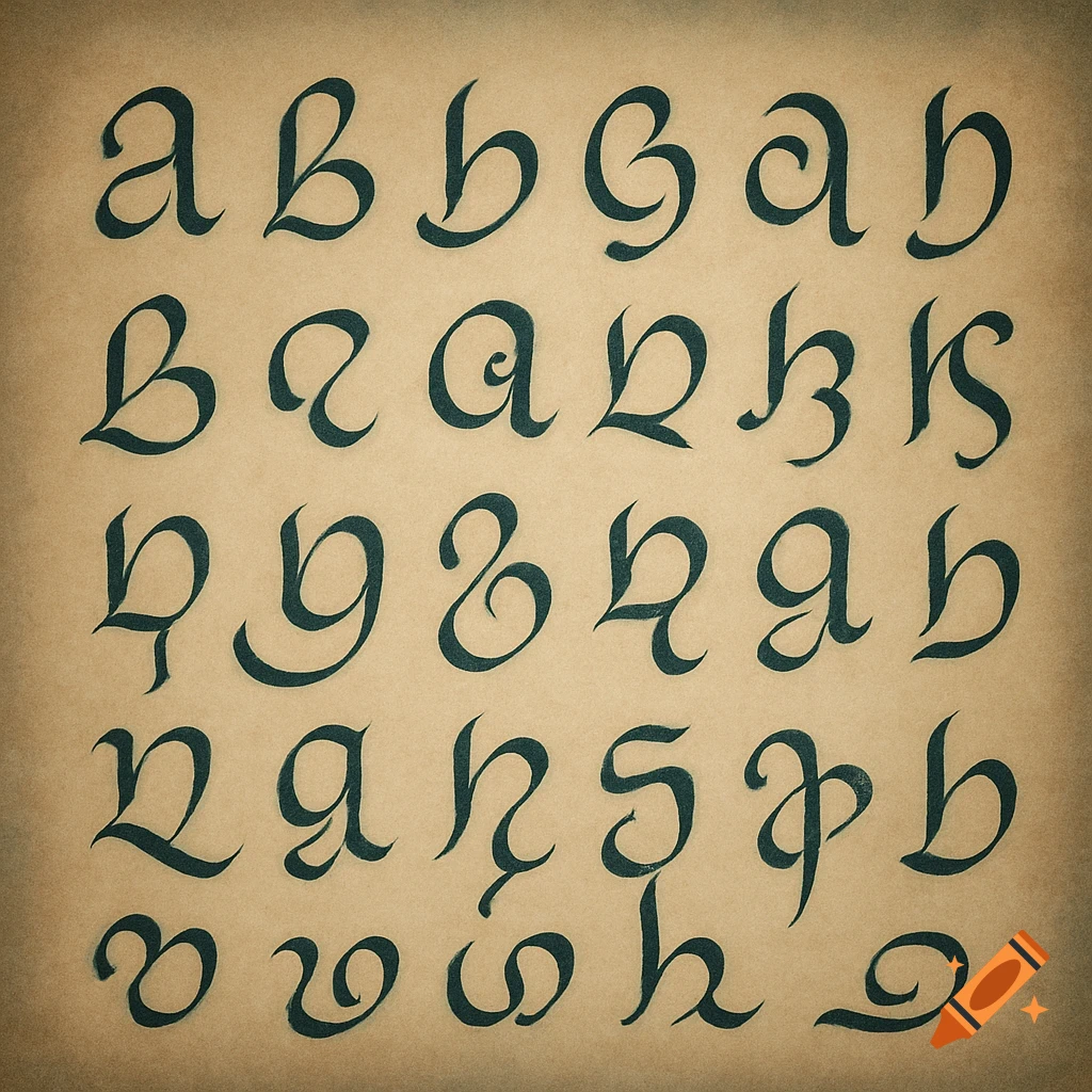
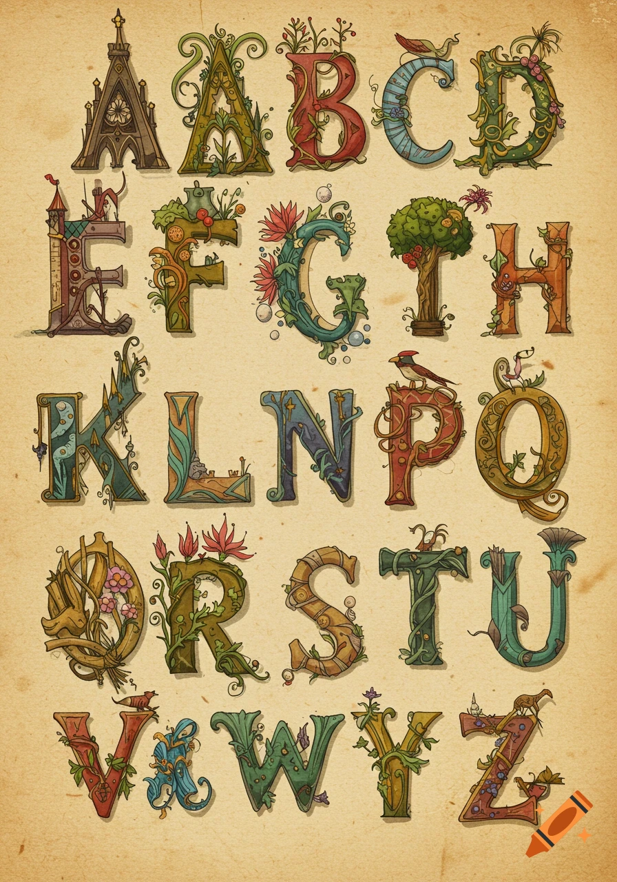
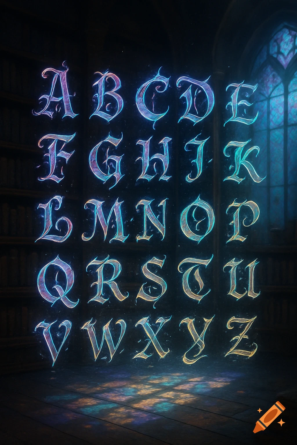
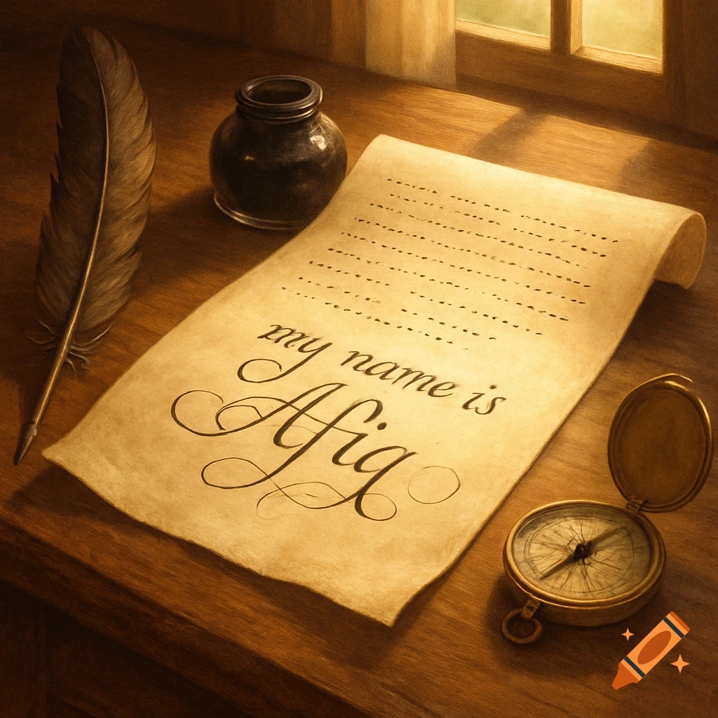
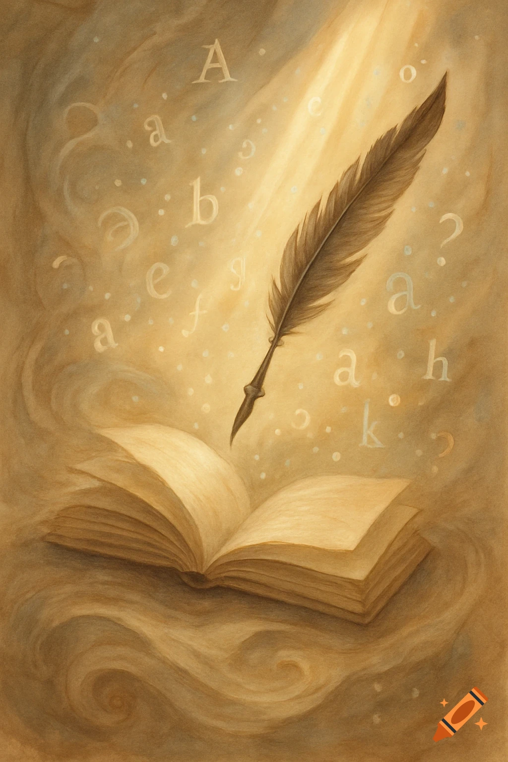
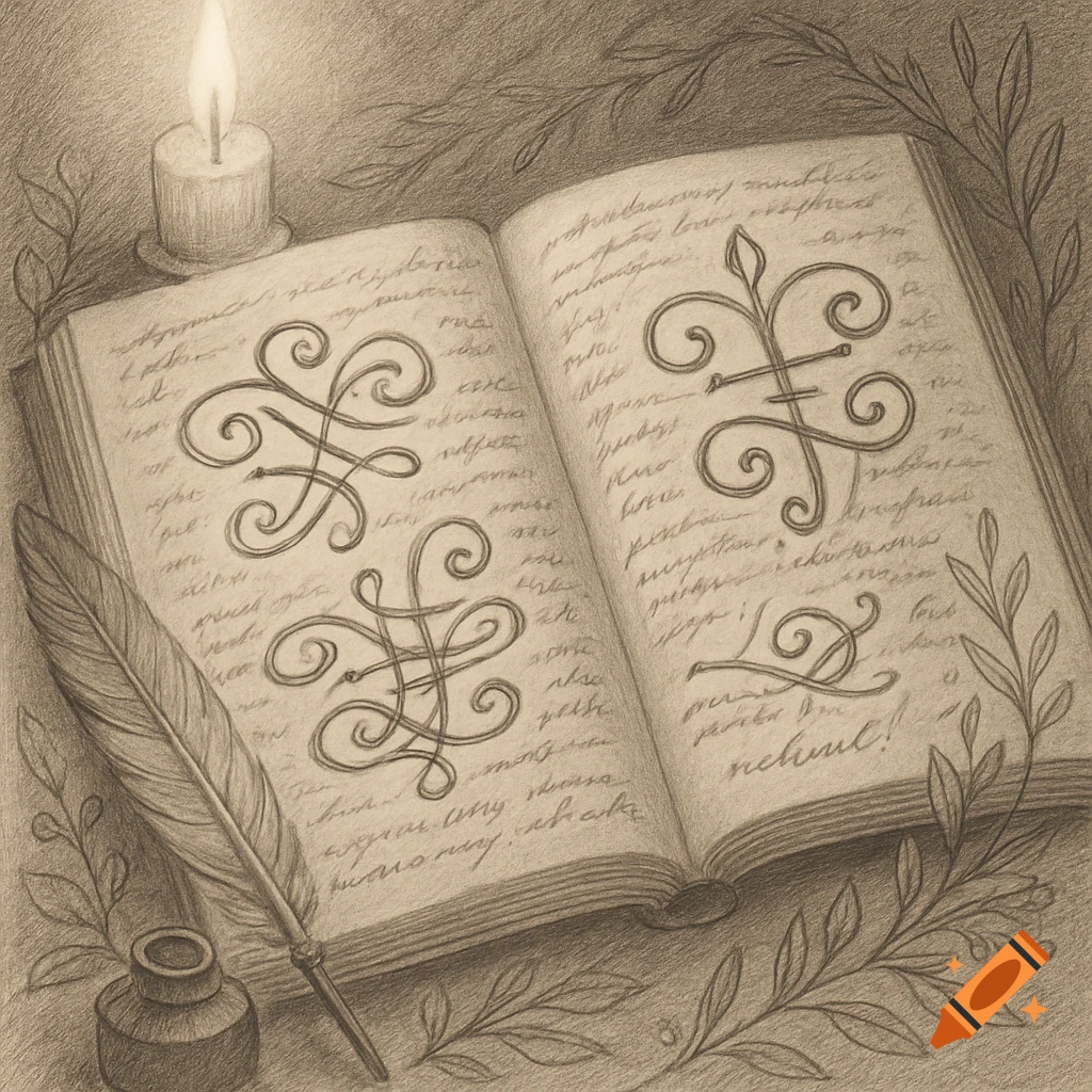
A vintage parchment page displays elegant script handwriting describing its own stylistic features.

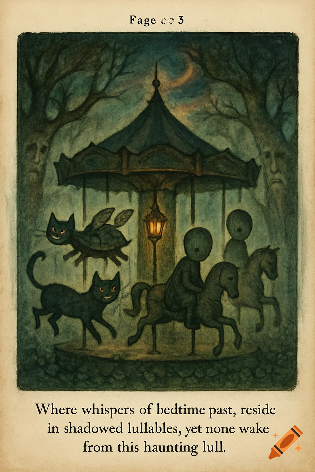
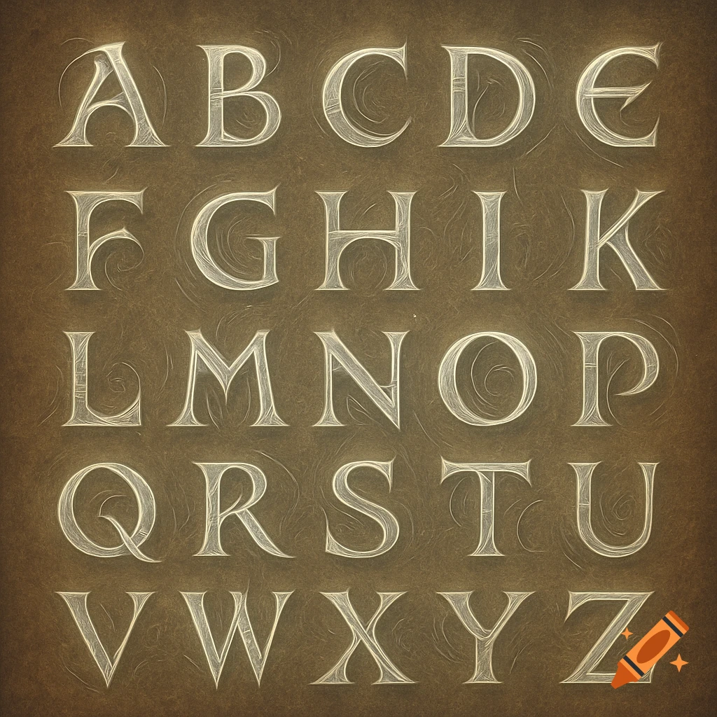
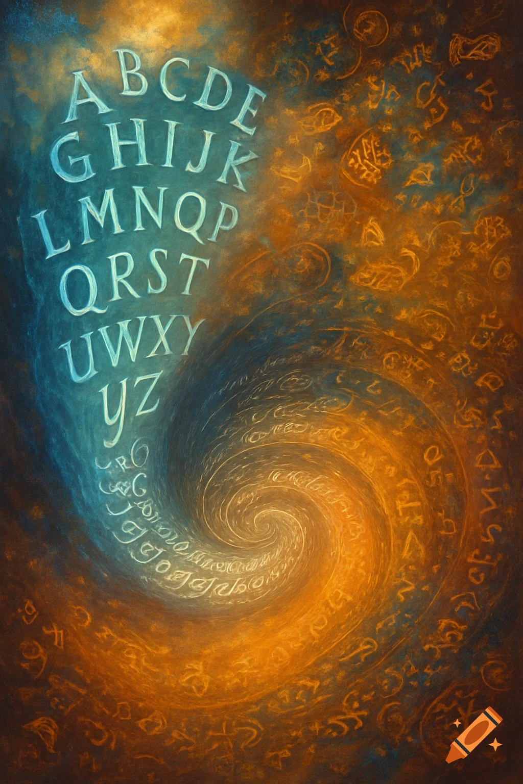
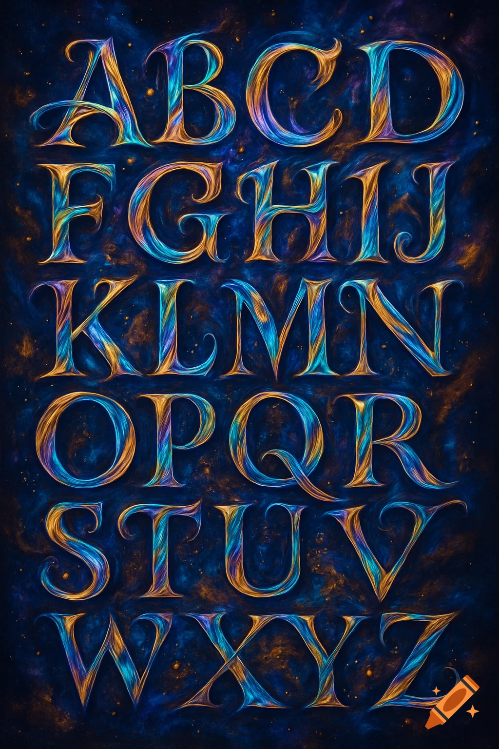
A page with writing in this exact font “ The handwriting is a mix of print and loosely joined letters, sitting mostly upright but leaning noticeably rightward as the pace picks up, sometimes reaching a fairly pronounced slant by the end of longer lines. The x-height is small and consistent, while tall letters like l, h, k, and t rise well above it, creating a top-heavy rhythm across the page. Descenders on g, y, and p drop with a noticeable loop, often curling slightly back to the left. Capital letters stand out strongly—oversized compared to the lowercase and more stylised, especially A, B, C, and E, which have a confident, almost calligraphic feel. Word spacing is even and fairly generous, while letter spacing within words starts more open and gradually compresses toward the end, particularly on longer lines. The t crossbars sit high and are often long, sometimes extending beyond the stem on both sides. Pressure is medium-light with slightly heavier downstrokes, giving a subtle rhythm to the writing. Neatness varies within sentences—starting more controlled, loosening through the middle, and tightening again toward the end—giving the overall style an energetic, expressive feel with strong visual character.” Mehr sehen
More images like this