A detailed brand identity for ASCNT, a challenge-mode frozen meal brand, featuring logos, packaging mockups, mission cards, and level indicators with a futuristic, extreme sports aesthetic.

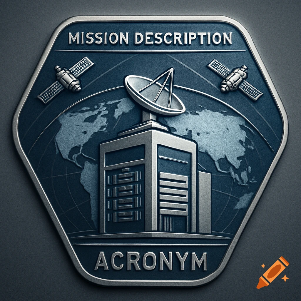
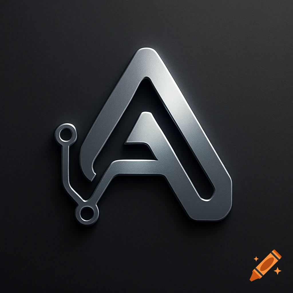
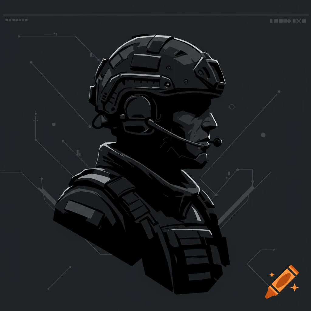
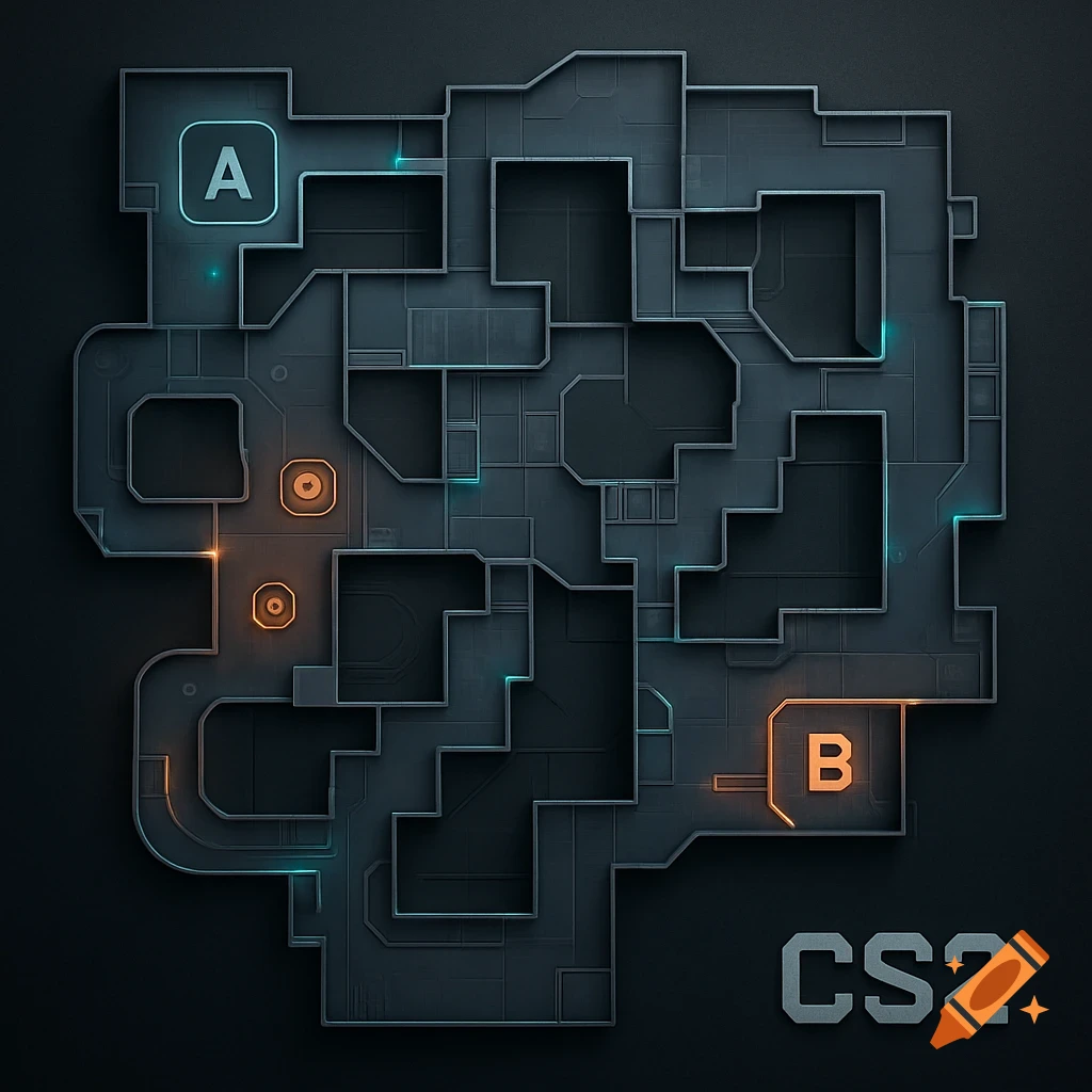
ASCNT — Challenge‑Mode Frozen Meal Brand Create a bold, high‑adrenaline visual identity for a frozen‑meal company built for thrill‑seekers. The brand theme is “ASCENT + CHALLENGE.” Logo Style: sharp geometric angles, summit‑inspired shapes, vertical ascent lines, minimalist but aggressive, high‑contrast, futuristic, adventure‑sport energy. Color Palette: black, charcoal, deep navy, ice blue, neon red, magma orange. Brand Mood: extreme sports, boss‑fight intensity, high‑altitude expedition, gamified challenge culture. Imagery Style: dramatic lighting, metallic textures, frost effects, heat‑wave gradients, topographic lines, challenge meters, level bars, QR‑code mission elements. Packaging Style: vertical layout, “LEVEL 1–10” difficulty indicators, mission cards, holographic accents, rugged expedition‑gear aesthetic, bold typography, collectible limited‑edition feel. Keywords: adrenaline, ascent, boss level, challenge mode, extreme flavor, survival, intensity, neon highlights, futuristic UI overlays, mission briefing, high‑contrast, cinematic. Deliverables: Primary logo Secondary icon (summit symbol or level bar) Packaging mockups for frozen meals Boss Level limited‑edition packaging Brand pattern (topographic lines + challenge bars) Social media hero images Style references: extreme sports branding, esports UI, expedition gear, boss‑fight video game screens, high‑contrast adventure photography. Mehr sehen
More images like this