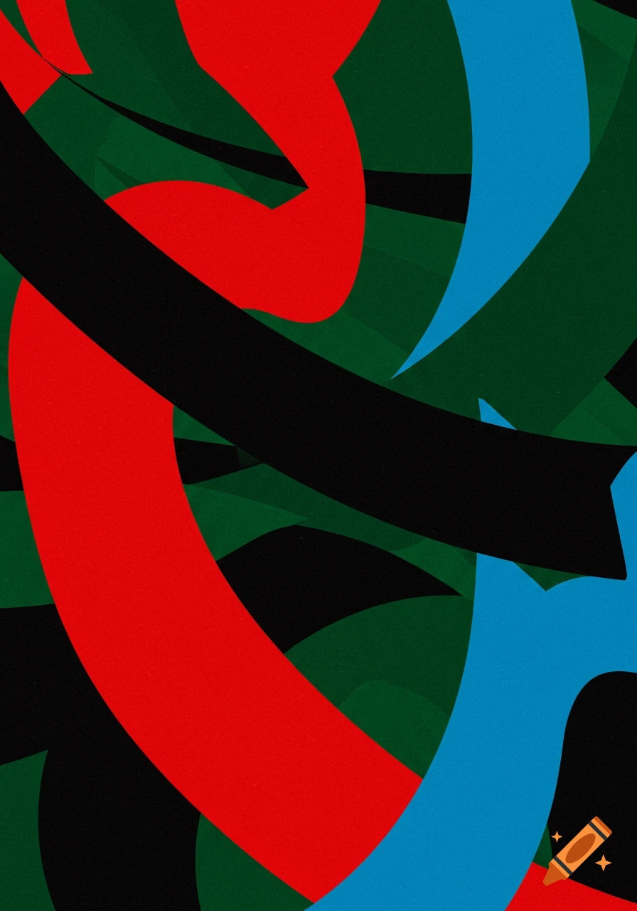
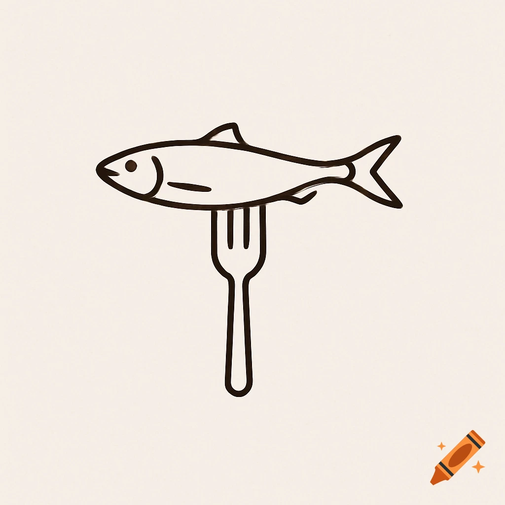
A retro, abstract fuchsia pink sardine logo with 'thepinksardine' text, on a cream background, featuring screen-print texture.
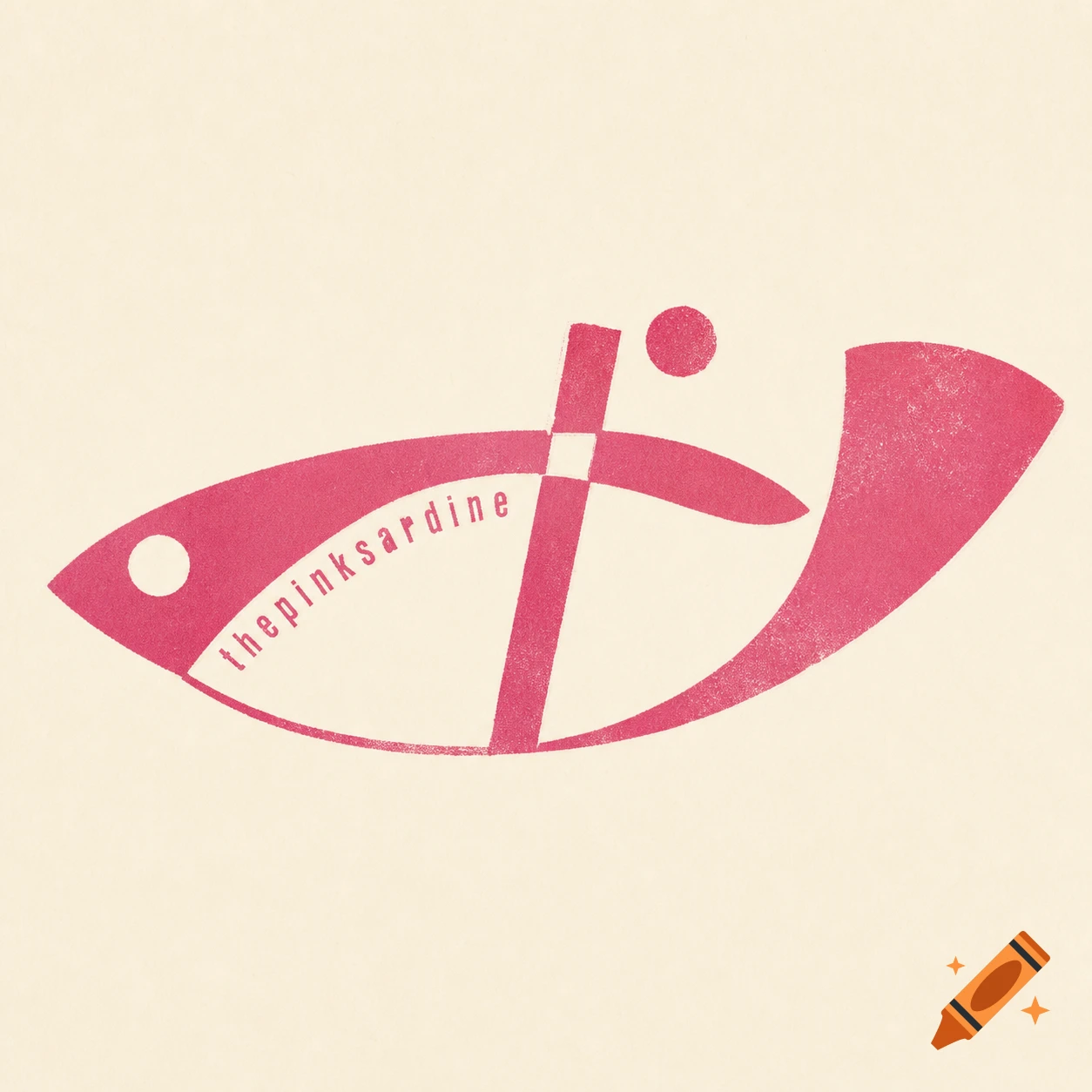
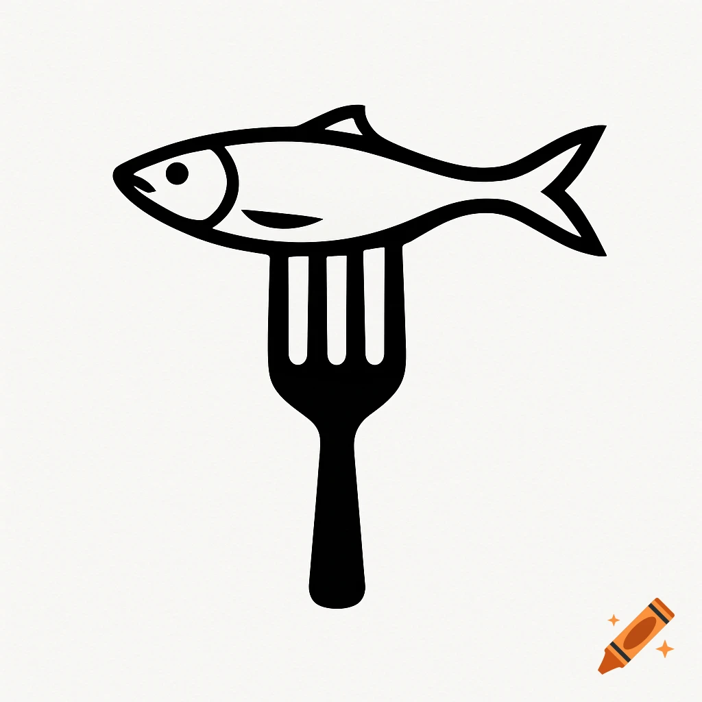
Logo design prompt — thepinksardine Design a distinctive minimalist artist’s mark for an artist and screen printer named “thepinksardine”. The logo should feel graphic, retro, handmade, slightly imperfect, characterful and intelligent — never cute, generic or overly polished. Create an abstract, highly reduced sardine-inspired symbol that subtly combines the flowing silhouette of a sardine with its fin and tail. The sardine should be suggested rather than literally illustrated. The form should have a sense of movement and organic flow, while still feeling like a strong graphic mark. The most important concept: the symbol should function as an independent artist’s signature. It should not look like a conventional fish logo, badge, emblem or commercial seafood brand. Explore the idea that the visual shape could subtly contain or derive from the lettering of “thepinksardine”, without requiring the full name to be immediately readable. The relationship between lettering and symbol should feel clever and almost hidden — something discovered on closer inspection. Aesthetic direction: • 1950s/1960s graphic design • vintage print ephemera • screen-print aesthetics • handmade printing imperfections • bold, simple shapes • organic curves combined with subtle geometric structure • slightly strange and unexpected, but still harmonious • confident, artistic, personal • no obvious nautical clichés The logo must work extremely well as a 1.5–2 cm rubber stamp and as a screen-print mark on Mehr sehen
More images like this