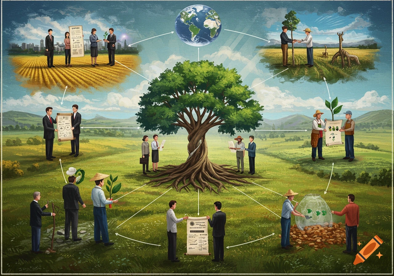
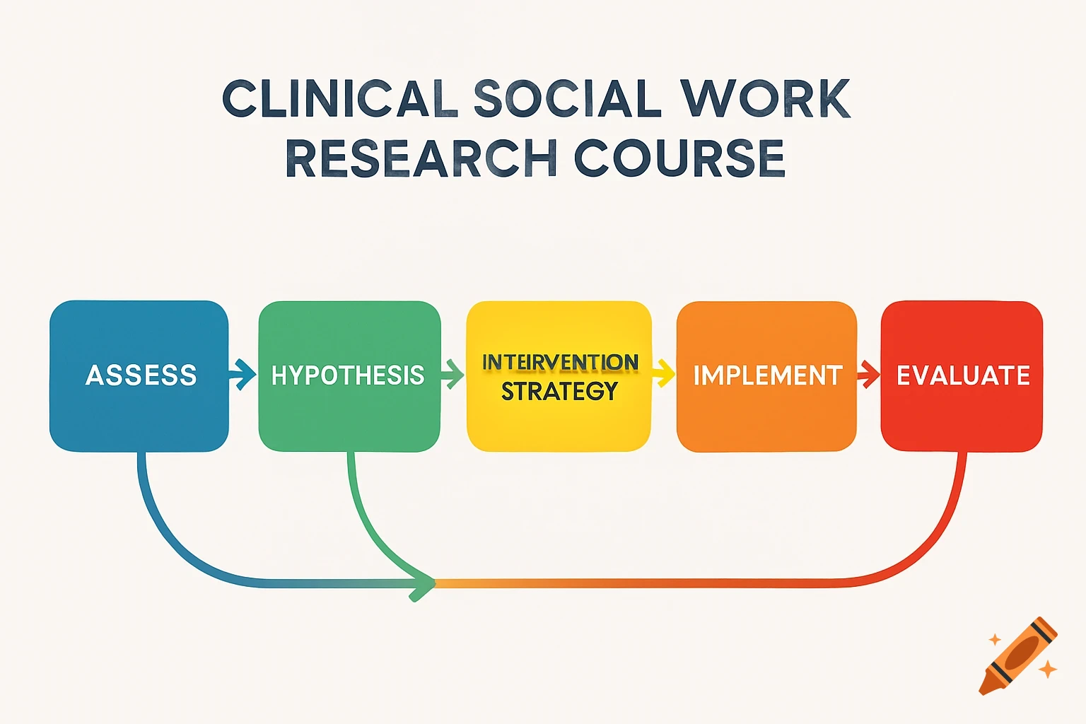
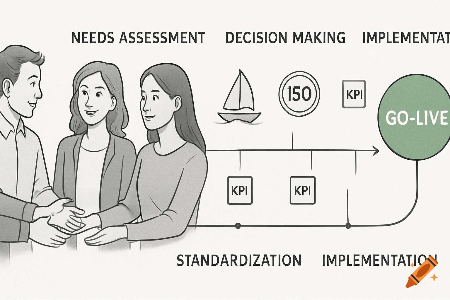
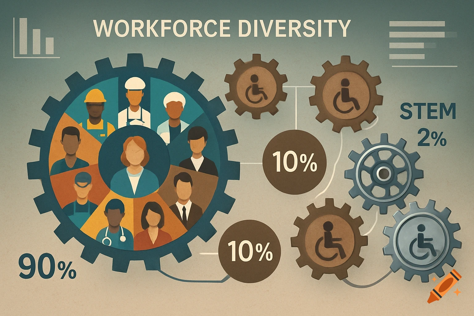
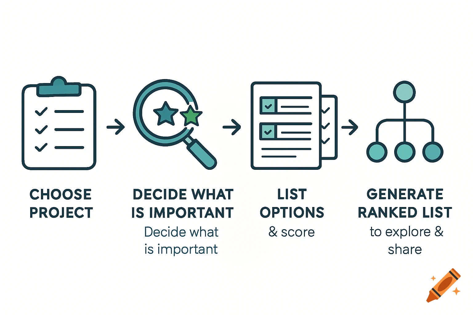
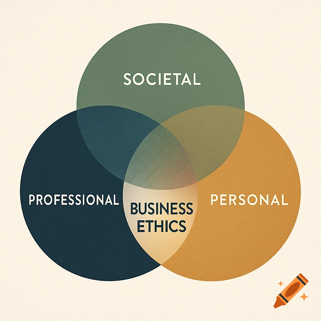
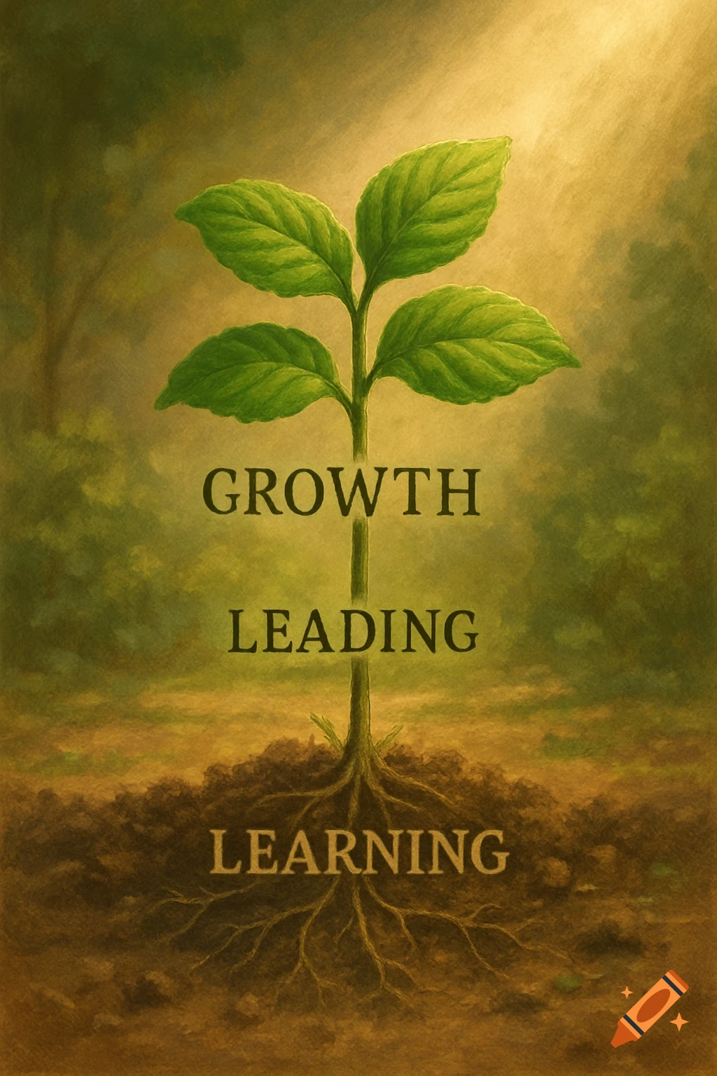
An elegant, minimalist infographic titled 'CAREER MAP' depicts a tree with roots and leaves. Career paths 'Agricultural Engineer', 'Sustainable Supply Chains', and 'Data Analytics' are listed.

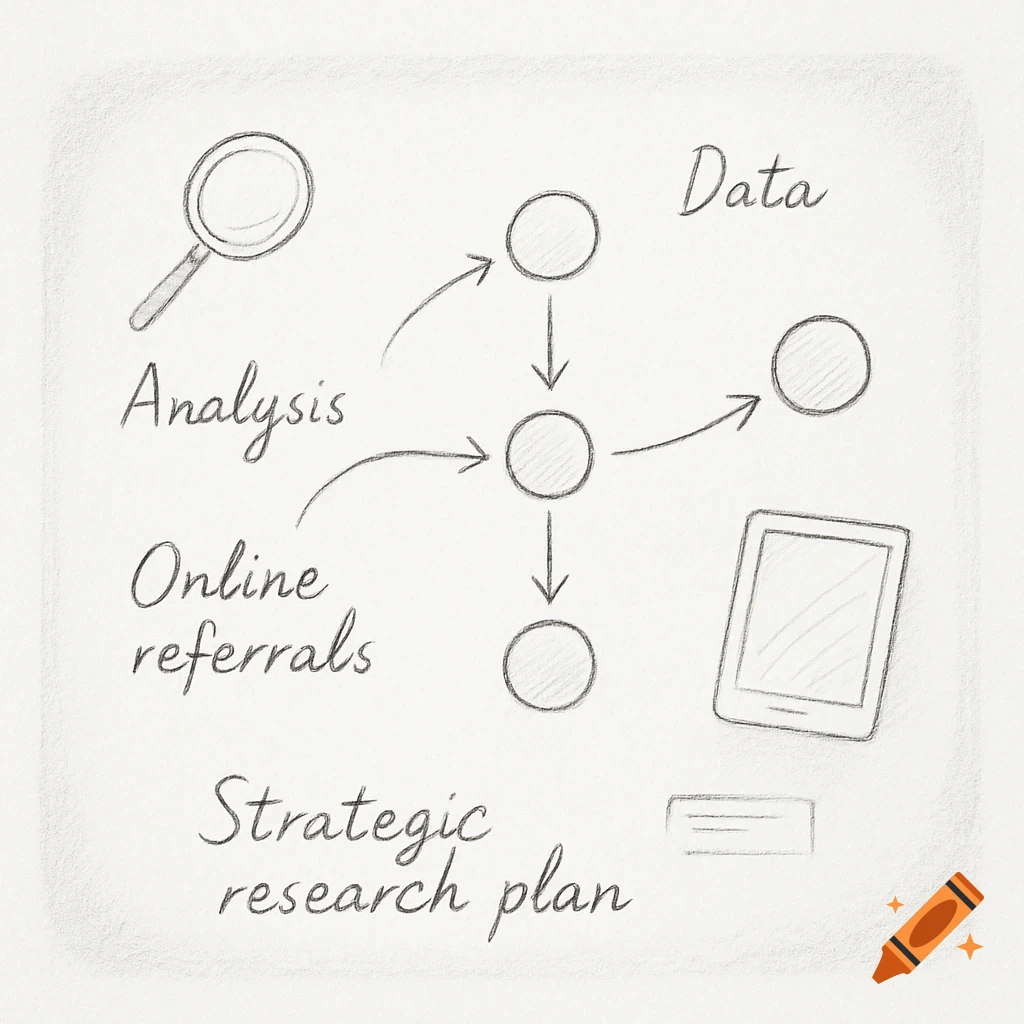
Create a premium professional infographic representing a career map in the agri-food sustainability sector. STYLE AND MOOD The infographic should look like it was designed by a top consulting firm (McKinsey, BCG, Deloitte Sustainability), FAO, World Bank, Nestlé Sustainability, Danone Impact, or Rabobank Food & Agriculture. The design must be: • Elegant and highly professional • Minimalist and uncluttered • Modern and strategic • Easy to understand in less than 10 seconds • Suitable for LinkedIn and executive audiences • Not a CV • Not a mind map • Not a student project • Not overly decorative Use generous white space. The visual hierarchy must immediately communicate a coherent professional journey. COLOR PALETTE Use soft, muted, sophisticated colors. Background: warm off-white / light beige Agriculture & Sustainability: sage green, olive green, forest green Data & Analytics: deep blue, blue-grey, petroleum blue Roots: warm taupe, light brown Text: dark charcoal Accent color: subtle orange only for quantified achievements Avoid bright colors. MAIN TITLE (top left) CAREER MAP Below: Rooted in Agronomy, Growing Sustainable Food Systems Use an elegant serif font for the title. Below: Agricultural Engineer | Sustainable Supply Chains | Data Analytics Use a clean modern sans-serif font. OVERALL CONCEPT A sophisticated tree representing a professional trajectory. The tree must feel organic and elegant. The roots represent foundations. The trunk represents the professional Mehr sehen
More images like this